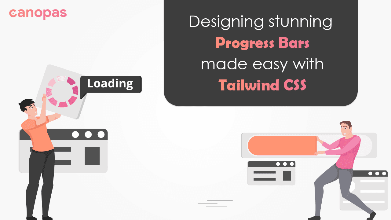
Designing Stunning Progress Bars Made Easy with Tailwind CSS
Background
In today’s fast-paced digital world, user experience is a crucial aspect of web development. One effective way to enhance the user experience is by incorporating progress bars into your website or application.
Consider you are building an online file upload feature for a cloud storage application. When users upload files, they often want to know the progress of their upload to estimate the remaining time or ensure the process is successfully completed.
By integrating a progress bar into your file upload feature, you can provide real-time feedback to the users, keeping them informed about the progress of their file upload. This enhances the user experience by reducing uncertainty and providing a sense of control over the upload process.
In this blog post, we will explore the power of progress bars and how you can easily create them using Tailwind CSS, a popular utility-first CSS framework. Let’s dive in!
Sponsored
We are what we repeatedly do. Excellence, then, is not an act, but a habit. Try out Justly and start building your habits today!
Why Progress Bar Matters?
Progress bars are invaluable tools when it comes to providing visual feedback and managing user expectations.
They convey a sense of completion, reduce anxiety, and increase user engagement.
Whether it’s a file upload, form submission, or an operation that requires time, a well-designed progress bar can keep users informed and engaged, leading to a more satisfying user experience.
Getting Started with Tailwind CSS
Tailwind CSS is a utility-first CSS framework that allows developers to rapidly build beautiful and responsive user interfaces. Its simplicity and flexibility make it an ideal choice for creating progress bars.
To begin, make sure you have Tailwind CSS installed in your project. If not, head over to the official Tailwind CSS documentation for instructions on installation.
1. Basic progress bar with rounded edges
This is the basic progress bar with rounded edges and is easy to integrate.
Example:
<div class="mb-5 h-2 rounded-full bg-gray-200">
	<div class="h-2 rounded-full bg-orange-500" style="width: 50%"></div>
</div>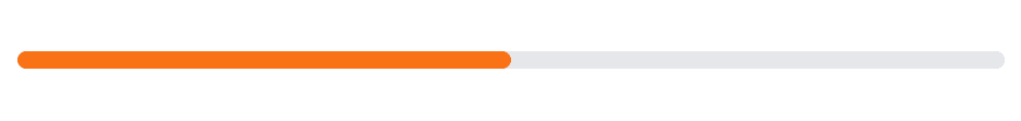
The above-given code snippet will produce a progress bar with a gray background and an orange fill, indicating progress of 50%.
Check out the live demo in the playground and feel free to play with it as per your requirements.
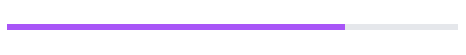
2. Slim progress bar with sharp edges
If you prefer a slimmer progress bar with sharp edges, you can modify the classes accordingly.
Example:
<div class="mb-5 h-1 bg-gray-200">
  <div class="h-1 bg-purple-500" style="width: 75%"></div>
</div>
The above-given code snippet will create a slimmer progress bar with a gray background and a purple fill, representing the progress of 75%.
Check out the live demo in the playground.
3. Progress bar with a label
Adding a label to the progress bar can provide additional context. We can achieve this by including a text element within the progress bar.
Example:
<div class="relative mb-5 h-2 rounded-full bg-gray-200">
  <div class="h-2 rounded-full bg-red-500" style="width: 25%"></div>
  <span class="absolute inset-0 flex items-center justify-center text-sm font-medium text-gray-900">25%</span>
</div>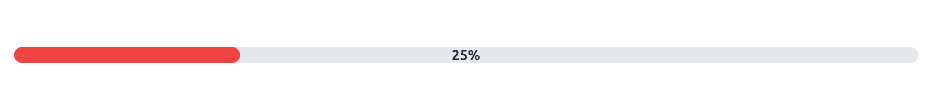
In this code snippet, a percentage label is positioned in the center of the progress bar, providing a clear visual representation of the progress.
Check out the live demo in the playground.
4. Animated progress bar
If you want to add a striped animation effect to the progress bar, we can achieve this with some additional CSS classes.
Example:
<div class="mb-5 h-2 overflow-hidden rounded-full bg-gray-200">
  <div class="h-2 animate-pulse rounded-full bg-gray-800" style="width: 50%">
    <div class="h-full w-full translate-x-full transform bg-white"></div>
  </div>
</div>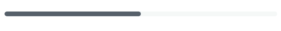
This code snippet creates a progress bar with a striped animation effect. The progress bar fills 50% of the container, and the striped animation moves from left to right, giving a visual indication of progress.
Check out the live demo in the playground.
5. Straight progress bar with bottom text
This progress bar allows adding external bottom text(progress percentage) along with showing progress.
Example:
<div class="relative mb-5 pt-1">
  <div class="mb-4 flex h-2 overflow-hidden rounded bg-gray-100 text-xs">
    <div style="width: 80%" class="bg-green-500"></div>
  </div>
  <div class="mb-2 flex items-center justify-between text-xs">
    <div class="text-gray-600">Progress</div>
    <div class="text-gray-600">100%</div>
  </div>
</div>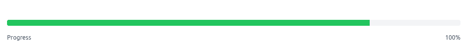
In this code snippet, a percentage label and text are positioned below the progress bar, providing a clear visual representation of the progress.
Check out the live demo in the playground.
6. Vertical progress bars
This progress bar is vertically directed. The flex-col class is used to align the elements in a column direction.
Example:
<div class="flex">
  <div class="mb-5 ml-5 flex flex-col items-center">
    <div class="h-24 w-5 overflow-hidden rounded-md bg-gray-300">
      <div class="h-full bg-yellow-800" style="height: 50%"></div>
    </div>
    <span class="mt-2 text-xs text-gray-600">50%</span>
  </div>
  <div class="mb-5 ml-5 flex flex-col items-center">
    <div class="h-24 w-10 overflow-hidden rounded-full bg-gray-300">
      <div class="h-full bg-yellow-500" style="height: 75%"></div>
    </div>
    <span class="mt-2 text-xs text-gray-600">75%</span>
  </div>
  <div class="mb-5 ml-5 flex flex-col items-center">
    <div class="h-24 w-10 overflow-hidden rounded-full bg-gray-200">
      <div class="h-full bg-gradient-to-t from-gray-200 via-blue-400 to-blue-600" style="height: 60%"></div>
    </div>
    <span class="mt-2 text-xs text-gray-600">60%</span>
  </div>
</div>
The height of the progress bar is set using the h-24 class and the fill amount is represented by adjusting the height of the inner div with the h-full class.
Check out the live demo in the playground.
7. Thermometer progress bar
This progress bar is a circular corner in shape.
Example:
<div class="relative mb-5">
  <div class="rounded-full border border-red-500 p-1">
    <div class="flex h-6 items-center justify-center rounded-full bg-red-300 text-xs leading-none" style="width: 85%; height: 85%;">
      <span class="p-1 text-white">85%</span>
    </div>
  </div>
</div>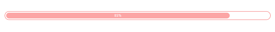
It’s a way different progress bar, which we made by applying padding as seen in the above snippet.
The outer div with the rounded-full and border classes create the circular container. The progress is filled based on the specified percentage, and the circular shape is achieved by setting the height and width using percentage values.
We can also add a circle at 50% or at any other position we want. It will represent some endpoints or goal points to easily get progress in the task.
<div class="relative my-20 mx-5">
  <div class="rounded-full border border-red-500 p-1">
    <div class="flex h-6 items-center justify-center rounded-full bg-red-300 text-xs leading-none" style="width: 85%; height: 85%;">
      <span class="p-1 text-white">85%</span>
    </div>
  </div>
  <div class="absolute inset-0 flex items-center justify-center">
    <div class="h-8 w-8 rounded-full bg-red-500"></div>
  </div>
</div>
The inner div represents the progress and is positioned using the absolute class inside the outer container.
Check out the live demo in the playground.
8. Multi-color progress bar
This progress bar is divided into multiple sections with different colors, each representing a specific percentage of the progress.
Example:
<div class="relative my-20 mx-5 pt-1">
  <div class="mb-4 flex h-2 overflow-hidden rounded bg-gray-100 text-xs">
    <div style="width: 10%" class="bg-green-500 transition-all duration-500 ease-out"></div>
    <div style="width: 25%" class="bg-yellow-500 transition-all duration-500 ease-out"></div>
    <div style="width: 20%" class="bg-red-500 transition-all duration-500 ease-out"></div>
  </div>
  <div class="mb-2 flex items-center justify-between text-xs">
    <div class="text-gray-600">Progress</div>
    <div class="text-gray-600">100%</div>
  </div>
</div>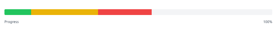
In this snippet, we have three different colors with different percentages. Which represents overall progress with sub-task progress using different colors.
Each section is defined by a separate div with the bg-green-500 class and the width is set using percentage values. The different sections can have different colors, and we can adjust the number of sections and their widths as per the requirement.
Check out the live demo in the playground.
9. Gradient progress bar
This progress bar utilizes a gradient effect to create a smooth transition of colors.
Example:
<div class="mb-5 h-4 overflow-hidden rounded-full bg-gray-200">
  <div class="h-4 animate-pulse rounded-full bg-gradient-to-r from-green-500 to-blue-500" style="width: 75%"></div>
</div>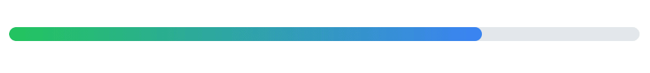
The bg-gradient-to-r class applies a gradient from left to right, starting with the color specified by from-green-500 and ending with the color specified by to-blue-500. The w-1/2 class sets the width of each gradient section to 50%, creating two equal segments.
We can also modify any style with it so it can be more interactive to show the progress of a task like this,
<div class="relative mb-5 h-5 rounded-full bg-gray-200">
  <div class="h-full animate-pulse rounded-full bg-blue-500" style="width: 75%">
    <span class="absolute inset-0 flex items-center justify-center text-xs font-semibold text-white">75%</span>
  </div>
</div>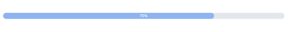
Check out the live demo in the playground.
10. Progress bar with multicolors and multi sections
This progress bar is divided into multi-color sections, each representing a specific percentage of the progress.
Example:
<div class="relative">
  <div class="mb-4 flex h-5 overflow-hidden rounded bg-gray-100 text-xs">
    <div class="flex flex-col justify-center bg-red-500 text-white" style="width: 25%;">
      <span class="text-center">25%</span>
    </div>
    <div class="flex flex-col justify-center bg-red-400 text-white" style="width: 25%;">
      <span class="text-center">25%</span>
    </div>
    <div class="flex flex-col justify-center bg-red-300 text-white" style="width: 25%;">
      <span class="text-center">25%</span>
    </div>
    <div class="flex flex-col justify-center bg-red-200 text-white" style="width: 25%;">
      <span class="text-center">25%</span>
    </div>
  </div>
  <div class="mb-2 flex items-center justify-between text-xs">
    <div class="text-gray-600">Progress</div>
    <div class="text-gray-600">100%</div>
  </div>
</div>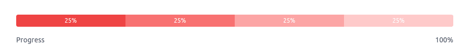
In this snippet, we have designed progress steps with different colors and progress percentages. Also, the bottom bar text represents overall progress and the inner text represents the progress of a step.
Each section is defined by a separate div with the bg-red-500 class and the width is set using percentage values. The different sections can have different colors, and we can adjust the number of sections and their widths as needed.
Check out the live demo in the playground.
These are just a few examples of the progress bars you can create using Tailwind CSS. By combining various utility classes and customizing the styles, you can create progress bars that match your design requirements.
Don’t forget to include the necessary Tailwind CSS classes and inline styles to adjust the width, color, and animation of the progress bars to your liking. With Tailwind CSS’s flexible utility classes, the possibilities are endless!
Conclusion
Throughout the blog, we explored how to create beautiful and customizable progress bars using Tailwind CSS. With its extensive set of utility classes, Tailwind CSS provides a straightforward and efficient way to style and customize progress bars to suit your design needs.
We started by creating basic rounded and slim progress bars, then added labels to the progress bars that provide additional context to users.
To add visual interest, we explored animated progress bars with striped effects. Combining classes such as animate-pulse and animate-stripes, we created dynamic and engaging progress bars.
Furthermore, we experimented with different styles, including gradient progress bars, vertical progress bars, circular progress bars, and multi-color progress bars. These variations allowed us to create visually appealing progress indicators that can be tailored to specific project requirements.
Keep progressing!
Similar articles

Whether you need...
- *High-performing mobile apps
- *Bulletproof cloud solutions
- *Custom solutions for your business.
