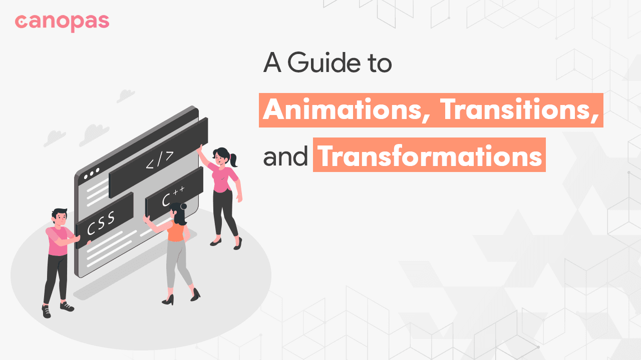
CSS Made Simple: A Guide To Animations, Transitions, And Transformations
Overview
Smooth motion, rather than static placement, is always appreciated in design, and when it comes to movements, we find solutions with animations(keyframes), transitions, or transformations. Whether you want to add subtle hover effects to buttons or create animated illustrations, the use of these three can make your website or application more intuitive, functional, and visually appealing.
Understanding the distinction between the three and knowing when to utilize it might be challenging for newcomers.
In this article, we’ll explore the power of CSS animations and how you can use them to add life to your designs with examples and best practices.
Sponsored
Animations add life to your designs, and good habits add purpose and meaning to your life. Try out Justly and start building your habits today!
Introduction
Animations, Transitions, and Transformations are powerful features that allow web designers to add movement and interactivity to their websites. By using CSS, designers can create visual effects and animations that enhance the user experience and make a website more engaging.
All three differ in their basic functionality.
- Transitions(Appearance of elements) — are used to smoothly change an element’s appearance over a specified duration, such as fading in or out, or changing the color of an element when hovering over it.
- Transformations(Shape, size, or position of elements) — are used to change the shape, size, and position of an element. You can use transformations to rotate, skew, scale, or translate an element, creating a wide range of visual effects.
- Animations(Series of movements) — are used to create dynamic effects that occur over a period of time, such as continuous zoom-in/zoom-out elements or moving them across the screen.
All three are often used together to create more complex and dynamic effects.
For instance, we want a circle that scrolls from left to right, with zoom-in and has the ability to change color when hovered over. We can use transitions to change colors seamlessly, transformation to zoom in a circle, and animation to move the circle.
Let’s see all of them by example.
Transitions
As we know, it's useful for changing the appearance of elements, like color, height, width, or opacity over time.
It requires a trigger to start. In our example, hover is a trigger to start the transition.
The basic syntax of it as,
transition: <property> <duration> <timing-function> <delay>;You can explore these properties at mdn.
Example
- transitions.html
<div class="circle"></div>
<div class="smooth-circle"></div>- transitions.css
.circle,
.smooth-circle {
  display: inline-block;
  background-color: blue;
  width: 50px;
  height: 50px;
  border-radius: 50px;
}

.circle:hover,
.smooth-circle:hover {
  background-color: red;
}

.smooth-circle {
  margin-left: 20px;
  transition: background-color 0.2s ease;
}- Output
Visit Codepen Demo for the result
In the above example, we have changed the appearance of the circle and it can be handled by transitions.
You can see the difference between hovering effects without and with transitions in the given example. You can experiment with this by changing the various properties and timing functions on the transitions.
Transformations
When you want to change the shape, size, or position of elements, you should use transformation.
The basic syntax of it as below,
transform: <css-transform-fucntions>Transform properties use CSS transform functions to adjust element visuals.
You can get more details of transformation at transforms and about function from transformation-function.
Example
- transitions.html
<div class="circle"></div>
<div class="smooth-circle"></div>- transitions.css
.circle,
.smooth-circle {
  display: flex;
  background-color: blue;
  width: 50px;
  height: 50px;
  border-radius: 50px;
}

.circle:hover,
.smooth-circle:hover {
  background-color: red;
  transform: translateX(100px);
  /** transform: skew(20deg, 20deg); **/
}

.smooth-circle {
  margin-top: 50px;
  transition: background-color 1s ease, transform 2s ease;
  /**  transition: all 2s ease; **/
}- Output
Visit Codepen Demo for the result
In the above example, we have changed the position of the circle on hover and it can be handled by transformations.
Try it out by utilizing various transformation functions to become more accustomed to transformations.
Animations(KeyFrames)
Keyframe animations allow you to define a sequence of styles that an element should follow over a set period of time. Animations start running automatically when rendering the elements.
Keyframes are created using the @keyframes rule and specifying percentages (or from and to) for each keyframe. We can use these key-frames using animation property.
Basic syntax as below,
@keyframes color-change {
  0% { background-color: red; }
  50% { background-color: purple; }
  100% { background-color: blue; }
}

.element {
  animation: color-change 2s infinite;
}
You can explore more about it from mdn.
Example
In the circle example, when 25% of the animation is completed, the circle should scale to 1, otherwise, it scaled at 0.5. Let’s see how we can scale the circle while it’s moving using keyframes.
- transitions.html
<div class="circle"></div>- transitions.css
.circle {
  background-color: blue;
  width: 50px;
  height: 50px;
  border-radius: 50px;
  transition: background-color 1s ease;
  animation: move 3s infinite;
/*  animation: move 3s 3; */
}

.circle:hover{
  background-color: red;
}

@keyframes move {
  0%, 100% { transform: translateX(100px) scale(0.5); }
  25% { transform: translateX(50px) scale(1); }
  50% { transform: translateX(0px) scale(0.5); }
}- Output
In the above example, we have implemented the full example we discussed earlier. You can try it out by adding more properties like changing background colors or opacity and time limits.
Visit Codepen Demo for the result
Best practices
When using CSS Animations and Transitions, it’s important to follow best practices to ensure they are effective and don’t negatively impact website performance. Here are some tips to keep in mind:
- Use animations and transitions sparingly: Too many animations can be distracting and slow down website performance. Use them only when necessary and in a way that enhances the user experience.
- Consider timing and duration: The timing and duration of animations and transitions are important. They should be timed in a way that feels natural and not too fast or slow.
- Use appropriate easing functions: Easing functions control the acceleration and deceleration of an animation or transition. Choose an easing function that matches the effect you’re trying to achieve.
- Use
transforminstead ofwidthorheightproperties for scaling or rotating elements, to avoid layout thrashing. - Use advanced properties for 3D rendering: Use
backface-visibilityto hide the back of an element during a 3D transformation to improve performance and avoid visual glitches. To manage the 3D rendering of transformed elements, useperspectiveandtransform-style. - Test on multiple devices and browsers: Animations and transitions can behave differently on different devices and browsers. Test your animations and transitions on multiple devices and browsers to ensure they work as intended.
- Add fallbacks: Provide fallbacks for browsers that don’t support CSS animations or transitions, to ensure a consistent experience for all users.
Conclusion
CSS animations, transitions, and transformations are powerful tools for adding visual interest and interactivity to web designs. We often get confused between these three and are unable to apply them effectively at the beginning. Hope, this article will clear your understanding of animations.
By following best practices and testing thoroughly, you can ensure animations and transitions are effective and don’t negatively impact website performance.
We implemented several animations on the canopas website and its open source. You can review it on GitHub.
We’re Grateful to have you with us on this journey!
Suggestions and feedback are more than welcome!
Please reach us at Canopas Twitter handle @canopas_eng with your content or feedback. Your input enriches our content and fuels our motivation to create more valuable and informative articles for you.
That’s it for today. Keep exploring for the best.
Related Useful Articles

Get started today
Let's build the next
big thing!
Let's improve your business's digital strategy and implement robust mobile apps to achieve your business objectives. Schedule Your Free Consultation Now.
Get Free Consultation
Get started today
Let's build the next big thing!
Let's improve your business's digital strategy and implement robust mobile apps to achieve your business objectives. Schedule Your Free Consultation Now.
Get Free Consultation