
Fancy tooltip arrows using pure CSS
Introduction
In the UI design, we often need to show limited information using images or icons. On hovering over it, we can show more information using tooltips.
This article will guide you to design different types of tooltip arrows using pure CSS. We will draw arrows on pseudo-selectors like :before and :after with the absolute position in pure CSS.
Sponsored
Let’s start designing!
Triangle
For making a triangle arrow, make the following changes on :before pseudo selector,
- Add a top border with any color and width.
- Make the left and right borders transparent with the same width as the top border.
  border-top: 15px solid <any-color>;
  border-left: 15px solid transparent;
  border-right: 15px solid transparent;
And you are done. See the full code below.
HTML
<div class="tooltip">
  This is triangle tooltip
</div>
CSS
.tooltip {
  position: absolute;
  padding: 20px 25px;
  color: #ffffff;
  background: #f2709c;
  left: 20%;
  top: 40%;
}

.tooltip:before {
  content: "";
  position: absolute;
  border-top: 15px solid #f2709c;
  border-left: 15px solid transparent;
  border-right: 15px solid transparent;
  top: 100%;
  left: 45%;
  margin-left: -5px;
  margin-top: -5px;
}

Review working example on CodePen
Right triangle
Add the following changes to :before pseudo selector,
- Add a top border with any color and width.
- Make the right border transparent with the same width as the top border.
border-top: 15px solid <any-color>;
border-right: 15px solid transparent;
See the working example below,
HTML
<div class="tooltip">
  This is cornered tooltip
</div>
CSS
.tooltip {
  position: absolute;
  padding: 20px 25px;
  color: #ffffff;
  background: #f2709c;
  left: 20%;
  top: 40%;
}

.tooltip:before {
  content: "";
  position: absolute;
  left: 0;
  top: 100%;
  border-top: 20px solid #f2709c;
  border-right: 20px solid transparent;
}
Review working example on CodePen
Curved
This is a bit complex arrow. Don’t worry, we will make it simple!
Add the below CSS in :before,
height: 40px;
width: 20px; /* half of height */
background-color: <any-color>;
border-bottom-right-radius: 20px;
And you will have,

Then add a box shadow and make the background transparent. You can see changes in your UI.Rotate it to 270deg and flip horizontally with scaleX property.
background-color: transperent;
border-bottom-right-radius: 20px;
box-shadow: 0 20px 0 0 <any-color>;
transform: rotate(270deg) scaleX(-1);
And you will have a curved arrow. See the full code in below,
HTML
<div class="tooltip">
  This is curved tooltip
</div>
CSS
.tooltip {
  position: absolute;
  padding: 20px 25px;
  color: #ffffff;
  background: #f2709c;
  border-radius: 25px;
  left: 20%;
  top: 40%;
}

.tooltip:before {
  content: "";
  position: absolute;
  bottom: -25px;
  left: 25px;
  height: 40px;
  width: 20px;
  background-color: transperent;
  border-bottom-right-radius: 20px;
  box-shadow: 0 20px 0 0 #f2709c;
  transform: rotate(270deg) scaleX(-1);
}
Review working example on CodePen
V-curved
In this, we will use both :before and :after selectors.
Add the below CSS in :before and :after ,
height: 40px;
/* half of the height */
width: 20px;
/* negative of the height */
bottom: -40px;
background-color: <any-color>;

/*
   In :before
   half of the height
*/
border-top-right-radius: 20px;
left: 30px;

/*
   In :after
   half of the height
*/
border-top-left-radius: 20px;
left: 50px;
And you will see,
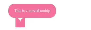
Now, the rest is simple. Add box-shadow and make the background transparent in both selectors.
background-color: transparent;
box-shadow: 0 -20px 0 0 <any-color>;
And the arrow is ready! See the code below,
HTML
<div class="tooltip">
  This is v-curved tooltip
</div>
CSS
.tooltip {
  position: absolute;
  left: 20%;
  top: 40%;
  padding: 20px 25px;
  color: #ffffff;
  background: #f2709c;
  border-radius: 25px;
}

.tooltip:before,
.tooltip:after {
  content: "";
  position: absolute;
  height: 40px;
  /* half of the height */
  width: 20px;
  /* negative of the height */
  bottom: -40px;
  background-color: transparent;
  box-shadow: 0 -20px 0 0 #f2709c;
}

.tooltip:before {
  /* half of the height */
  border-top-right-radius: 20px;
  /* as per preference */
  left: 30px;
}

.tooltip:after {
  /* half of the height */
  border-top-left-radius: 20px;
  /* as per preference */
  left: 50px;
}
Review working example on CodePen
Circled
Create a circle with any color and then add the below code in :before
 border-bottom: 40px solid <any-color>;
 border-left: 60px solid transparent;
Again it's a game of borders only. See the full code below,
HTML
<div class="tooltip"></div>CSS
.tooltip {
  position: absolute;
  padding: 15px 25px;
  left: 20%;
  top: 40%;
  width: 50px;
  height: 50px;
  background: #f2709c;
  border-radius: 50%;
}

.tooltip:before {
  content: "";
  position: absolute;
  width: 0;
  height: 0;
  bottom: 0px;
  left: -10px;
  border-bottom: 40px solid #f2709c;
  border-left: 60px solid transparent;
}

Review working example on CodePen.
Related articles

Get started today
Let's build the next
big thing!
Let's improve your business's digital strategy and implement robust mobile apps to achieve your business objectives. Schedule Your Free Consultation Now.
Get Free Consultation
Get started today
Let's build the next big thing!
Let's improve your business's digital strategy and implement robust mobile apps to achieve your business objectives. Schedule Your Free Consultation Now.
Get Free Consultation