
Master Intro Showcase Views with Jetpack Compose on Android
Introduction
This article is an implementation of an intro showcase to highlights different features of the app using Jetpack Compose. The implementation is inspired by the TapTargetView which is useful for legacy views.
The implementation is also available as a standalone library Intro-showcase-view on github which you can directly add as a gradle dependency in your project.
I have divided the implementation into byte size steps. Feel free to skip the steps that you understand or jump directly to the step you are interested in. The final implementation will look like above GIF.
Sponsored
We are what we repeatedly do. Excellence, then, is not an act, but a habit. Try out Justly and start building your habits today!
Let’s start coding!!
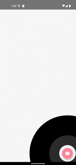
Step 1: Add a feature and draw circles on Canvas
First, let’s add an email fab button aligned to the bottom of the screen.
@Composable
fun ShowcaseExample() {
    val context = LocalContext.current
    Box {
        FloatingActionButton(
            onClick = {
                Toast.makeText(
                    context,
                    "Fab Clicked",
                    Toast.LENGTH_SHORT
                ).show()
            },
            modifier = Modifier
                .align(Alignment.BottomEnd)
                .padding(bottom = 16.dp, end = 16.dp),
            backgroundColor = ThemeColor,
            contentColor = Color.White,
            elevation = FloatingActionButtonDefaults.elevation(6.dp)
        ) {
            Icon(
                Icons.Filled.Email,
                contentDescription = "Email"
            )
        }

        IntroShowCase()
    }
}
Then, we’ll create two circles. We’ll use Canvas API to draw our circle.
@Composable
fun IntroShowCase() {
   Canvas(
    modifier = Modifier
        .fillMaxSize()
) {
    drawCircle(
        color = Color.Black
    )
    drawCircle(
        color = Color.White,
        radius = 150f
    )
}
}
Pretty Simple…
But, that’s not what we want.
Step 2: Find LayoutCoordinates of a fab button and recenter circle.
We have to set a circle offset to highlight our Fab button. And for that, we need a position of our fab button. We’ll use OnGloballyPositionedModifier property of Modifier we’ll have view’s LayoutCoordinates in a callback.
A modifier whose
onGloballyPositionedis called with the final LayoutCoordinates of the Layout when the global position of the content may have changed. Note that it will be called after a composition when the coordinates are finalized.
Let’s modify the modifier of fab button to get its coordinates.
@Composable
fun showcaseExample() {

    var target by remember {
        mutableStateOf<LayoutCoordinates?>(null)
    }
    val context = LocalContext.current

    Box {
        FloatingActionButton(
            ....
            modifier = Modifier
                .align(Alignment.BottomEnd)
                .onGloballyPositioned { coordinates ->
                    target = coordinates
                }
                ....
        ) {
            ....
        }

        target?.let {
            IntroShowCase(it)
        }
    }
}
Now let’s use this coordinate to recenter our circle. Here’s how,
@Composable
fun IntroShowCase(targetCords: LayoutCoordinates) {
val targetRect = targetCords.boundsInRoot()
Canvas(
modifier = Modifier
.fillMaxSize()
) {
drawCircle(
color = Color.Black,
center = targetRect.center
)
drawCircle(
color = Color.White,
radius = 150f,
center = targetRect.center
)
}
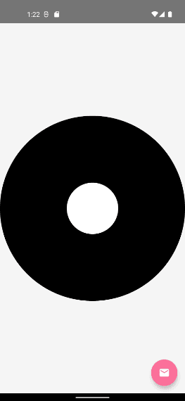
}We have used our target view Rect’s center offset to center our circle.
Oops!!, Where’s our fab button?. Our fab button is overlapped by circles.
Step 3: Blend the overlapped circle to set transparency
We have to set transparency where both circles are overlapped. We’ll use BlendMode to fix this and also let’s fix the radius of the inner circle based on our target view dimension.
BlendMode.Clear : Drop both the source and destination images, leaving nothing.
@Composable
fun IntroShowCase(targetCords: LayoutCoordinates) {
    val targetRect = targetCords.boundsInRoot()
   val targetRadius = targetRect.maxDimension / 2f + 40f
              // 40f extra traget spacing

    Canvas(
        modifier = Modifier
            .fillMaxSize().graphicsLayer (alpha = 0.99f)
    ) {
        drawCircle(
            color = Color.Black,
            center = targetRect.center
        )
        drawCircle(
            color = Color.White,
            radius = targetRadius,
            center = targetRect.center,
            blendMode = BlendMode.Clear
        )
    }
}
Perfect!! Isn’t it?
Step: 4 Add circle reveals animation to highlight target
Now, Let’s add an animation around our target view
val animationSpec = infiniteRepeatable<Float>(
    animation = tween(2000, easing = FastOutLinearInEasing),
    repeatMode = RepeatMode.Restart,
)
val animatables = listOf(
    remember { Animatable(0f) },
    remember { Animatable(0f) }
)

animatables.forEachIndexed { index, animatable ->
    LaunchedEffect(animatable) {
        delay(index * 1000L)
        animatable.animateTo(
            targetValue = 1f, animationSpec = animationSpec
        )
    }
}

val dys = animatables.map { it.value }
Canvas(
    ...
) {
    ...

    dys.forEach { dy ->
        drawCircle(
            color = Color.White,
            radius = targetRect.maxDimension * dy * 2f,
            center = targetRect.center,
            alpha = 1 - dy
        )
    }
   ...
}
Let’s try to understand this, We have used infiniteRepeatable , as we want our animation to run infinitely.
animatables is the array of Animatable, We have set up the initial delay for the second wave, We can not use delayMillis as that is considered for repeat animation as well. We just want to delay the initial animation, and then continue the loop without any delay.
we created an animation that will animate between 0 to 1 infinitely. Based on that, we have set up a radius and animated alpha between 1 to 0, which will make waves disappear at the end of an animation.
Let’s see what it look likes,
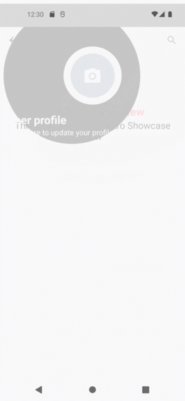
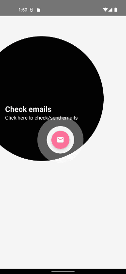
Step 5: Add texts to describe the feature
Let’s create a data class that holds the value of our targets coordinates, title, subtitle, colors, etc.
data class ShowcaseProperty(
    val index: Int,
    val coordinates: LayoutCoordinates,
    val title: String, val subTitle: String,
    val titleColor: Color = Color.White,
    val subTitleColor: Color = Color.White,
)
Okay, for now, let’s ignore index field, we’ll use it later to manage the order of when we have multiple features. Let’s refactor our composable a bit.
@Composable
fun IntroShowCase(target: ShowcaseProperty) {
    val targetRect = target.coordinates.boundsInRoot()
    val targetRadius = targetRect.maxDimension / 2f + 40f

    val animationSpec = infiniteRepeatable<Float>(
        animation = tween(2000, easing = FastOutLinearInEasing),
        repeatMode = RepeatMode.Restart,
    )
    val animatables = listOf(
        remember { Animatable(0f) },
        remember { Animatable(0f) }
    )

    animatables.forEachIndexed { index, animatable ->
        LaunchedEffect(animatable) {
            delay(index * 1000L)
            animatable.animateTo(
                targetValue = 1f, animationSpec = animationSpec
            )
        }
    }

    val dys = animatables.map { it.value }

    Box {

        Canvas(
            modifier = Modifier
                .fillMaxSize()
                .graphicsLayer(alpha = 0.99f)
        ) {
            drawCircle(
                color = Color.Black,
                center = targetRect.center
            )

            dys.forEach { dy ->
                drawCircle(
                    color = Color.White,
                    radius = targetRect.maxDimension * dy * 2f,
                    center = targetRect.center,
                    alpha = 1 - dy
                )
            }

            drawCircle(
                color = Color.White,
                radius = targetRadius,
                center = targetRect.center,
                blendMode = BlendMode.Clear
            )
        }

        ShowCaseText(
            currentTarget = target
        )
    }
}
@Composable
private fun ShowCaseText(
    currentTarget: ShowcaseProperty,
) {

    Column(modifier = Modifier
        .padding(16.dp)
    )
    {
        Text(
            text = currentTarget.title,
            fontSize = 24.sp,
            color = currentTarget.subTitleColor,
            fontWeight = FontWeight.Bold
        )
        Text(text = currentTarget.subTitle, fontSize = 16.sp, color = currentTarget.subTitleColor)
    }
}
We just have added two Text for title and subtitle, let’s see the output.
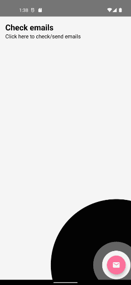
But that’s not even near to our circles.
Step 6: Set offset of Texts
Here we need to check the top and bottom space to set up our text in free space. So we’re going to do it in onGloballyPositioned we’ll calculate the Y offset of our Text, based on total text height and the center of our target. Here’s how.
@Composable
fun IntroShowCaseEx(target: ShowcaseProperty){
    ....
     val targetRect = target.coordinates.boundsInRoot()
     val targetRadius = targetRect.maxDimension / 2f + 40f
     Box {
          ShowCaseText(target, targetRect, targetRadius)
     }
     ....
}

@Composable
private fun ShowCaseText(
    currentTarget: ShowcaseProperty,
    targetRect: Rect,
    targetRadius: Float
) {

    var txtOffsetY by remember {
        mutableStateOf(0f)
    }

    Column(modifier = Modifier
        .offset(y = with(LocalDensity.current) {
            txtOffsetY.toDp()
        })
        .onGloballyPositioned {
            val textHeight = it.size.height

            val possibleTop =
                targetRect.center.y - targetRadius - textHeight

            txtOffsetY = if (possibleTop > 0) {
                possibleTop
            } else {
                targetRect.center.y + targetRadius
            }
        }
        .padding(16.dp)
    )
    {
        Text(
            text = currentTarget.title,
            fontSize = 24.sp,
            color = currentTarget.subTitleColor,
            fontWeight = FontWeight.Bold
        )
        Text(text = currentTarget.subTitle, fontSize = 16.sp, color = currentTarget.subTitleColor)
    }

}
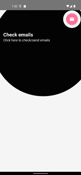
And here’s the result.
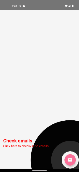
But, the Text is not in the radius of our circle.
Step 7: Calculate outer circle radius
We have to estimate the rectangle which includes our text, and our target view including its spacing.
fun getOuterRadius(textRect: Rect, targetRect: Rect): Float {

    val topLeftX = min(textRect.topLeft.x, targetRect.topLeft.x)
    val topLeftY = min(textRect.topLeft.y, targetRect.topLeft.y)
    val bottomRightX = max(textRect.bottomRight.x, targetRect.bottomRight.x)
    val bottomRightY = max(textRect.bottomRight.y, targetRect.bottomRight.y)

    val expandedBounds = Rect(topLeftX, topLeftY, bottomRightX, bottomRightY)

    val d = sqrt(
        expandedBounds.height.toDouble().pow(2.0)
                + expandedBounds.width.toDouble().pow(2.0)
    ).toFloat()

    return (d / 2f)
}
Okay, we just have found the rectangle of our content, and from that, we got the radius.
var textCoordinate: LayoutCoordinates? by remember {
mutableStateOf(null)
}
var outerRadius by remember {
mutableStateOf(0f)
}
textCoordinate?.let { textCoords ->
val textRect = textCoords.boundsInRoot()
outerRadius = getOuterRadius(textRect, targetRect) + targetRadius
}
Box {
Canvas(
modifier = Modifier
.fillMaxSize()
.graphicsLayer(alpha = 0.99f)
) {
drawCircle(
color = Color.Black,
center = targetRect.center,
radius = outerRadius,
alpha = 0.9f
)
dys.forEach { dy ->
drawCircle(
color = Color.White,
radius = targetRect.maxDimension * dy * 2f,
center = targetRect.center,
alpha = 1 - dy
)
}
drawCircle(
color = Color.White,
radius = targetRadius,
center = targetRect.center,
blendMode = BlendMode.Clear
)
}
ShowCaseText(
currentTarget = target,
targetRect = targetRect,
targetRadius = targetRadius
) {
textCoordinate = it
}
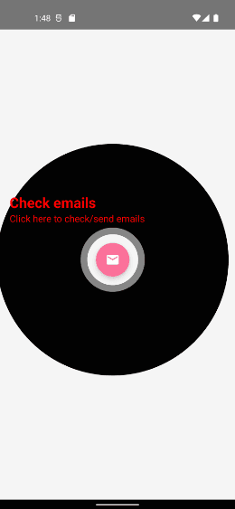
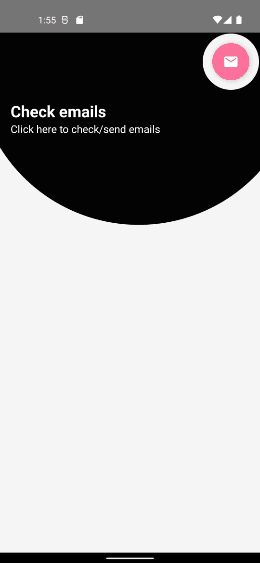
}Let’s see the result.
Step 8: change the offset of our outer circle
Now, let’s find the center offset of the outer circle which includes our target and texts.
var outerOffset by remember {
    mutableStateOf(Offset(0f, 0f))
}
textCoordinate?.let { textCoords ->
    val textRect = textCoords.boundsInRoot()
    val textHeight = textCoords.size.height

    outerOffset = getOuterCircleCenter(
        targetRect, textRect, targetRadius, textHeight
    )

    outerRadius = getOuterRadius(textRect, targetRect) + targetRadius
}
Box {
    Canvas(
        modifier = Modifier
            .fillMaxSize()
            .graphicsLayer(alpha = 0.99f)
    ) {
        drawCircle(
            color = Color.Black,
            center = outerOffset,
            radius = outerRadius,
            alpha = 0.9f
        )

        dys.forEach { dy ->
            drawCircle(
                color = Color.White,
                radius = targetRect.maxDimension * dy * 2f,
                center = targetRect.center,
                alpha = 1 - dy
            )
        }

        drawCircle(
            color = Color.White,
            radius = targetRadius,
            center = targetRect.center,
            blendMode = BlendMode.Clear
        )
    }

    ShowCaseText(
        currentTarget = target,
        targetRect = targetRect,
        targetRadius = targetRadius
    ) {
        textCoordinate = it
    }
}
fun getOuterCircleCenter(
    targetBound: Rect,
    textBound: Rect,
    targetRadius: Float,
    textHeight: Int,
): Offset {
    var outerCenterX: Float
    var outerCenterY: Float

    val onTop =
        targetBound.center.y - targetRadius - textHeight > 0

    val left = min(
        textBound.left,
        targetBound.left - targetRadius
    )
    val right = max(
        textBound.right,
        targetBound.right + targetRadius
    )

    val centerY =
        if (onTop) targetBound.center.y - targetRadius - textHeight
        else targetBound.center.y + targetRadius + textHeight

    outerCenterY = centerY
    outerCenterX = (left + right) / 2

    return Offset(outerCenterX, outerCenterY)
}
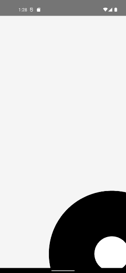
Looks cool!!
But what if our target is in a toolbar or bottom bar? Let’s see by changing the alignment of our fab button to TopEnd .
Not so perfect!!.
Step 9: Fix the outer circle center point for the Top and Bottom bar.
We have to recheck our center point of an outer circle when our target is in the toolbar or at the bottom of the screen.
Here’s how
val topArea = 88.dp
val screenHeight = LocalConfiguration.current.screenHeightDp
val yOffset = with(LocalDensity.current) {
    target.coordinates.positionInRoot().y.toDp()
}
var outerOffset by remember {
    mutableStateOf(Offset(0f, 0f))
}
textCoordinate?.let { textCoords ->
    val textRect = textCoords.boundsInRoot()
    val textHeight = textCoords.size.height
    val isInGutter = topArea > yOffset || yOffset > screenHeight.dp.minus(topArea)

    outerOffset = getOuterCircleCenter(
        targetRect, textRect, targetRadius, textHeight, isInGutter
    )

    outerRadius = getOuterRadius(textRect, targetRect) + targetRadius
}
....
fun getOuterCircleCenter(
    targetBound: Rect,
    textBound: Rect,
    targetRadius: Float,
    textHeight: Int,
    isInGutter: Boolean,
): Offset {
    var outerCenterX: Float
    var outerCenterY: Float

    val onTop =
        targetBound.center.y - targetRadius - textHeight > 0

    val left = min(
        textBound.left,
        targetBound.left - targetRadius
    )
    val right = max(
        textBound.right,
        targetBound.right + targetRadius
    )

    val centerY =
        if (onTop) targetBound.center.y - targetRadius - textHeight
        else targetBound.center.y + targetRadius + textHeight

    outerCenterY = centerY
    outerCenterX = (left + right) / 2

    if (isInGutter) {
        outerCenterY = targetBound.center.y
    }

    return Offset(outerCenterX, outerCenterY)
}
If our target is in Gutter we just set targetBound.center.y to outerCenterY and our outerCenterX would be the same as the center X of our content rectangle in both cases.
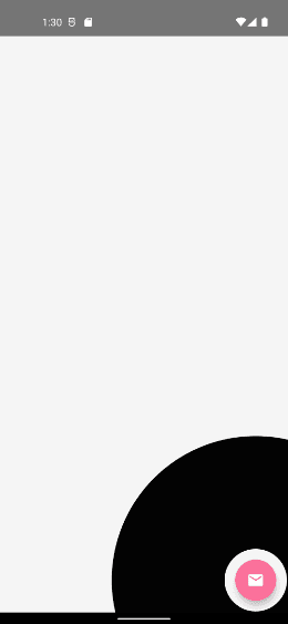
Let’s check the output now.
Perfect!!
And last but not least…
Step 10: Add circle reveals animation to our outer circle.
val outerAnimatable = remember { Animatable(0.6f) }

LaunchedEffect(target) {
    outerAnimatable.snapTo(0.6f)

    outerAnimatable.animateTo(
        targetValue = 1f,
        animationSpec = tween(
            durationMillis = 500,
            easing = FastOutSlowInEasing,
        ),
    )
}
We have created Animatable with initial value 0.6 as we don’t want our circle to scale from 0.0. If you notice, we have used target here as a key of LaunchedEffect , this will only trigger the inner block when a key changes. Whenever key changes we have reset the current value to the initial value 0.6f using snapTo. Let’s use Animatable value with our outer circle radius.
Box {
    Canvas(
        modifier = Modifier
            .fillMaxSize()
            .graphicsLayer(alpha = 0.99f)
    ) {
        drawCircle(
            color = Color.Black,
            center = outerOffset,
            radius = outerRadius * outerAnimatable.value,
            alpha = 0.9f
        )
     }
}
Okay, here’s the result
That’s it!!
Now let’s integrate it with multiple feature showcases. We’re not going to cover all the basic details.onGloballyPositioned may call multiple times so we’ll use an mutableStateMapOf of ShowcaseProperty to avoid duplications.
@Composable
fun ShowcaseSample() {
val targets = remember {
mutableStateMapOf<String, ShowcaseProperty>()
}
Box {
FloatingActionButton(
onClick = {},
modifier = Modifier
.padding(16.dp)
.align(Alignment.BottomEnd)
.onGloballyPositioned { coordinates ->
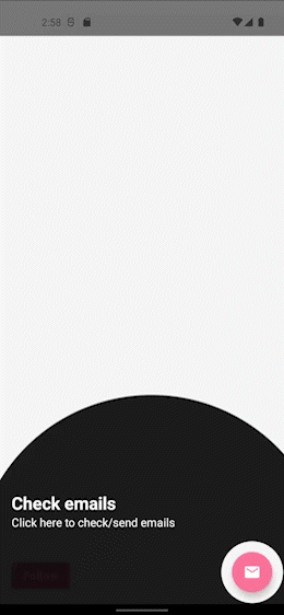
targets["email"] = ShowcaseProperty(
1, coordinates,
"Check emails", "Click here to check/send emails"
)
},
backgroundColor = ThemeColor,
contentColor = Color.White,
elevation = FloatingActionButtonDefaults.elevation(6.dp)
) {
Icon(
Icons.Filled.Email,
contentDescription = "Email"
)
}
Button(
onClick = {},
modifier = Modifier
.align(Alignment.BottomStart)
.padding(start = 16.dp, bottom = 16.dp)
.onGloballyPositioned { coordinates ->
targets["follow"] = ShowcaseProperty(
2, coordinates,
"Follow me", "Click here to follow"
)
}
) {
Text(text = "Follow")
}
IntroShowCase(targets)
}
}And Here’s our Intro showcase view
@Composable
fun IntroShowCase(
    targets: SnapshotStateMap<String, ShowcaseProperty>,
    backgroundColor: Color = Color.Black,
    onShowcaseCompleted: () -> Unit
) {
    val uniqueTargets = targets.values.sortedBy { it.index }
    var currentTargetIndex by remember { mutableStateOf(0) }

    val currentTarget =
        if (uniqueTargets.isNotEmpty() && currentTargetIndex < uniqueTargets.size) uniqueTargets[currentTargetIndex] else null


    currentTarget?.let {
        TargetContent(it, backgroundColor) {
            if (++currentTargetIndex >= uniqueTargets.size) {
                onShowcaseCompleted()
            }
        }
    }
}
Conclusion
Pretty simple!!
Similarly, you can add rest of the views as aShowcaseProperty to make it look like the video shown at the beginning of the article. Full source code is available here.
As I mentioned earlier, the implementation is also available as a library, which you can integrate easily. Feel free to use it in your app and if you want to customize it you’re free to fork.
Thanks for your support!
Keep showcasing!! 👐
Related Similar Articles

Get started today
Let's build the next
big thing!
Let's improve your business's digital strategy and implement robust mobile apps to achieve your business objectives. Schedule Your Free Consultation Now.
Get Free Consultation
Get started today
Let's build the next big thing!
Let's improve your business's digital strategy and implement robust mobile apps to achieve your business objectives. Schedule Your Free Consultation Now.
Get Free Consultation