
Jetpack compose — How to implement Custom Pager Indicators
Background
Pager indicators are vital in guiding users through multiple screens or pages in an app. While Jetpack Compose offers a wide range of built-in components, customizing pager indicators to match your app's unique style and branding can elevate the user experience.
In this blog post, we will explore how to create and implement custom pager indicators in Jetpack Compose, allowing you to add a touch of uniqueness to your app’s navigation.
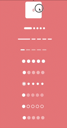
What we’ll implement in this blog?
Sponsored
We are what we repeatedly do. Excellence, then, is not an act, but a habit. Try out Justly and start building your habits today!
Let’s get started…
I have implemented most of the indicators using the Canvas API. Additionally, to demonstrate alternative approaches, I have also implemented a few using built-in composable like Box.
Additionally, we’ll highlight the flexibility of pager indicators and showcase how they can be implemented using a unified logic.
Let’s go through the calculation of common values used in all indicators.
// To get scroll offset
val PagerState.pageOffset: Float
    get() = this.currentPage + this.currentPageOffsetFraction


// To get scrolled offset from snap position
fun PagerState.calculateCurrentOffsetForPage(page: Int): Float {
    return (currentPage - page) + currentPageOffsetFraction
}
and here’s a typical extension function to draw indicators on canvas
private fun DrawScope.drawIndicator(
    x: Float,
    y: Float,
    width: Float,
    height: Float,
    radius: CornerRadius
) {
    val rect = RoundRect(
        x,
        y - height / 2,
        x + width,
        y + height / 2,
        radius
    )
    val path = Path().apply { addRoundRect(rect) }
    drawPath(path = path, color = Color.White)
}
Let’s start implementing cool indicators.
Expanding Line/Dot indicators
To achieve expand/collapse effect, we just need to animate the indicator width based on the page offset.
 Canvas(modifier = Modifier.width(width = totalWidth)) {
        val spacing = circleSpacing.toPx()
        val dotWidth = width.toPx()
        val dotHeight = height.toPx()

        val activeDotWidth = activeLineWidth.toPx()
        var x = 0f
        val y = center.y

        repeat(count) { i ->
            val posOffset = pagerState.pageOffset
            val dotOffset = posOffset % 1
            val current = posOffset.toInt()

            val factor = (dotOffset * (activeDotWidth - dotWidth))

            val calculatedWidth = when {
                i == current -> activeDotWidth - factor
                i - 1 == current || (i == 0 && posOffset > count - 1) -> dotWidth + factor
                else -> dotWidth
            }

            drawIndicator(x, y, calculatedWidth, dotHeight, radius)
            x += calculatedWidth + spacing
        }
}- The variable
xis initialized to 0, representing the starting x-coordinate for drawing the indicators. - The
yvariable is assigned the y-coordinate for drawing the indicators, which is calculated as the center y-coordinate of the canvas. posOffsetrepresents the fractional page offset obtained frompagerState.pageOffset.dotOffsetis calculated as the decimal part ofposOffsetusing the modulo operator% 1.currentis assigned the integer part ofposOffset.- The
factordetermines the adjustment to the indicator's width based on the current position within the page. - In the end,
xis updated to calculate the start position of the following indicator.
And here’s the result.

Sliding Indicators
For this indicator, we’ll use Box Composables. We just need to move the line/dot horizontally as the page changes.
@OptIn(ExperimentalFoundationApi::class)
private fun Modifier.slidingLineTransition(pagerState: PagerState, distance: Float) =
    graphicsLayer {
        val scrollPosition = pagerState.currentPage + pagerState.currentPageOffsetFraction
        translationX = scrollPosition * distance
}distance— the width of the indicator + the spacing
    Box(
        contentAlignment = Alignment.CenterStart
    ) {
        Row(
            horizontalArrangement = Arrangement.spacedBy(spacing),
            verticalAlignment = Alignment.CenterVertically,
        ) {
            repeat(count) {
                Box(
                    modifier = Modifier
                        .size(width = dotWidth, height = dotHeight)
                        .background(
                            color = inactiveColor,
                            shape = RoundedCornerShape(3.dp)
                        )
                )
            }
        }

        Box(
            Modifier
                .slidingLineTransition(pagerState, distance)
                .size(width = dotWidth, height = dotHeight)
                .background(
                    color = activeColor,
                    shape = RoundedCornerShape(3.dp),
                )
        )
    }
let’s see the result.

Worm Dot indicator
For this indicator too, we’ll use Box Composables. We just need to change the width of the current indicator to have a worm-like effect. Let’s create a modifier for it.
@OptIn(ExperimentalFoundationApi::class)
private fun Modifier.wormTransition(
    pagerState: PagerState
) =
    drawBehind {
        val distance = size.width + 10.dp.roundToPx()
        val scrollPosition = pagerState.currentPage + pagerState.currentPageOffsetFraction
        val wormOffset = (scrollPosition % 1) * 2

        val xPos = scrollPosition.toInt() * distance
        val head = xPos + distance * 0f.coerceAtLeast(wormOffset - 1)
        val tail = xPos + size.width + 1f.coerceAtMost(wormOffset) * distance

        val worm = RoundRect(
            head, 0f, tail, size.height,
            CornerRadius(50f)
        )

        val path = Path().apply { addRoundRect(worm) }
        drawPath(path = path, color = Color.White)
    }
Here we have calculated the value of left and right position of indicators and draw the path in drawBehind modifier.
@OptIn(ExperimentalFoundationApi::class)
@Composable
fun WormIndicator(
    count: Int,
    pagerState: PagerState,
    modifier: Modifier = Modifier,
    spacing: Dp = 10.dp,
) {

    Box(
        modifier = modifier,
        contentAlignment = Alignment.CenterStart
    ) {
        Row(
            horizontalArrangement = Arrangement.spacedBy(spacing),
            modifier = modifier
                .height(48.dp),
            verticalAlignment = Alignment.CenterVertically,
        ) {
            repeat(count) {
                Box(
                    modifier = Modifier
                        .size(20.dp)
                        .background(
                            color = Color.White,
                            shape = CircleShape
                        )
                )
            }
        }

        Box(
            Modifier
                .wormTransition(pagerState)
                .size(20.dp)
        )
    }
}
And the result is… 🤩

Jumping Dot Indicator
This indicator implementation is quite similar to the above one.
Here we’ll use graphicsLayer Modifier and change the X position and scaling of the indicator to have an effect something like this…

Let’s see the jumpingDotTransition
@OptIn(ExperimentalFoundationApi::class)
private fun Modifier.jumpingDotTransition(pagerState: PagerState, jumpScale: Float) =
    graphicsLayer {
        val pageOffset = pagerState.currentPageOffsetFraction
        val scrollPosition = pagerState.currentPage + pageOffset
        translationX = scrollPosition * (size.width + 8.dp.roundToPx()) // 8.dp - spacing between dots

        val scale: Float
        val targetScale = jumpScale - 1f

        scale = if (pageOffset.absoluteValue < .5) {
            1.0f + (pageOffset.absoluteValue * 2) * targetScale;
        } else {
            jumpScale + ((1 - (pageOffset.absoluteValue * 2)) * targetScale);
        }

        scaleX = scale
        scaleY = scale
    }
Here, we calculate the current page offset (pageOffset) and add it to the current page index (currentPage) of the pagerState. This provides the precise scroll position of the pager.
We then assign this value multiplied by the size of the dot indicator (size.width) plus an additional 8 dp (spacing between dots) to the translationX property of the graphics layer. This translation creates the horizontal movement of the dot indicator as the pager scrolls.
We then use an if-else condition to calculate the scale based on the pageOffset. If the absolute value of pageOffset is less than 0.5 (indicating the dot is in the center of the screen), we interpolate the scale linearly from 1.0f to targetScale. On the other hand, if the absolute value of pageOffset is greater than or equal to 0.5, we reverse the interpolation to create a smooth transition back to the original size of the dot.
Use this modifier as we used wormTransition in the previous indicator example.
Box(
   Modifier
      .jumpingDotTransition(pagerState, 0.8f)
      .size(20.dp)
      .background(
         color = activeColor,
         shape = CircleShape,
      )
)
Bouncing Dot Indicator
This indicator is quite similar to the above indicator. We’ll use the same logic of scaling and translating the x value. Additionally, We’ll change the Y position to give a bounce effect. Let’s see how.
private fun Modifier.bounceDotTransition(
    pagerState: PagerState,
    jumpOffset: Float,
    jumpScale: Float
) =
    graphicsLayer {
        val targetScale = jumpScale - 1f
        val distance = size.width + 8.dp.roundToPx()
        val pageOffset = pagerState.currentPageOffsetFraction
        val scrollPosition = pagerState.currentPage + pageOffset
        val current = scrollPosition.toInt()
        val settledPage = pagerState.settledPage

        translationX = scrollPosition * distance

        val scale = if (pageOffset.absoluteValue < .5) {
            1.0f + (pageOffset.absoluteValue * 2) * targetScale;
        } else {
            jumpScale + ((1 - (pageOffset.absoluteValue * 2)) * targetScale);
        }

        scaleX = scale
        scaleY = scale

        val factor = (pageOffset.absoluteValue * Math.PI)
        val y =
            if (current >= settledPage) -sin(factor) * jumpOffset else sin(factor) * distance / 2
        translationY += y.toFloat()
    }
We calculate a factor by multiplying the absolute value of pageOffset with Math.PI. This factor controls the vertical movement of the dot during the bouncing motion.
Based on the relationship between the current and settledPage, we determine the direction of the bounce. If current is greater than or equal to settledPage, we calculate a negative y value using the sine function multiplied by jumpOffset. Otherwise, we calculate a positive y value using the sine function multiplied by half of the distance. This creates a bouncing effect in the opposite direction when the pager is scrolling back to a previous page.
Use this modifier as we used in the previous indicator to have an effect like this.

Swapping Dot Indicator
Here we’ve used Canvas composable to draw the dot indicators. The width of the canvas is calculated based on the total number of indicators and their combined width and spacing.
@OptIn(ExperimentalFoundationApi::class)
@Composable
fun SwapDotIndicators(
    count: Int,
    pagerState: PagerState,
) {
    val circleSpacing = 8.dp
    val circleSize = 20.dp

    Box(
        modifier = Modifier
            .fillMaxWidth()
            .height(48.dp), contentAlignment = Alignment.Center
    ) {
        val width = (circleSize + circleSpacing) * count

        Canvas(
            modifier = Modifier
                .width(width = width)
        ) {
            val distance = (circleSize + circleSpacing).toPx()

            val dotSize = circleSize.toPx()

            val yPos = center.y

            repeat(count) { i ->
                val posOffset = pagerState.currentPage + pagerState.currentPageOffsetFraction

                val dotOffset = posOffset - posOffset.toInt()
                val current = posOffset.toInt()
                val alpha = if (i == current) 1f else 0.4f

                val moveX: Float = when {
                    i == current -> posOffset
                    i - 1 == current -> i - dotOffset
                    else -> i.toFloat()
                }

                drawIndicator(moveX * distance, yPos, dotSize, alpha)
            }
        }
    }
}
Within the Canvas scope,
posOffsetrepresents the current page position with a fractional offset.dotOffsetcaptures the fractional part ofposOffsetrepresenting the offset within the current page.currentis the integer part ofposOffsetrepresenting the current page index.moveXdetermines the horizontal position of the dot indicator. It is calculated differently based on the relationship betweeniandcurrent. Ifiis equal tocurrent, it usesposOffsetas the position. Ifi - 1is equal tocurrent, it usesi - dotOffsetas the position. Otherwise, it usesias the position.
Let’s see the output

Revealing Dot Indicator
We’ll see two different effect’s here.
Effect #1
This effect renders dot indicators that reveal and scale based on the pager state.
@OptIn(ExperimentalFoundationApi::class)
@Composable
fun RevealDotIndicator1(
    count: Int,
    pagerState: PagerState,
    activeColor: Color = Color.White,
) {
    val circleSpacing = 8.dp
    val circleSize = 20.dp
    val innerCircle = 14.dp

    Box(
        modifier = Modifier
            .fillMaxWidth()
            .height(48.dp), contentAlignment = Alignment.Center
    ) {
        val width = (circleSize * count) + (circleSpacing * (count - 1))

        Canvas(modifier = Modifier.width(width = width)) {
            val distance = (circleSize + circleSpacing).toPx()
            val centerY = size.height / 2
            val startX = circleSpacing.toPx()

            repeat(count) {
                val pageOffset = pagerState.calculateCurrentOffsetForPage(it)

                val scale = 0.2f.coerceAtLeast(1 - pageOffset.absoluteValue)
                val outlineStroke = Stroke(2.dp.toPx())

                val x = startX + (it * distance)
                val circleCenter = Offset(x, centerY)
                val innerRadius = innerCircle.toPx() / 2
                val radius = (circleSize.toPx() * scale) / 2

                drawCircle(
                    color = activeColor,
                    style = outlineStroke,
                    center = circleCenter,
                    radius = radius
                )

                drawCircle(
                    color = activeColor,
                    center = circleCenter,
                    radius = innerRadius
                )
            }
        }
    }
}
The scale variable determines the scale of the dot indicator based on the absolute value of pageOffset and the radius represents the scaled radius of the dot indicator based on the circleSize and scale . This creates a scaling effect where the dot gradually grows and reveals as the pager state changes like this.

Effect #2
In the above effect, we draw a circle with Stroke style, by making simple modifications in effect #1 we’ll have another effect.
@OptIn(ExperimentalFoundationApi::class)
@Composable
fun RevealDotIndicator2(
    count: Int,
    pagerState: PagerState,
) {
    val circleSpacing = 8.dp
    val circleSize = 20.dp
    val innerCircle = 14.dp

    Box(
        modifier = Modifier
            .fillMaxWidth()
            .height(48.dp), contentAlignment = Alignment.Center
    ) {
        Canvas(modifier = Modifier) {
            val distance = (circleSize + circleSpacing).toPx()

            val centerX = size.width / 2
            val centerY = size.height / 2

            val totalWidth = distance * count
            val startX = centerX - (totalWidth / 2) + (circleSize / 2).toPx()

            repeat(count) {
                val pageOffset = pagerState.calculateCurrentOffsetForPage(it)

                val alpha = 0.8f.coerceAtLeast(1 - pageOffset.absoluteValue)
                val scale = 1f.coerceAtMost(pageOffset.absoluteValue)

                val x = startX + (it * distance)
                val circleCenter = Offset(x, centerY)
                val radius = circleSize.toPx() / 2
                val innerRadius = (innerCircle.toPx() * scale) / 2

                drawCircle(
                    color = Color.White, center = circleCenter,
                    radius = radius, alpha = alpha,
                )

                drawCircle(color = Color(0xFFE77F82), center = circleCenter, radius = innerRadius)
            }
        }
    }
}
And the result…

Conclusion
I hope this blog post has given you valuable insights and inspiration to experiment with custom pager indicators in your Jetpack Compose projects.
Now, it’s time to take your app’s navigation to the next level and leave a lasting impression on your users.
Happy coding!
Related Articles


Whether you need...
- *High-performing mobile apps
- *Bulletproof cloud solutions
- *Custom solutions for your business.
