How to Use Responsive Images to Speed Up Apps — Android Glide
Introduction
Loading images efficiently is very important, on every platform, be it android, iOS or the Web. It makes apps/websites faster and also saves users' internet bandwidth.
Today, we will answer these 4 questions —
- What is responsive image loading?
- Why is it important?
- Various approaches to providing responsive images
- How to implement it with the android Glide library
Sponsored
We are what we repeatedly do. Excellence, then, is not an act, but a habit. Try out Justly and start building your habits today!
Let’s begin!
1. What is responsive image loading?
Responsive loading is the term where a client fetches exact or nearby resolution images that is required from the server.
Device resolution varies from device to device and to support high-quality images, most of the time we keep the multiple resolution images on the server.
With responsive images, instead of a server pushing for an exact resolution, the client chooses what it wants to use based on its own use cases.
2. Why is it important?
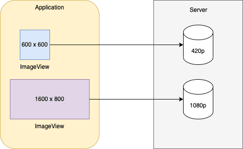
Loading 4k images on a 1080p device is very inefficient.
Not only you will end up making your apps slower, but you will also waste user’s internet bandwidth. Also, loading higher resolution images will slow down your app as GPU will have to render useless pixels.
It’s better to use different images based on device resolution. Clients can also load different resolution images based on the ImageView size.
i.e Image container can be a small thumbnail or full screen image and loading the same size image for both use case does not make sense.
Now you have a basic idea of what is responsive images and their importance.
Let’s explore the ways to implement it on servers.
3. Various approaches to providing responsive images
We will discuss 2 general ways.
- Servers provide available image sizes
- Servers allow dynamic image sizes
Let’s start with the first one.
1. Servers provide available image sizes
With this approach, server provides exact list of the available image sizes.
For example, you are developing a facebook app and you need to show feeds on home screen. You make an API call and you will receive following response from the server.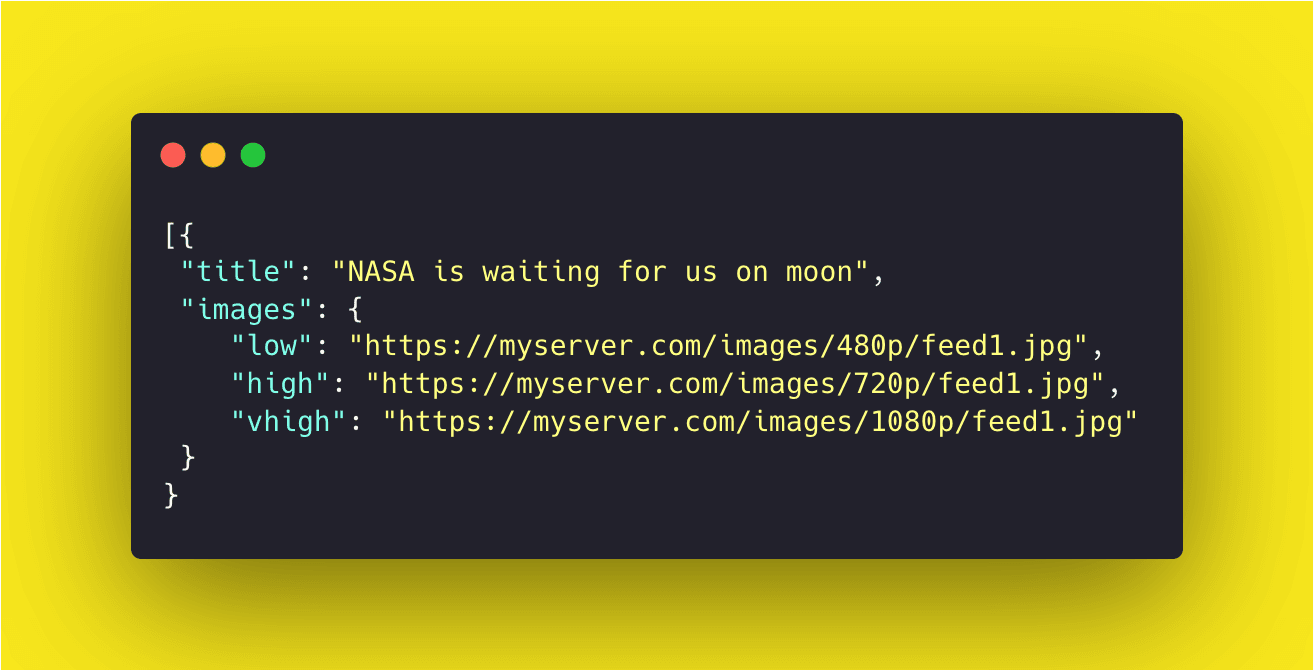
As you can see, server provides low , high and vhigh images and client chooses the right one based on the use case.
However, this approach has a few drawbacks
- Clients need to know in advance which exact resolutions are available and need to update code whenever it changes
- Increases API response size as every image size has its own url. List can grow significantly if server supports more image sizes.
A better approach would be to provide available image sizes in a single URL.
Google I/O open source app suggests something like this
myserver.com/images/__w-200-400-600-800-1000__/session1.jpgThis single URL consists of all the supported resolutions for the images.
By default, this URL will serve the full size image. To get the image restricted to width 200px, replace __w-...__ by "w200":
myserver.com/images/w200/session1.jpgAnd for 400px of width:
myserver.com/images/w400/session1.jpgToo easy right? Yes, indeed.
We will later see how Glide can be configured to load responsive images with just a few lines of code!
2. Servers support dynamic image size
With this approach, servers don’t store different sizes of images. Instead, they generate required image size upon request and serve it.
By default, the URL will provide full-size image. However, you can add query parameters to fetch the exact image size.
For example, clients can use this URL to get 300x150 px images.
myserver.com/images/session1.jpg?size=300x150The configuration and query parameters will defer from server to server. Usually, the API server will have documentation on how you can request specific image sizes.
Now, we have an idea about how servers can provide options to use responsive images.
Let’s explore how we can configure Glide to make use of this.
4. How to implement it with the android Glide library
The best way to use responsive images with Glide is to just register a module globally that will modify URLs based on view size.
Let’s start by adding a glide module
@GlideModule
class MyGlideModule : AppGlideModule() {
    override fun registerComponents(context: Context, glide: Glide, registry: Registry) {
        registry.replace(String::class.java, InputStream::class.java, VariableWidthModelFactory())
    }
}
This snippet will register VariableWidthModelFactory in glide to handle String URLs.
In short, whenever an image is loaded with a string URL, this factory will get a callback and we will have a chance to modify the URL.
Let’s see implementation of VariableWidthModelFactory
class VariableWidthModelFactory : ModelLoaderFactory<String, InputStream> {
    override fun build(multiFactory: MultiModelLoaderFactory): ModelLoader<String, InputStream> {
        return VariableWidthImageLoader(
                multiFactory.build(
                        GlideUrl::class.java,
                        InputStream::class.java
                )
        )
    }

    override fun teardown() {
        // Do nothing.
    }
}
The factory will just provide an instance of the VariableWidthImageLoader class and actual URL modification will happen inside that class.
Let’s see implementation of VariableWidthImageLoader
class VariableWidthImageLoader(concreteLoader: ModelLoader<GlideUrl?, InputStream?>?) :
        BaseGlideUrlLoader<String>(concreteLoader, ModelCache(500)) {

    override fun getUrl(model: String, width: Int, height: Int, options: Options): String {
        var glideModel = model
        val m = URL_WIDTH_PATTERN.matcher(glideModel)
        var bestBucket = 0
        if (m.find()) {
            val found = m.group(1)?.split("-")?.toTypedArray()
            val length = found?.size
            if (length != null && length > 0) {
                val intFound = IntArray(length)
                for (i in 0 until length) {
                    intFound[i] = found[i].toInt()
                }
                bestBucket = Utils.nearestNumber(width, intFound)
            }
            if (bestBucket > 0) {
                glideModel = m.replaceFirst("w$bestBucket")
            }
        }
        return glideModel
    }

    override fun handles(s: String): Boolean {
        return true
    }

    companion object {
        val URL_WIDTH_PATTERN = Pattern.compile("__w-((?:-?\\d+)+)__")
    }
}
Let’s see what’s happening in this class
- When glide receives a request to load an image, first it will call the
getUrlmethod of this class with URL, image width and height. The loader can return the updated URL if it detects that the server supports responsive images. - We will check for responsive support with
URL_WIDTH_PATTERN.matcher(glideModel) - If responsive images are available, we will get the list and will iterate through the list to find the best bucket size for the
ImageView - If bucket size is found, we will update the URL to replace variable size URL with that particular bucket.
Yey! We are done with the responsive image implementation using Glide library. Now images will be loaded very efficiently and users will love you for making the app faster and smoother.
Conclusion
That’s it for today. Even though the implementation is provided only for android, a similar approach can be used for all platforms like web, iOS, flutter etc.
I will explore how it can be done with Jetpack compose in a separate post later. Please let me know your thoughts and feedback on responsive image loading.
Useful Articles

'%3e%3crect%20opacity='0.3'%20width='253.333'%20height='256.667'%20rx='10'%20transform='matrix(0.898794%200.438371%20-0.425364%200.905022%20109.961%20230.004)'%20fill='%23F2709C'%20fill-opacity='0.2'/%3e%3crect%20opacity='0.3'%20width='211.667'%20height='188.333'%20rx='15'%20transform='matrix(0.987688%200.156434%20-0.151006%200.988533%20-40.0391%201715)'%20fill='%23FF9472'%20fill-opacity='0.2'/%3e%3crect%20opacity='0.3'%20width='150'%20height='150'%20rx='10'%20transform='matrix(0.669131%200.743145%20-0.730788%200.682605%202111.64%201603.34)'%20fill='%23F2709C'%20fill-opacity='0.2'/%3e%3crect%20opacity='0.3'%20width='165'%20height='165'%20rx='15'%20transform='matrix(-0.669131%20-0.743145%20-0.730788%200.682605%201998.3%20643.336)'%20fill='%236CCAFF'%20fill-opacity='0.2'/%3e%3crect%20opacity='0.3'%20width='128.333'%20height='128.333'%20rx='50'%20transform='matrix(0.669131%200.743145%20-0.730788%200.682605%20379.961%20958.336)'%20fill='%23B66CFF'%20fill-opacity='0.2'/%3e%3crect%20opacity='0.3'%20width='128.333'%20height='128.333'%20rx='50'%20transform='matrix(0.669131%200.743145%20-0.730788%200.682605%201859.97%202311.67)'%20fill='%23B66CFF'%20fill-opacity='0.2'/%3e%3crect%20opacity='0.3'%20width='156.667'%20height='158.333'%20rx='10'%20transform='matrix(0.891007%200.453991%20-0.440801%200.897605%20938.312%202176.67)'%20fill='%23B66CFF'%20fill-opacity='0.2'/%3e%3c/g%3e%3c/svg%3e)
