6 tricks to boost your website performance
Introduction
In this article, we will discuss best practices for web designing, which will make web designing easier, faster, and more effective.
We have discovered some useful guidelines for web designing and applied the same while designing our website and achieved surprising results.
Today, I would like to share those useful tips with you guys. You can apply them to your website design.
Note — These are guidelines from my own experience. It may vary for others.
Sponsored
We believe that everyone deserves the opportunity to succeed and thrive, and Justly is designed to provide the guidance and support needed to make that a reality.
1. Use a structural approach (Design component-wise)
It’s not enough to know HTML or CSS for any front-end design. It’s always better to divide the design into small modules(components) rather than designing a full page into one!
Ex — Consider designing a home page for a site, consisting of a header, footer, content…etc sections.
Rather than designing all the sections into separate files/components, keeping them separate is recommended. It makes our life easier!
Similarly, if any sub-component is large enough to design, we can further divide it into small components.
See the below example.
I’ll go with
vue, You can apply this to your preferred framework.
<template>
  <Header />
  <LandingSection />
  <MiddleSection />
  <CTASection />
  <Footer />
</template>
Tip — Divide the whole page into separate components.
2. Start with a rough design
Perfection is good to manage things. But sometimes it requires time to achieve results with it.
Instead of going with perfection while designing, we can apply rough-design approach.
Whenever we try to design perfectly as given, it takes more time to design. Later on, when we start with a new div, we have to adjust the perfect design also and it becomes cyclic 😨.
Ex — You want to design the below section.
I am seeing two horizontal divs (description and image) in it. It can be designed in two different ways.
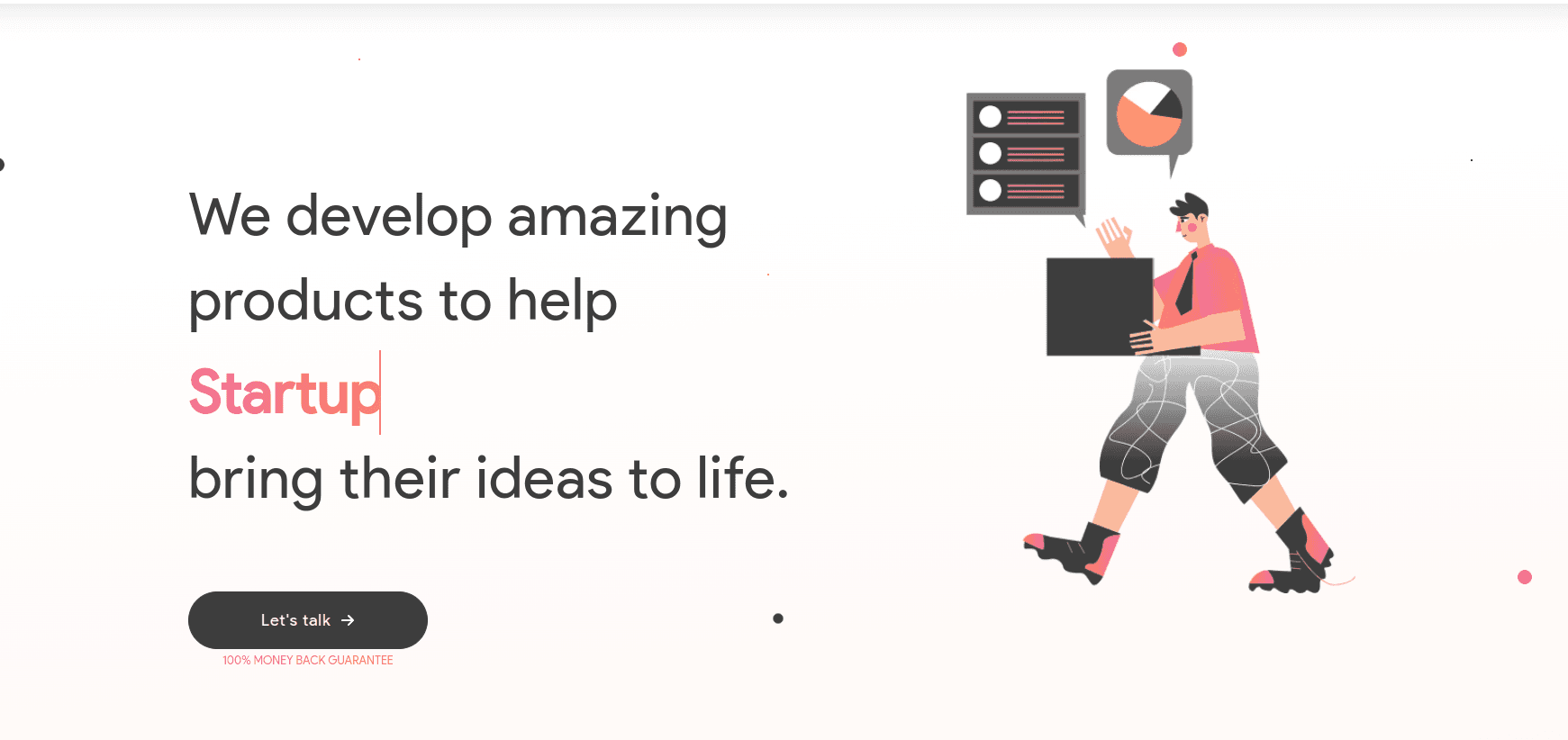
Perfection — Will take time, don’t waste time
<template>
   <div class="flex">
      <div class="description">
         We develop amazing products to help
              Startups
              bring their ideas to life.

              <router-link :to="contactURL">
                  <span>Let's talk</span>
                  <font-awesome-icon
                    class="fa"
                    icon="arrow-right"
                  />
              </router-link>

              <small class="v2-canopas-gradient-text pt-1">
                  100% MONEY BACK GUARANTEE
              </small>
           </div>
</template>
Rough Design — Quick and easy to do
<template>
   <div class="flex">
        <div class="description">
              <!-- description will be here -->
        </div>
        <div class="image">
              <!-- image will be here. currenlty, can apply any background color here -->
        </div>
   </div>
</template>
Tip — First do the rough design of each div, later you can make them perfect.
Done > Perfect
3. Mobile-first design approach
People are using mobiles more than desktops nowadays. We need equal focus on page responsiveness on mobiles, too.
We need to design pages that will compatible with all devices from mobile to desktops (You can consider TVs and Wearables also).
Mobile-first design: Write CSS for smaller(mobile) devices first, then go with larger(desktop) devices.
From my experience, I found some advantages of mobile-first design.
- Easy to start with any type of design — Mobile layouts are simpler than desktop.
- Faster and more productive than desktop-first design
- Reduces media queries — It reduces lots of media queries that we need to write for handling designs on smaller devices.
Tip — Start writing CSS from smaller resolutions and scale them to the larger ones!
4. Use fewer styles and be more productive
Don’t judge me wrong. I am saying about using available frameworks like bootstrap or tailwind.
Bootstrap: It is a very well-known and most used framework for CSS. It comes up with predefined classes. By using this, we can design anything with fewer styles.
Tailwind: This lightweight CSS framework is a buzzword among developers recently. It has classes for all CSS properties, so we don’t need to write any custom classes. and we can build our website without CSS.
There are many other frameworks though like Bulma, Skeleton, UIKit, etc… Go ahead with your favorite one!
However, I personally recommend using Tailwind over any other, as it’s too lightweight comparatively.
Tip — Use frameworks to design websites faster.
5. Spare some time to think of images
On websites, around 70% of the content is occupied by images. Fit images to the page, that will be responsive is a quite tricky task.
We have applied the following things when designing images,
- Responsive images
- Lazy loading
- Conditional import
Responsive images
A div or container should not depend on image size, instead image size should resize according to the container's size.
We should use responsive images for website design according to device size(Ex: 400px, 800px, 1200px, 1600px).
Resize the image in given sizes and use it according to device size. See the below example.
<template>
  <picture>
    <img
      :src="images[2]"
      :srcset="`${images[0]} 400w, ${images[1]} 800w, ${images[2]} 1200w`"
      sizes="33vw"
      alt="image"
    />
  </picture>
</template>
I have used img tag. Alternatively, the source tag can also be used. Based on device size, the img tag will choose an image and display it.
Attributes the example has used are,
- src: used to show the default-sized image.
- srcset: contains multiple images as per device width(VW)
- sizes: Defines styles according to the viewport. In the above example, the image should be shown in 33vw.
Explore more about Responsive images, pictures, img, and source tags from MDN.
Note: Don’t create more than 5 responsive images. srcset will use nearby-sized images as per devices.
Tip —Image size should be equal to or slightly more than the given container size, for that use responsive images.
Lazy loading
Lazy loading is helpful for a better user experience, and also for SEO kinds of stuff.
What will happen if we don’t apply it?
- Content will wait until the image will not render(Image is devil 😨)
- Users may see a blank page as there is no content until the image will be loaded.
- SEO rank can be reduced.
Lazy loading makes images or any resources non-blocking. It identifies those resources and only renders them when needed. Ultimately, it won’t load all the images on page load, rather than it will load images as we scroll the page.
Lazy loading example for images,
<img src="image.jpg" alt="..." loading="lazy">Similar way we can apply it to other resources like fonts, iframe, or even on CSS and JS links.
Tip — Use lazy loading for larger-resolution images.
Conditional loading
Why do we load an image if it’s not needed in the design?
Sometimes we need to hide images on mobile devices and show them in desktop browsers.
There are two ways to do it.
i. Load image every time and show/hide from CSS — Bad practice
Hiding images from CSS will not remove images from DOM. And it will affect the performance of the website eventually.
ii. Load image when needed — Good practice
Conditional image loading removes the extra overhead of loading unused images from DOM and the page loads fast.
Tip — Use conditional rendering instead of permanent rendering.
6. Testing
Testing is the most important phase of software development, no matter if it’s design or development.
While testing a website, the designer must have to consider user experience, responsiveness, loading time, SEO ranking, etc.
Here are some notes on it,
- Check responsiveness on all real devices — Always test on real devices.
I faced some animations working on desktops but not on real mobile devices. So if there will be the same case with you, you can catch them up at an earlier stage.
With page responsiveness, we should also check for image responsiveness too. - Check the page score of the local website —Lighthouse is an open-source, automated tool for improving the performance, quality, and correctness of web apps. We can check our website score. It should be around 90%.
Conclusion
We have found these tricks and applied them to our website, and you won’t believe it, it has improved the performance score on Pagespeed Insights by ~50% 😳.
We’re Grateful to have you with us on this journey!
Suggestions and feedback are more than welcome!
Please reach us at Canopas Twitter handle @canopassoftware with your content or feedback. Your input enriches our content and fuels our motivation to create more valuable and informative articles for you.
Keep improving for the best✌️!!
Similar articles


Whether you need...
- *High-performing mobile apps
- *Bulletproof cloud solutions
- *Custom solutions for your business.
