How to make Unique shapes using TailwindCSS
Background
As developers, we frequently spend a substantial amount of time styling elements. We can’t make a simple website or a complex application great unless we use a lot of CSS.
It’s not always as easy as it appears, and some tasks are quite tricky. However, you can solve these problems relatively quickly if you have the right skills. That’s why they say practice makes perfect.
CSS is used for more than just styling elements. CSS shapes enable web designers to create custom paths such as triangles, circles, and polygons. ⚪️, 🔷, 🔺, ⭐️, ◾️.
This way, you’re not forced to insert a transparent-background floating image only to be disappointed by a rectangular box around it.
This article will design various shapes using TailwindCSS and a few functional shapes and values.
Sponsored
We are what we repeatedly do. Excellence, then, is not an act, but a habit. Try out Justly and start building your habits today!
Introduction
Tailwind CSS can be used to create various shapes using its pre-defined classes.
You can make shapes such as circles, squares, triangles, and more using the .rounded-* classes for rounded shapes and the .w-* and .h-* classes for width and height.
Additionally, you can create shapes using the :before and :after pseudo-elements with the content property set to an empty string and the border property set to create the desired shape.
And you’ll see how simple a task like this can be if you sharpen your skills and practice regularly.
Let’s start with the styling shapes 👉
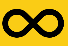
Infinity
You can create both sides of the shape and thus get the required output by using pseudo-elements.
This solution will work well with all browsers.
Steps:
- Create div
relativeusew-*andh-*u. - Set an element’s box-sizing to
content-boxby using box content, which instructs the browser to add borders and padding on top of the element’s specified width or height. - Use
:beforeand:afterpseudo property which includesabsolute,top,left,rounded,rotatehaving the same values. - The only difference comes here, in
:beforerounded-l-[50px], and in:afterrounded-l-0. So, here is our infinity 😎.
<div class="bg-yellow-400  p-20">
<div class="relative w-[212px] h-[100px] box-content

before:content-[''] before:absolute before:top-0 before:left-0
before:h-[60px] before:w-[60px] before:border-[20px]
before:border-black before:border-solid before:rounded-t-[50px]
before:rounded-tr-[50px] before:rounded-b-0 before:rounded-l-[50px]
before:-rotate-45 before:box-content

after:content-[''] after:absolute after-top-0 after:right-0
after:left-auto after:h-[60px] after:w-[60px] after:border-[20px]
after:border-black after:border-solid after:rounded-t-[50px]
after:rounded-r-[50px] after:rounded-b-0 after:rounded-l-0
after:rotate-45 after:box-content">
</div>
</div>
Yin-Yang
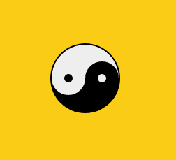
YinYang
we’ll go over how to use pseudo-classes and various border properties,
Steps:
1. Create a Shape
To distinguish the two sides of our yin-yang body, we need to make a round shape and use black and white colors.
1. To add more shapes inside the element, we’ll use position: relative.
2. The tricky part is that we specified a width of 50px as well as a border width of 2px 50px 2px 2px.
3. We now have a square, so we’ll set the border radius to 50% to turn it into a circle.
Because of the background property, the left side is white, and the right side is black because the border color is set to black.
<div class="w-[96px] box-content h-[48px] bg-[#eee] border-solid
border-[#000] border-x-2 border-t-2 border-b-[50px]
rounded-full relative></div>
2. Inner Circle
Both circles are based on the same idea. We’ll do this with CSS pseudo-elements like :before and :after. Pseudo-elements allow you to create non-DOM elements and style a specific portion of an element’s content.
1. The main properties are content-none, box-content, absolute, border, rounded, left, top, height and width.
2. The following step is to repeat the process with our bottom circle. The only difference is that we’ll use the: after pseudo-element to invert the colors to create a black circle with a white border.
3. Secondly, set before:left-0 , and after:left-[50%] .
And… We’re Done, here is our YinYang 💁
<div before:content-[''] before:absolute before:top-[50%] before:left-0
before:bg-[#000] before:border-[18px] before:border-[#eee]
before:border-solid before:rounded-full before:h-[12px] before:w-[12px]
 before:box-content></div>
Whole Code
<div class="bg-yellow-400 p-20">
<div class="w-[96px] box-content h-[48px] bg-[#eee] border-solid
border-[#000] border-x-2 border-t-2 border-b-[50px] rounded-full relative
before:content-[''] before:absolute before:top-[50%] before:left-0
before:bg-[#000] before:border-[18px] before:border-[#eee]
before:border-solid before:rounded-full before:h-[12px] before:w-[12px]
before:box-content
after:content-[''] after:absolute after:top-[50%] after:left-[50%]
after:bg-[#eee] after:border-[18px] after:border-[#000] after:border-solid
after:rounded-full after:h-[12px] after:w-[12px] after:box-content">
</div>
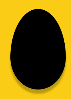
</div>Egg
You’ll need to manipulate the height , width and sprinkle ⭐️ some colors in it then add rounded[50%/60%_60%_40%_40%] .
Using the value to transform the egg using some shadow, to make it look cool. Easy right?✌️
<div class="bg-yellow-400  p-20">
  <div class="block w-[192px] h-[280px] bg-black
 rounded-[50%/60%_60%_40%_40%]drop-shadow-[0px_15px_3px_rgba(0,0,0,0.25)]">
 </div>
</div>
Heart
The heart shape is a little tricky to achieve, but you can do it by using :before and :after pseudo-elements. You can use different transform values to rotate them from various angles until they perfectly form a heart shape.
The only difference before:left-[50px] before:origin-[0_100%]after:left-0 and after:origin-[100%_100%].
And that’s it. Easy peasy lemon squeezy. 😃
Finally, you can use transform-origin to specify the origin of the transformation.
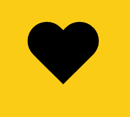
<div class="bg-yellow-400  p-20">

<div class="relative w-[100px] h-[90px]
before:content-[''] before:absolute before:top-0 before:left-[50px]
before:h-[80px] before:w-[50px] before:rounded-t-[50px]
before:rounded-r-[50px]before:rounded-b-0 before:rounded-l-0
before:bg-black before:-rotate-45 before:origin-[0_100%]

after:content-[''] after:absolute after:top-0 after:left-0 after:h-[80px]
after:w-[50px] after:rounded-t-[50px] after:rounded-r-[50px]
after:rounded-b-0 after:rounded-l-0 after:bg-black after:rotate-45
after:origin-[100%_100%]
">
</div>
</div>
Diamond
Using position, join two triangles pointing upwards and downwards to form a diamond shape. Yes, we will make these triangles using the border properties.
- Set
border-b-[1.25em],border-t-[50px] - In Pseudo property
after:border-b-[3em]after:border-t-[4.4em]
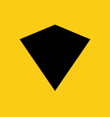
<div class="bg-yellow-400  p-20">
<div class="relative top-[-3em] w-0 h-0 border-t-[50px]
 border-t-transparent border-solid border-x-transparent  border-x-[3em]
 border-b-[1.25em] border-black

afte:content-none after:absolute after:left-[-3em] after:top-[1.25em]
after:h-0 after:w-0 after:border-b-[3em] after:border-solid
after:border-x-transparent after:border-b-transparent after:border-x-[3em]
after:border-t-[4.4em] after:border-t-black
"></div>
</div>
Ellipse
Simply, give a square a border radius of 50% and you’ll get a circle. To make an ellipse, repeat the process with the rectangle.
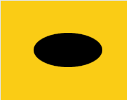
<div class="p-12 h-[50%] mx-auto my-auto bg-yellow-400">
<div class="h-[50px] w-[100px] bg-[#000] rounded-[50%]"></div>
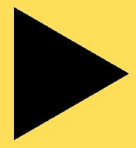
</div>Triangle-Right
All you need to do is to create a <div> and give it a border-left, border-right, border-bottom and width, and height.
<div class="h-0 w-0 border-t-[25px] border-l-[55px] border-b-[25px]
border-solid border-t-transparent border-b-transparent border-l-[#555]">
Triangle-up
You can create a triangle shape by using the :before or :after pseudo-elements and setting the border,width,height and border-color properties.
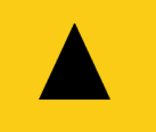
<div class="bg-yellow-400 mx-auto h-full p-20">
<div class="mx-auto h-0 w-0 border-r-[25px] border-b-[55px]
border-l-[25px] border-solid border-r-transparent
border-l-transparent border-b-[#000]">
</div>
That’s what this article has covered.
Shared Ideas & Thoughts With The purpose of learning together and growing together.
Conclusion
You should now be familiar with various pure CSS images that can be created with just a few lines of code. Building a lightning-fast website is no longer a challenging task if you know how to play with code.
The best part is that you can relate to the brand’s voice by manipulating different shapes and colors as needed.
As a result, keep experimenting and exploring new ways to draw awesome shapes using only CSS.
Related Useful Articles


Whether you need...
- *High-performing mobile apps
- *Bulletproof cloud solutions
- *Custom solutions for your business.
