AutoSizing TextField in Jetpack compose
Background
I was working on the Justly app at Canopas, and I needed a few TextField that should resize as the text grows. Currently, there’s no way to accomplish this in Jetpack compose. So let’s implement a custom resizable text field.
We’ll implement the TextField which always resizes depending on the fixed height.
The complete source code of the implementation is available on GitHub.
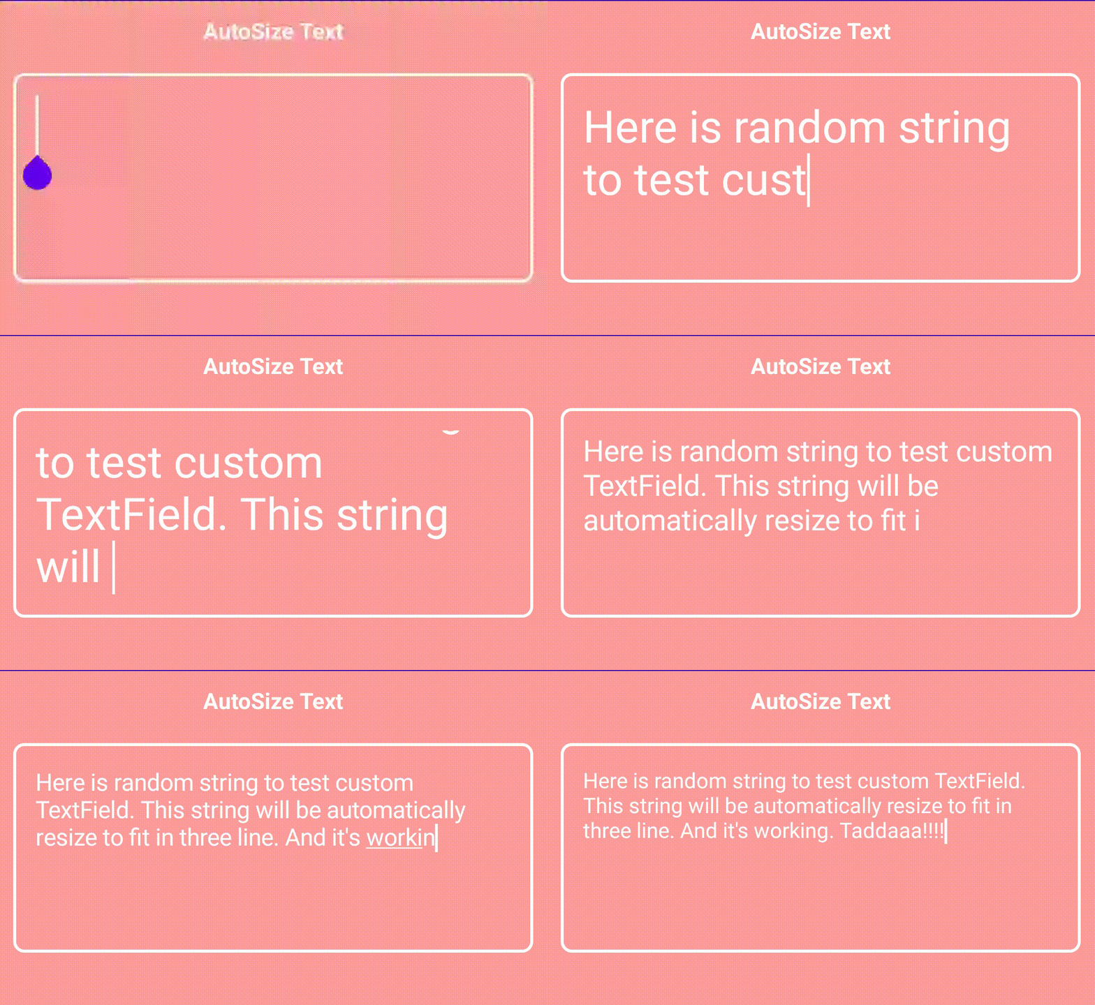
What we’ll achieve at the end of this article? — Nice autoSizable TextField

Sponsored
Let’s get started
Let’s break the implementation into smaller parts to make it easy.
- Calculate the line count and height of the Text with the given Text Style
- Shrink the font size to fit on the specified max line
Let’s first set up the custom composable.
@Composable
fun AutoSizableTextField(
    value: String,
    onValueChange: (String) -> Unit,
    modifier: Modifier = Modifier,
    fontSize: TextUnit = 32.sp,
) {
    BoxWithConstraints(
        modifier = modifier
    ) {
        OutlinedTextField(
            value = value,
            onValueChange = onValueChange,
            modifier = Modifier
                .fillMaxSize(),
            shape = RoundedCornerShape(8.dp),
            textStyle = TextStyle(fontSize = fontSize),
            colors = TextFieldDefaults.outlinedTextFieldColors(
                textColor = Color.White,
                focusedBorderColor = Color.White,
                cursorColor = Color.White
            )
        )
    }
}
Here we have used BoxWithConstraints to get the maxWidth/maxHeight of TextField.
1. Calculate the line count and height of the Text with the given Text Style
We’ll Use Paragraph API to determine the height/width of Text with the given constraints like style, maxLines, ellipsis, etc...
So now let’s define the Paragraph composable in AutoSizableTextField.
val calculateParagraph = @Composable {
    Paragraph(
        text = value,
        style = TextStyle(fontSize = nFontSize),
        density = LocalDensity.current,
        resourceLoader = LocalFontLoader.current,
        width = with(LocalDensity.current) { maxWidth.toPx() }
    )
}
Here we just specified the constraints that we have for our TextField.
Using Paragraph API we can easily retrieve the following properties.
width — The amount of horizontal space this paragraph occupies.
height — The amount of vertical space this paragraph occupies.
minIntrinsicWidth — The width for text if all soft wrap opportunities were taken.
maxIntrinsicWidth — Returns the smallest width beyond which increasing the width never decreases the height.
lineCount — The total number of lines in the text.
didExceedMaxLines — It returns true if one of the lines exceeded the width constraints.
any many more to give a try…
Now let’s use it in the next step.
2. Shrink the font size to fit on the specified max line
var intrinsics = calculateParagraph()

with(LocalDensity.current) {
    while ((intrinsics.height.toDp() > maxHeight || intrinsics.didExceedMaxLines) && nFontSize >= minFontSize) {
        nFontSize *= scaleFactor
        intrinsics = calculateParagraph()
    }
}
Here, we are describing the font size and recalculating the paragraph until our text height becomes smaller than the paragraph height.
We also don’t want our text to be too small that we can’t even read it. That’s why I’ve added a check to ensure the font size will be always bigger than the minimum font size.
Also, we want our text field to never exceed the max line count, so for that, we added a check intrinsics.didExceedMaxLines .
With that, now we have the shrunk font size and apply it to TextField.
@Composable
fun AutoSizableTextField(
    value: String,
    onValueChange: (String) -> Unit,
    modifier: Modifier = Modifier,
    fontSize: TextUnit = 32.sp,
    maxLines: Int = Int.MAX_VALUE,
    minFontSize: TextUnit,
    scaleFactor: Float = 0.9f,
) {
    BoxWithConstraints(
        modifier = modifier
    ) {
        var nFontSize = fontSize

        val calculateParagraph = @Composable {
            Paragraph(
                text = value,
                style = TextStyle(fontSize = nFontSize),
                density = LocalDensity.current,
                resourceLoader = LocalFontLoader.current,
                maxLines = maxLines,
                width = with(LocalDensity.current) { maxWidth.toPx() }
            )
        }

        var intrinsics = calculateParagraph()
        with(LocalDensity.current) {
            while ((intrinsics.height.toDp() > maxHeight || intrinsics.didExceedMaxLines) && nFontSize >= minFontSize) {
                nFontSize *= scaleFactor
                intrinsics = calculateParagraph()
            }
        }

        OutlinedTextField(
            value = value,
            onValueChange = onValueChange,
            modifier = Modifier.fillMaxSize(),
            shape = RoundedCornerShape(8.dp),
            maxLines = maxLines,
            textStyle = TextStyle(fontSize = nFontSize),
        )
    }
}
Let’s compare both TextField and our AutoSizable TextField.
@Composable
fun DefaultPreview() {
    var text by remember { mutableStateOf("") }

    AutosizetextdemoTheme {
        Column(
            modifier = Modifier
                .fillMaxSize()
                .background(ThemeColor.copy(0.7f))
                .padding(10.dp), horizontalAlignment = Alignment.CenterHorizontally
        ) {
            Text(
                text = "AutoSize  TextField", fontWeight = FontWeight.Bold,
                color = Color.White
            )

            AutoSizableTextField(
                value = text,
                onValueChange = { text = it },
                maxLines = 2,
                minFontSize = 10.sp,
                modifier = Modifier
                    .padding(top = 20.dp, bottom = 20.dp)
                    .fillMaxWidth()
                    .height(150.dp)
            )

            Text(
                text = "TextField", fontWeight = FontWeight.Bold,
                color = Color.White
            )

            OutlinedTextField(
                value = text,
                onValueChange = { text = it },
                maxLines = 2,
                textStyle = TextStyle(fontSize = 32.sp),
                modifier = Modifier
                    .padding(top = 20.dp)
                    .fillMaxWidth()
                    .height(150.dp)
            )
        }
    }
}
And the result is here,

To Conclude
That’s it for today, hope you get some basic ideas about paragraph API. This blog post is inspired by the flutter package auto_size_text.
For now, we have implemented TextFeild that resizes to fit on a max line, but we can customize it in different ways same as above mentioned flutter package. Stay tuned for the next part of this post.
The complete source code of the above examples is available on Github.
Hope you found this blog post helpful.
Thank you!!
Popular articles


Let's Work Together
Not sure where to start? We also offer code and architecture reviews, strategic planning, and more.
