Keyboard Handling in Jetpack Compose: Best Practices
Introduction
In this article, we’ll learn the important use-cases to manage Keyboard in Jetpack compose.
We’re going to cover
1. How to hide & show a soft keyboard.
2. How to adjust the layout when the keyboard appears.
3. Keyboard actions
4. Keyboard options
5. How to detect the keyboard?
Sponsored
We are what we repeatedly do. Excellence, then, is not an act, but a habit. Try out Justly and start building your habits today!
Let’s get started!
1. How to hide & show a soft keyboard
When we tap on a TextField, the keyboard pops up, after inputting text, we want to dismiss the keyboard.
a. KeyboardController
In jetpack compose, we have LocalSoftwareKeyboardController API to control the keyboard visibility. This API is marked as ExperimentalComposeUiApi, so it may change in future.
val keyboardController = LocalSoftwareKeyboardController.current
//To hide keyboard
keyboardController?.hide()
//To show keyboard
keyboardController?.show()
With the hide & show requests on SoftwareKeyboardController we can control the visibility of a Keyboard.
If we have TextField with keyboard ImeAction.Done, then we need to invoke hide()call in the callback of Keyboard actions.
val keyboardController = LocalSoftwareKeyboardController.current
var text by remember {
    mutableStateOf("")
}

TextField(
    value = text,
    onValueChange = { text = it },
    keyboardOptions = KeyboardOptions(imeAction = ImeAction.Done),
    keyboardActions = KeyboardActions(
        onDone = { keyboardController?.hide() }),
)
b. LocalFocusManager
Also, we can dismiss a keyboard by removing the focus from the TextField
val focusManager = LocalFocusManager.current
var text by remember {
    mutableStateOf("")
}

TextField(
    value = text,
    onValueChange = { text = it },
    keyboardOptions = KeyboardOptions(imeAction = ImeAction.Done),
    keyboardActions = KeyboardActions(
        onDone = { focusManager.clearFocus() }),
)
This will close the keyboard and clears the focus from the TextField, whereas SoftwareKeyboardController only closes the keyboard without removing focus from any TextField.
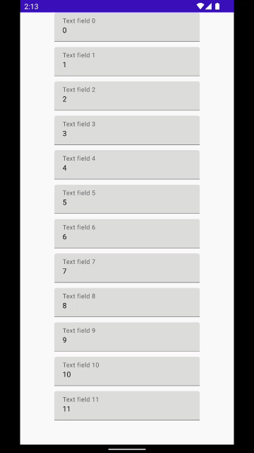
2. How to adjust the layout when the keyboard appears
The keyboard reduces the available space for the app’s UI when it appears.
When we have too many TextField, for example, Registration form where we have 5 to 6 TextField to input user detail, probably not all fields going to be visible, some text fields may hide behind the keyboard. So how to prevent this?
a. windowSoftInputMode
With the windowSoftInputMode attribute, we can configure our keyboard, how it going to affect our UI and its visibility state.
In manifest file set adjustResize to windowSoftInputMode attribute.
<activity
    android:name=".MainActivity"
    android:windowSoftInputMode="adjustResize"
    .../>
The system resizes your layout to the available space, to make content accessible when the keyboard appears on the screen.
b. BringIntoViewRequester
With BringIntoViewRequester we can automate scroll on focus change to make TextField fully visible. BringIntoViewRequester is an Experimental API it may change in future.
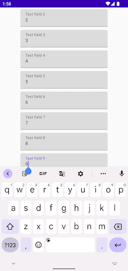
Here’s Text field 9 is not fully visible, BringIntoViewRequester auto-scroll item and bring into parent bounds. Let’s see how to add BringIntoViewRequester
val state = rememberLazyListState()
LazyColumn(
    state = state,
    modifier = Modifier.fillMaxSize(),
    horizontalAlignment = Alignment.CenterHorizontally
){
    items(12) { item ->
        YourTextField(item)
        Spacer(modifier = Modifier.height(10.dp))
    }
}
//YourTextField
@OptIn(ExperimentalFoundationApi::class)
@Composable
fun YourTextField(index: Int) {

    val bringIntoViewRequester = remember { BringIntoViewRequester() }
    val coroutineScope = rememberCoroutineScope()
    TextField(
       /* ... your text field value and onValueChange callback */
      modifier = Modifier
            .bringIntoViewRequester(bringIntoViewRequester)
            .onFocusEvent { focusState ->
                if (focusState.isFocused) {
                    coroutineScope.launch {
                        bringIntoViewRequester.bringIntoView()
                    }
                }
            }
    )
}Modifier.bringIntoViewRequester(bringIntoViewRequester) demonstrates how a composable can ask its parents to scroll so that the component using this modifier is brought into the bounds of all its parents.
BringIntoViewRequester is only work with windowSoftInputMode=”adjustResize”
c. imePadding
The Ime padding modifiers allow you to apply keyboard padding to a composable.
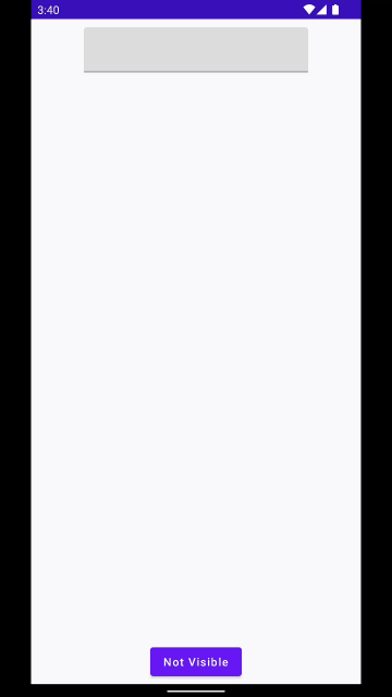
In the below example, we have a button at the bottom of Column
Column(
horizontalAlignment = Alignment.CenterHorizontally,
modifier = Modifier
.fillMaxSize()
.padding(10.dp)
) {
TextField(value = "", onValueChange = {})
Spacer(Modifier.weight(1f))
Button(onClick = {}) {
Text(text = "Yeah Visible")
}
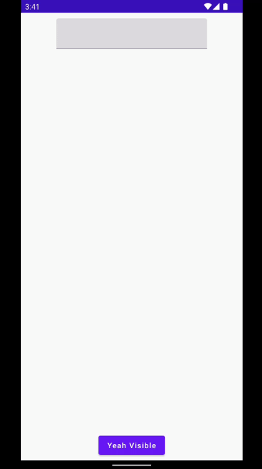
}Without setting adjustResize to windowSoftInputMode attribute, button hide behind the keyboard.
Now let’s set imePadding to move button as keyboard appears. We also need to set WindowCompat.setDecorFitsSystemWindows(window, false)
Column(
    horizontalAlignment = Alignment.CenterHorizontally,
    modifier = Modifier
        .fillMaxSize()
        .statusBarsPadding()
        .navigationBarsPadding()
        .imePadding()
        .padding(10.dp)
) {
    TextField(value = "", onValueChange = {})
    Spacer(Modifier.weight(1f))
    Button(onClick = {}) {
        Text(text = "Yeah Visible")
    }
}
And here’s the result
3. Keyboard options
keyboardOptions in TextField allow you to configure your keyboard options, such as auto capitalisation, autocorrect, what type of keyboard you want for your TextField and IME action button. For example, for password TextField you don’t want to capitalisation input neither you want auto correct feature.
keyboardOptions = KeyboardOptions.Default.copy(
    capitalization = KeyboardCapitalization.None,
    autoCorrect = false,
    keyboardType = KeyboardType.Password,
    imeAction = ImeAction.Done
)- capitalization — to automatically capitalize characters, words or sentences.
- autoCorrect — informs the keyboard whether to enable auto correct.
- keyboardType — The keyboard type to be used in this text field. For example, for the password TextField, the keyboard type is
KeyboardType.Password - imeAction — what type of action button should be displayed on Keyboard.
4. Keyboard actions
Keyboard action is used to detect the click event of the IME action button of the Keyboard. There’s 6 KeyboardActions are available.
keyboardActions = KeyboardActions(
    onDone = { },
    onGo = { },
    onNext = { },
    onPrevious = { },
    onSearch = { },
    onSend = { },
)
For example, if you want to focus the next textField, on ImeAction.Next click, you’ll receive callback in onNext
TextField(
    value = text,
    onValueChange = { text = it },
    keyboardOptions = KeyboardOptions(imeAction = ImeAction.Next),
    keyboardActions = KeyboardActions(
        onNext = { focusManager.moveFocus(FocusDirection.Down) }),
)
5. How to detect the keyboard
With WindowInsets we can check if the keyboard is present in screen container.WindowInsets.ime.getBottom(LocalDensity.current) returns bottom space in pixel.
val isVisible = WindowInsets.ime.getBottom(LocalDensity.current) > 0
LaunchedEffect(key1 = isVisible) {
    if (isVisible) {
        //hide fab button
    } else {
        //show fab button
    }
}
That’s it. Hope now you have a basic understanding of the common interactions with Keyboard APIs in Jetpack compose.
Popular Articles

Let's Work Together
Not sure where to start? We also offer code and architecture reviews, strategic planning, and more.