
Android — How to Drag And Drop Views in Jetpack Compose
Introduction
To the user, the interface is the product
In this blog post, we will implement Drag and Drop functionality using Jetpack compose.
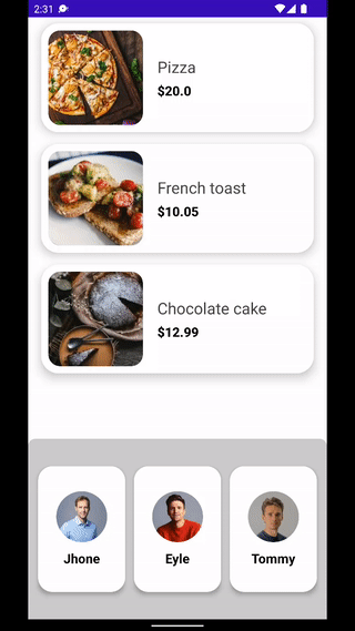
We’ll create a food order book, that shows list of food items with list of persons. Users can select food items and drop them to the person paying for all dropped food items.
This blog post is inspired by Flutter’s LongPressDraggable widget.
At the end of this blog post, we’ll have something like this

Not interested in implementation? Here’s the source code for you.
Sponsored
We are what we repeatedly do. Excellence, then, is not an act, but a habit. Try out Justly and start building your habits today!
Let’s get started!
We’ll divide implementation into 5 simple steps to make each step easy to understand.
Now, enough talk and let’s focus on implementation.
Step 1: Design Composable to show food items
We’ll first create a FoodItem card that shows a single food item.
@Composable
fun FoodItemCard(foodItem: FoodItem) {
    Card(
        elevation = 10.dp, backgroundColor = Color.White,
        shape = RoundedCornerShape(24.dp),
        modifier = Modifier.padding(8.dp)
    ) {
        Row(
            verticalAlignment = Alignment.CenterVertically,
            modifier = Modifier.padding(10.dp)
        ) {
                Image(
                    painter = painterResource(id = foodItem.image),
                    contentDescription = null,
                    contentScale = ContentScale.Crop,
                    modifier = Modifier
                        .size(130.dp)
                        .clip(RoundedCornerShape(16.dp))
                )
            Spacer(modifier = Modifier.width(20.dp))
            Column(modifier = Modifier.weight(1f)) {
                Text(
                    text = foodItem.name,
                    fontSize = 22.sp,
                    color = Color.DarkGray
                )
                Spacer(modifier = Modifier.height(6.dp))
                Text(
                    text = "$${foodItem.price}",
                    fontSize = 18.sp,
                    color = Color.Black,
                    fontWeight = FontWeight.ExtraBold
                )
            }
        }
    }
}
and here’s LazyColumn
LazyColumn(
modifier = Modifier.fillMaxSize(),
contentPadding = PaddingValues(horizontal = 10.dp)
) {
items(items = foodList) { food ->
FoodItemCard(foodItem = food)
}
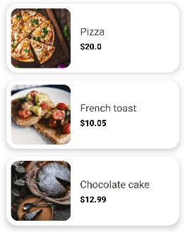
}and it’ll look something like this:
Step 2: Design Composable to show Users
Now Let’s add composable to show Persons, we’ll show the Profile image and person's name in the card.
@Composable
fun PersonCard(person: Person) {
        Column(
            modifier = Modifier
                .padding(6.dp)
                .shadow(elevation = 4.dp, shape = RoundedCornerShape(16.dp))
                .width(width = 120.dp)
                .fillMaxHeight(0.8f)
                .background(Color.White, RoundedCornerShape(16.dp)),
            verticalArrangement = Arrangement.Center,
            horizontalAlignment = Alignment.CenterHorizontally
        ) {
            Image(
                painter = painterResource(id = person.profile), contentDescription = null,
                modifier = Modifier
                    .size(70.dp)
                    .clip(CircleShape),
                contentScale = ContentScale.Crop
            )
            Spacer(modifier = Modifier.height(10.dp))
            Text(
                text = person.name,
                fontSize = 18.sp,
                color = Color.Black,
                fontWeight = FontWeight.Bold
            )
        }
}
To show List of users
LazyRow(
modifier = Modifier
.fillMaxHeight(0.3f)
.fillMaxWidth()
.background(Color.LightGray, shape = RoundedCornerShape(topEnd = 10.dp, topStart = 10.dp))
.padding(vertical = 10.dp)
.align(Alignment.BottomCenter),
verticalAlignment = Alignment.CenterVertically,
horizontalArrangement = Arrangement.Center
) {
items(items = persons) { person ->
PersonCard(person)
}
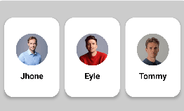
}And here’s the result:
Step 3: Implement DragTarget
We’ll first save the state of our drag target(our food image).
internal class DragTargetInfo {
    var isDragging: Boolean by mutableStateOf(false)
    var dragPosition by mutableStateOf(Offset.Zero)
    var dragOffset by mutableStateOf(Offset.Zero)
    var draggableComposable by mutableStateOf<(@Composable () -> Unit)?>(null)
    var dataToDrop by mutableStateOf<Any?>(null)
}
Here’s our DragTargetInfo . The first state isDragging is for drag status, second state dragPosition to store the object’s current position, 3rd one is dragOffset for object's current offset, and draggableComposable is for composable that we’ll drag, and the last one dataToDrop store the data that our drop target will receive.
Now let's implement DragTarget composable, which does nothing than just store the state of the draggable view.
internal val LocalDragTargetInfo = compositionLocalOf { DragTargetInfo() }
@Composable
fun <T> DragTarget(
    modifier: Modifier,
    dataToDrop: T,
    content: @Composable (() -> Unit)
) {
    var currentPosition by remember { mutableStateOf(Offset.Zero) }
    val currentState = LocalDragTargetInfo.current

    Box(modifier = modifier
        .onGloballyPositioned {
            currentPosition = it.localToWindow(Offset.Zero)
        }
        .pointerInput(Unit) {
           // detect DragGestures After LongPress
        }) {
        content()
    }
}
Here we used pointerInput to detect gestures that are generated from user interaction.
As we want to drag our object on a long click and we also want a state of drag such as star, end, cancel, or in progress.
    Modifier.pointerInput(Unit) {
        detectDragGesturesAfterLongPress(onDragStart = {
            currentState.dataToDrop = dataToDrop
            currentState.isDragging = true
            currentState.dragPosition = currentPosition + it
            currentState.draggableComposable = content
        }, onDrag = { change, dragAmount ->
            change.consumeAllChanges()
            currentState.dragOffset += Offset(dragAmount.x, dragAmount.y)
        }, onDragEnd = {
            currentState.isDragging = false
            currentState.dragOffset = Offset.Zero
        }, onDragCancel = {
            currentState.dragOffset = Offset.Zero
            currentState.isDragging = false
        })
    }
We have used detectDragGesturesAfterLongPress for it. In its callback method, we’re just updating the state of our draggable object.
Now let’s use this Composable to make our food image draggable
DragTarget(modifier = Modifier, dataToDrop = foodItem) {
    Image(
        painter = painterResource(id = foodItem.image),
        contentDescription = null,
        contentScale = ContentScale.Crop,
        modifier = Modifier
            .size(130.dp)
            .clip(RoundedCornerShape(16.dp))
    )
}
Step 4: Copy the draggable object and drag it
As we don’t want our actual object to move on screen, we need a copy of an object that we want to drag.
Let’s create a composable that recognises drag and create a copy of the object near the user’s pointer.
@Composable
fun LongPressDraggable(
    modifier: Modifier = Modifier,
    content: @Composable BoxScope.() -> Unit
) {
    val state = remember { DragTargetInfo() }
    CompositionLocalProvider(
        LocalDragTargetInfo provides state
    ) {
        Box(
            modifier = modifier
                .fillMaxSize()
        ) {
            content()
        }
    }
}
LongPressDraggable works as a container that gives us full access to control our draggable object. Now we need to have a copy of our draggable object when the user starts dragging an object.
Box(modifier = modifier.fillMaxSize())
{
    content()
    if (state.isDragging) {
        var targetSize by remember {
            mutableStateOf(IntSize.Zero)
        }
        Box(modifier = Modifier
            .graphicsLayer {
                val offset = (state.dragPosition + state.dragOffset)
                scaleX = 1.3f
                scaleY = 1.3f
                alpha = if (targetSize == IntSize.Zero) 0f else .9f
                translationX = offset.x.minus(targetSize.width / 2)
                translationY = offset.y.minus(targetSize.height / 2)
            }
            .onGloballyPositioned {
                targetSize = it.size
            }
        ) {
            state.draggableComposable?.invoke()
        }
    }
}
Here, whenever drag accrues, we’re adding a copy of the draggable composable in our root view.
We have used graphicsLayer modifier to apply scaling, opacity to make the draggable view slightly bigger and transparent than the original one and translation to move our view on screen.
LongPressDraggable(modifier = Modifier.fillMaxSize()) {
    LazyColumn(
        modifier = Modifier.fillMaxSize(),
        contentPadding = PaddingValues(horizontal = 10.dp)
    ) {
        items(items = foodList) { food ->
            FoodItemCard(foodItem = food)
        }
    }
    PersonListContainer()
}
So here we have added food items and person list containers inside LongPressDraggable so we can drag objects freely on the screen.
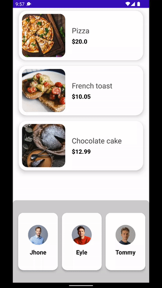
Here’s what we have implemented till now
Step 5: Implement DropTarget
Now it’s time to have a receiver that receives the data we drop on it, in our case FoodItem
@Composable
fun <T> DropTarget(
    modifier: Modifier,
    content: @Composable() (BoxScope.(isInBound: Boolean, data: T?) -> Unit)
) {

    val dragInfo = LocalDragTargetInfo.current
    val dragPosition = dragInfo.dragPosition
    val dragOffset = dragInfo.dragOffset
    var isCurrentDropTarget by remember {
        mutableStateOf(false)
    }

    Box(modifier = modifier.onGloballyPositioned {
        it.boundsInWindow().let { rect ->
            isCurrentDropTarget = rect.contains(dragPosition + dragOffset)
        }
    }) {
        val data =
            if (isCurrentDropTarget && !dragInfo.isDragging) dragInfo.dataToDrop as T? else null
        content(isCurrentDropTarget, data)
    }
}
So our DropTarget works in a simple way, from the state of LocalDragTargetInfo we fetch the position and the offset of draggable objects, then we check that offset is inside the bound of our drop target, If it is, we pass simply that data to the target composable.
Now Let’s modify the customer card composable to use DropTarget also add price and quantity text composable to show total dropped items in cart.
@Composable
fun PersonCard(person: Person) {
    val foodItems = remember {
        mutableStateMapOf<Int, FoodItem>()
    }

    DropTarget<FoodItem>(
        modifier = Modifier
            .padding(6.dp)
            .width(width = 120.dp)
            .fillMaxHeight(0.8f)
    ) { isInBound, foodItem ->
        val bgColor = if (isInBound) Color.Red else  Color.White

        foodItem?.let {
            if (isInBound)
                foodItems[foodItem.id] = foodItem
        }

        Column(
            modifier = Modifier.background( bgColor, RoundedCornerShape(16.dp)),
        ) {
            // ...User Image and name Text views

            if (foodItems.isNotEmpty()) {
                Text(
                    text = "$${foodItems.values.sumOf { it.price}}",
                    fontSize = 16.sp,
                    color = Color.Black,
                    fontWeight = FontWeight.ExtraBold
                )
                Text(
                    text = "${foodItems.size} Items",
                    fontSize = 14.sp,
                    color = Color.Black
                )
            }
        }
    }
}
When the target is in the bound we have changed the background colour from white to red. Also to avoid duplication of Food items we have used mutableStateMapOf And the rest of things are pretty simple, just added Text to show the total amount to pay and the total items added on customer’s cart.
Wahoo!! We are done with the drag and drop implementation and the result is here…
Conclusion
Hopefully this gives you basic idea about how drag and drop works in jetpack compose. Add gestures to your apps will do wonders for your users as they can use the language that is more natural than click — gestures.
Full source code of the above implementation is also available on Github, feel free to check it out. As always, suggestions and feedbacks are more than welcome.
That’s it for today. Keep dragging. Keep coding 😈
Related Useful Articles

'%3e%3crect%20opacity='0.3'%20width='253.333'%20height='256.667'%20rx='10'%20transform='matrix(0.898794%200.438371%20-0.425364%200.905022%20109.961%20230.004)'%20fill='%23F2709C'%20fill-opacity='0.2'/%3e%3crect%20opacity='0.3'%20width='211.667'%20height='188.333'%20rx='15'%20transform='matrix(0.987688%200.156434%20-0.151006%200.988533%20-40.0391%201715)'%20fill='%23FF9472'%20fill-opacity='0.2'/%3e%3crect%20opacity='0.3'%20width='150'%20height='150'%20rx='10'%20transform='matrix(0.669131%200.743145%20-0.730788%200.682605%202111.64%201603.34)'%20fill='%23F2709C'%20fill-opacity='0.2'/%3e%3crect%20opacity='0.3'%20width='165'%20height='165'%20rx='15'%20transform='matrix(-0.669131%20-0.743145%20-0.730788%200.682605%201998.3%20643.336)'%20fill='%236CCAFF'%20fill-opacity='0.2'/%3e%3crect%20opacity='0.3'%20width='128.333'%20height='128.333'%20rx='50'%20transform='matrix(0.669131%200.743145%20-0.730788%200.682605%20379.961%20958.336)'%20fill='%23B66CFF'%20fill-opacity='0.2'/%3e%3crect%20opacity='0.3'%20width='128.333'%20height='128.333'%20rx='50'%20transform='matrix(0.669131%200.743145%20-0.730788%200.682605%201859.97%202311.67)'%20fill='%23B66CFF'%20fill-opacity='0.2'/%3e%3crect%20opacity='0.3'%20width='156.667'%20height='158.333'%20rx='10'%20transform='matrix(0.891007%200.453991%20-0.440801%200.897605%20938.312%202176.67)'%20fill='%23B66CFF'%20fill-opacity='0.2'/%3e%3c/g%3e%3c/svg%3e)
