20 Button Effects That Will Wow Your Users
Why Do Button Effects Matter?
Integrating button effects into simple buttons provides users with intuitive feedback and guides them through the interface.
The visual cues offered by these effects, such as changes in color or motion, immediately communicate the interactivity of the buttons, reducing uncertainty and improving user confidence.
Consistent and well-designed effects also play a role in establishing brand identity, as users may come to associate specific animations or styles with a particular brand. Furthermore, the incorporation of engaging button effects can lead to increased click-through rates, making users more likely to interact with the interface.
In this blog post, we’ll explore 20 different button effects using the popular CSS framework, Tailwind CSS. These effects are not only visually stunning but also functional, providing users with a delightful and engaging interface.
Sponsored
“Empower your journey to well-being with Justly. Your life is your greatest wealth — let us be your guide on the path to a happier you!”
Let's get Started!
1. Gradient Hover Effect
This button effect utilizes a gradient hover effect to add a dynamic and visually appealing transition when users interact with the button. The transition is controlled by the transition and ease-out classes, ensuring a seamless and delightful effect.
<button class="group relative inline-flex items-center justify-center overflow-hidden rounded-md border-4 border-double border-black px-6 py-3 font-bold text-black shadow-2xl hover:border-transparent hover:text-white">
    <span class="absolute inset-0 h-full w-full bg-gradient-to-br from-pink-600 via-purple-700 to-blue-400 opacity-0 transition duration-300 ease-out group-hover:opacity-100"></span>
    <span class="relative">Button Text</span>
</button>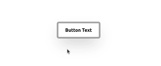
Check out the live demo in the playground.
2. Slide and Color Transition
This button features a captivating effect that combines both movement and color transition. The transition effects are orchestrated using the transition-all and duration-300 classes, creating a seamless and engaging user interaction.
<button class="group relative m-1 cursor-pointer overflow-hidden rounded-md border-2 border-pink-500 px-5 py-3 font-mono font-semibold">
    <span class="ease absolute top-1/2 h-0 w-64 origin-center -translate-x-20 rotate-45 bg-pink-500 transition-all duration-300 group-hover:h-64 group-hover:-translate-y-32"></span>
    <span class="ease relative text-pink-500 transition duration-300 group-hover:text-white">Button Text</span>
</button>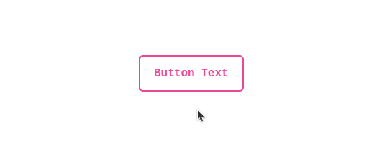
Check out the live demo in the playground.
3. Button Fill on Hover
This button introduces a captivating effect where, upon hovering, a purple-colored background elegantly fills the button’s border. The effect is achieved through a combination of the transition-all, duration-300, and ease-out classes, providing a smooth and visually appealing transition.
<button class="group relative inline-block overflow-hidden rounded border-4 border-double border-purple-500 px-8 py-3 font-medium text-purple-600">
    <span class="absolute left-0 top-0 mb-0 flex h-full w-0 translate-x-0 transform bg-purple-600 opacity-90 transition-all duration-300 ease-out group-hover:w-full"></span>
    <span class="relative group-hover:text-white">Button Text</span>
</button>
Check out the live demo in the playground.
4. Unveiling Shadow & Text Transition
This button offers a distinctive effect that unfolds as users hover over it. A rotating, shadow-casting element gradually reveals itself, creating a dynamic effect.
<button class="group relative inline-flex items-center justify-start overflow-hidden rounded-full px-5 py-3 font-bold">
    <span class="absolute left-0 top-0 h-32 w-32 -translate-y-2 translate-x-12 rotate-45 bg-black opacity-[3%]"></span>
    <span class="absolute left-0 top-0 -mt-1 h-48 w-48 -translate-x-56 -translate-y-24 rotate-45 bg-black opacity-100 transition-all duration-500 ease-in-out group-hover:-translate-x-8"></span>
    <span class="relative w-full text-left text-black transition-colors duration-200 ease-in-out group-hover:text-white">Button Text</span>
    <span class="absolute inset-0 rounded-full border-2 border-black"></span>
</button>
Check out the live demo in the playground.
5. Border Inversion on Hover
This button introduces a sleek effect where, upon hovering, the border color of the button undergoes a swift inversion, creating a striking contrast.
The transition effects are controlled by the transition-all, duration-100, and ease-linear classes, resulting in a visually appealing and responsive button interaction.
<button class="group relative inline-flex items-center justify-start overflow-hidden rounded border-2 border-blue-600 bg-blue-600 px-5 py-3 font-medium transition-all hover:bg-white">
    <span class="absolute inset-0 rounded border-0 border-white transition-all duration-100 ease-linear group-hover:border-[25px]"></span>
    <span class="relative w-full text-left text-white transition-colors duration-200 ease-in-out group-hover:text-blue-600">Button Text</span>
</button>
Check out the live demo in the playground.
6. Sliding Icon on Hover
This button’s background color transforms, and the text smoothly translates to the right. The transition effects are controlled by the transition-all, duration-300, and ease-out classes, resulting in a visually dynamic and responsive button interaction.
<button class="group relative inline-flex items-center justify-center overflow-hidden border-2 border-purple-500 p-4 px-6 py-3 font-medium text-indigo-600 shadow-md transition duration-300 ease-out hover:border-4 hover:border-double">
    <span class="ease absolute inset-0 flex h-full w-full -translate-x-full items-center justify-center bg-purple-500 text-white duration-300 group-hover:translate-x-0">
      <svg class="h-6 w-6" fill="none" stroke="currentColor" viewBox="0 0 24 24" xmlns="http://www.w3.org/2000/svg"><path stroke-linecap="round" stroke-linejoin="round" stroke-width="2" d="M14 5l7 7m0 0l-7 7m7-7H3"></path></svg>
    </span>
    <span class="ease absolute flex h-full w-full transform items-center justify-center text-purple-500 transition-all duration-300 group-hover:translate-x-full">Button Text</span>
    <span class="invisible relative">Button Text</span>
</button>
Check out the live demo in the playground.
7. Gradient Fill and Text Reveal on Hover
This button showcases an intricate effect where, upon hovering, a gradient background elegantly fills the button. The color transition and text reveal effects are orchestrated using the transition-all, duration-400, and ease-out classes.
<button class="group relative inline-flex items-center justify-center overflow-hidden rounded-md p-0.5 font-bold">
    <span class="absolute h-full w-full bg-gradient-to-br from-[#ff8a05] via-[#ff5478] to-[#ff00c6] group-hover:from-[#ff00c6] group-hover:via-[#ff5478] group-hover:to-[#ff8a05]"></span>
    <span class="duration-400 relative rounded-md bg-white px-6 py-3 transition-all ease-out group-hover:bg-opacity-0">
      <span class="relative bg-gradient-to-br from-[#ff8a05] via-[#ff5478] to-[#ff00c6] bg-clip-text text-transparent group-hover:text-white">Button Text</span>
    </span>
</button>
Check out the live demo in the playground.
8. Gradient Border Unfolding on Hover
This button transition is controlled by the transition-all, duration-200, and ease-out classes. The combination of the unfolding border and text color transition results in an engaging and polished button interaction.
<button class="group relative m-1 inline-flex cursor-pointer items-center justify-center overflow-hidden rounded border-b-4 border-l-2 border-lime-700 bg-gradient-to-tr from-lime-700 to-lime-400 px-7 py-4 font-mono text-white shadow-lg hover:text-lime-800">
    <span class="absolute h-0 w-0 bg-lime-200 transition-all duration-200 ease-out group-hover:h-full group-hover:w-full"></span>
    <span class="relative">Button Text</span>
</button>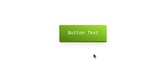
Check out the live demo in the playground.
9. Dual Transition on Hover
This button introduces a captivating dual-transition effect on hover. The transitions are controlled by the transition-all and duration classes, resulting in a seamless and polished button interaction.
<button class="group relative inline-flex items-center overflow-hidden rounded-full border-2 border-fuchsia-800 px-12 py-3 text-lg font-medium text-fuchsia-800 hover:bg-gray-50 hover:text-white">
    <span class="duration-400 ease absolute left-0 top-1/2 block h-0 w-full bg-fuchsia-800 opacity-100 transition-all group-hover:top-0 group-hover:h-full"></span>
    <span class="ease absolute right-0 flex h-10 w-10 translate-x-full transform items-center justify-start duration-500 group-hover:-translate-x-2">
      <svg class="h-5 w-5" fill="none" stroke="currentColor" viewBox="0 0 24 24" xmlns="http://www.w3.org/2000/svg"><path stroke-linecap="round" stroke-linejoin="round" stroke-width="2" d="M14 5l7 7m0 0l-7 7m7-7H3"></path></svg>
    </span>
    <span class="relative transform duration-700 group-hover:-translate-x-3">Button Text</span>
</button>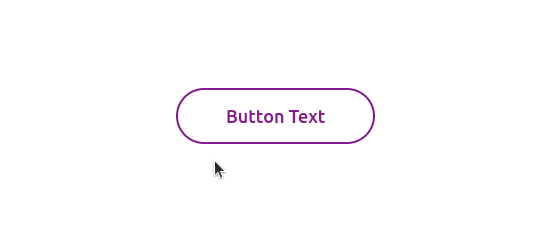
Check out the live demo in the playground.
10. 3D Effect with Border Transitions
This button showcases a sophisticated 3D effect with intricate border transitions. The transitions are achieved through the transition and ease-out classes, resulting in a visually intriguing and polished button interaction.
<button class="group relative px-6 py-3 text-black">
    <span class="absolute inset-0 h-full w-full -translate-x-2 -translate-y-2 transform bg-red-200 transition duration-300 ease-out group-hover:translate-x-0 group-hover:translate-y-0"></span>
    <span class="absolute z-[1] h-full w-full -translate-x-8 -translate-y-5 border-b-2 border-e-2 border-white group-hover:border-none"></span>
    <span class="absolute inset-0 h-full w-full translate-x-2 translate-y-2 transform border-s-2 border-t-2 border-white bg-red-200 transition duration-300 ease-out group-hover:translate-x-0 group-hover:translate-y-0"></span>
    <span class="absolute inset-0 z-[1] h-full w-full border-2 border-black"></span>
    <span class="relative">Button Text</span>
</button>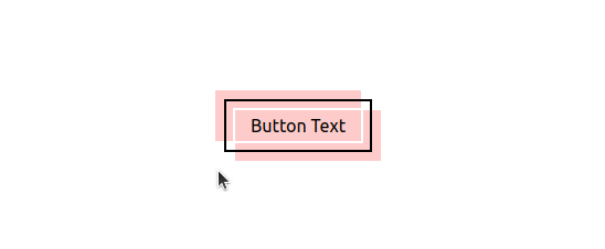
Check out the live demo in the playground.
11. Gradient Hover with Ring and Shadow Effect
This button incorporates a seamless gradient transition on hover, smoothly shifting from a solid gray background to a gradient from gray to a lighter shade. The transition effects are achieved through the transition-all and duration classes, enhancing the overall aesthetic appeal.
<button class="group relative overflow-hidden rounded bg-gray-600 px-8 py-4 text-white transition-all duration-300 ease-out hover:bg-gradient-to-r hover:from-gray-600 hover:to-gray-400 hover:ring-2 hover:ring-gray-600 hover:ring-offset-2">
    <span class="ease absolute right-0 -mt-12 h-32 w-8 translate-x-12 rotate-12 transform bg-white opacity-10 transition-all duration-700 group-hover:-translate-x-40"></span>
    <span class="relative">Button Text</span>
</button>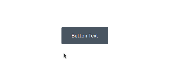
Check out the live demo in the playground.
12. Dotted Border Toggle on Hover
This button’s transitions are controlled by the transition and ease-out classes, resulting in a smooth and polished button interaction. The text color also smoothly transitions from black to white during the hover state, enhancing the overall dynamic feel.
<button class="group relative inline-block px-4 py-2 font-medium">
    <span class="absolute inset-0 h-full w-full translate-x-1 translate-y-1 transform border-2 border-dotted border-black bg-black transition duration-200 ease-out group-hover:-translate-x-1 group-hover:-translate-y-1 group-hover:bg-white"></span>
    <span class="absolute inset-0 h-full w-full border-2 border-dotted border-black bg-white group-hover:bg-black"></span>
    <span class="relative text-black group-hover:text-white">Button Text</span>
</button>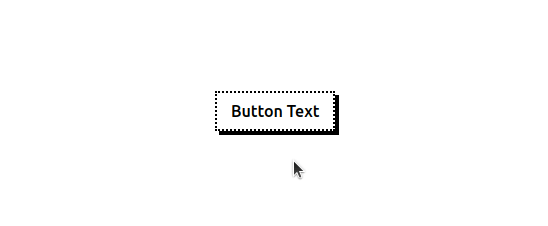
Check out the live demo in the playground.
13. Colorful Blooms on Hover
This button unfolds a mesmerizing effect, resembling blooming flowers. The transitions are orchestrated using the transition and duration classes, ensuring a smooth and delightful experience.
<button class="group relative inline-block items-center justify-center overflow-hidden rounded-lg px-8 py-5 font-medium text-indigo-600 shadow-2xl">
    <span class="ease absolute left-0 top-0 -ml-3 -mt-10 h-40 w-40 rounded-full bg-red-500 blur-md transition-all duration-700"></span>
    <span class="ease absolute inset-0 h-full w-full transition duration-700 group-hover:rotate-180">
      <span class="absolute bottom-0 left-0 h-24 w-24 rounded-full bg-purple-500 blur-md"></span>
      <span class="absolute bottom-0 right-0 h-24 w-24 rounded-full bg-blue-600 blur-md"></span>
      <span class="absolute bottom-0 right-0 h-24 w-24 rounded-full bg-sky-500 blur-md"></span>
      <span class="absolute bottom-0 right-0 h-24 w-24 rounded-full bg-green-500 blur-md"></span>
      <span class="absolute bottom-0 right-0 -mr-10 h-24 w-24 rounded-full bg-orange-500 blur-md"></span>
      <span class="absolute bottom-0 right-0 -mr-20 h-24 w-24 rounded-full bg-red-500 blur-md"></span>
    </span>
    <span class="relative text-white">Button Text</span>
</button>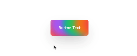
Check out the live demo in the playground.
14. Slide and Unveil on Hover
This button features a sophisticated effect where, upon hovering, the text container smoothly slides to reveal a gradient background. The transitions are orchestrated using the transition and duration classes, ensuring a seamless and polished button interaction.
<button class="group relative inline-block font-mono text-lg">
    <span class="relative z-10 block overflow-hidden rounded-lg border border-blue-900 px-5 py-3 font-medium leading-tight text-blue-800 transition-colors duration-300 ease-out group-hover:border-transparent group-hover:text-white">
      <span class="absolute inset-0 h-full w-full rounded-lg bg-blue-50 px-5 py-3"></span>
      <span class="ease absolute left-0 -ml-2 h-48 w-48 origin-top-right -translate-x-full translate-y-12 -rotate-90 bg-gradient-to-br from-blue-500 to-blue-900 transition-all duration-300 group-hover:-rotate-180"></span>
      <span class="relative">Button Text</span>
    </span>
    <span class="absolute bottom-0 right-0 -mb-1 -mr-1 h-12 w-full rounded-lg bg-blue-900 transition-all duration-200 ease-linear group-hover:mb-0 group-hover:mr-0 group-hover:bg-transparent" data-rounded="rounded-lg"></span>
</button>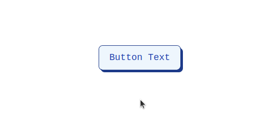
Check out the live demo in the playground.
15. Slide and Icon Transition on Hover
This button incorporates a sleek effect where, upon hovering, the text container smoothly slides to reveal a background color change. The transitions are orchestrated using the transition and duration classes, ensuring a seamless and polished button interaction.
<button class="group relative inline-flex items-center justify-start overflow-hidden rounded bg-indigo-50 py-3 pl-6 pr-16 font-semibold text-indigo-600 transition-all duration-150 ease-in-out hover:pl-16 hover:pr-6">
    <span class="absolute bottom-0 left-0 h-1 w-full bg-indigo-600 transition-all duration-150 ease-in-out group-hover:h-full"></span>
    <span class="absolute right-0 pr-7 duration-200 ease-out group-hover:translate-x-12">
      <svg class="h-5 w-5 text-green-400" fill="none" stroke="currentColor" viewBox="0 0 24 24" xmlns="http://www.w3.org/2000/svg"><path stroke-linecap="round" stroke-linejoin="round" stroke-width="2" d="M14 5l7 7m0 0l-7 7m7-7H3"></path></svg>
    </span>
    <span class="absolute left-0 -translate-x-12 pl-7 duration-200 ease-out group-hover:translate-x-0">
      <svg class="h-5 w-5 text-green-400" fill="none" stroke="currentColor" viewBox="0 0 24 24" xmlns="http://www.w3.org/2000/svg"><path stroke-linecap="round" stroke-linejoin="round" stroke-width="2" d="M14 5l7 7m0 0l-7 7m7-7H3"></path></svg>
    </span>
    <span class="relative w-full text-left transition-colors duration-200 ease-in-out group-hover:text-white">Button Text</span>
</button>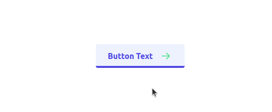
Check out the live demo in the playground.
16. Skewing Background on Hover
This button’s skewing effect is controlled by the transition-all, duration-300, and ease-out classes, resulting in a polished and seamless button interaction. The text color also transforms to yellow during the hover state, enhancing the overall modern and vibrant feel.
<button class="group relative px-7 py-2 font-medium text-white hover:text-yellow-900">
    <span class="absolute inset-0 h-full w-full translate-x-0 -skew-x-12 transform bg-yellow-400 transition-all duration-300 ease-out group-hover:skew-x-0 group-hover:bg-yellow-700"></span>
    <span class="absolute inset-0 h-full w-full skew-x-12 transform bg-yellow-700 transition-all duration-300 ease-out group-hover:-skew-x-0 group-hover:bg-yellow-400"></span>
    <span class="relative">Button Text</span>
</button>
Check out the live demo in the playground.
17. Folding Corner and Slide on Hover
This button presents a dynamic effect where, upon hovering, the top-right corner smoothly folds, revealing a white triangular element. The transitions are orchestrated using the transition-all, duration, and ease-in-out classes, resulting in a polished and visually engaging button interaction.
<button class="group relative inline-flex items-center justify-start overflow-hidden rounded-xl bg-red-500 px-8 py-4 font-medium transition-all">
    <span class="absolute right-0 top-0 inline-block h-4 w-4 rounded bg-red-700 transition-all duration-500 ease-in-out group-hover:-mr-4 group-hover:-mt-4">
      <span class="absolute right-0 top-0 h-5 w-5 -translate-y-1/2 translate-x-1/2 rotate-45 bg-white"></span>
    </span>
    <span class="absolute bottom-0 left-0 h-full w-full -translate-x-full translate-y-full rounded-2xl bg-red-600 transition-all delay-200 duration-500 ease-in-out group-hover:mb-14 group-hover:translate-x-0"></span>
    <span class="relative w-full text-left text-white transition-colors duration-200 ease-in-out group-hover:text-white">Button Text</span>
</button>
Check out the live demo in the playground.
18. Dual Background Blend on Hover
This button features a captivating effect where, upon hovering, dual backgrounds seamlessly blend into view. The transitions are controlled by the transition and duration-300 classes, ensuring a smooth and polished button interaction.
<button class="group relative rounded-lg px-6 py-3 font-bold text-white">
    <span class="ease absolute inset-0 h-full w-full -translate-x-1 -translate-y-1 transform bg-blue-800 transition duration-300 group-hover:translate-x-0 group-hover:translate-y-0"></span>
    <span class="ease absolute inset-0 h-full w-full translate-x-1 translate-y-1 transform bg-yellow-700 mix-blend-screen transition duration-300 group-hover:translate-x-0 group-hover:translate-y-0"></span>
    <span class="relative">Button Text</span>
</button>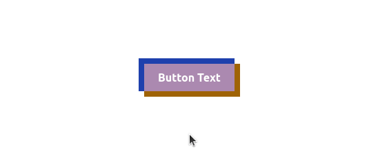
Check out the live demo in the playground.
19. Diagonal Slide and Gradient Hover
This button introduces a visually dynamic effect where, upon hovering, a diagonal gradient background elegantly slides into view from the bottom-left corner. The transitions are controlled by the transition-all, duration, and ease-out classes, resulting in a polished and engaging button interaction.
<button class="group relative inline-flex items-center justify-start overflow-hidden rounded bg-white px-6 py-3 font-medium transition-all hover:bg-white">
    <span class="absolute bottom-0 left-0 mb-9 ml-9 h-48 w-48 -translate-x-full translate-y-full rotate-[-40deg] rounded bg-gradient-to-br from-[#ff8a05] via-[#ff5478] to-[#ff00c6] transition-all duration-500 ease-out group-hover:mb-32 group-hover:ml-0 group-hover:translate-x-0"></span>
    <span class="relative w-full text-left text-black transition-colors duration-300 ease-in-out group-hover:text-white">Button Text</span>
</button>
Check out the live demo in the playground.
20. Gradient Reveal and Circle Expansion on Hover
This button showcases an elegant effect where, upon hovering, a gradient background gradually reveals itself from the top, creating a smooth transition effect. The transitions are controlled by the transition-all, duration-500, and ease-out classes, resulting in a polished and engaging button interaction.
<button class="group relative inline-flex items-center justify-center overflow-hidden rounded-lg bg-blue-800 px-10 py-4 font-mono font-medium tracking-tighter text-white">
    <span class="absolute h-0 w-0 rounded-full bg-green-500 transition-all duration-500 ease-out group-hover:h-56 group-hover:w-56"></span>
    <span class="absolute inset-0 -mt-0 h-full w-full rounded-lg bg-gradient-to-b from-transparent to-gray-700"></span>
    <span class="relative">Button Text</span>
</button>
Check out the live demo in the playground.
That’s it for today. Keep Animating! 👋
Conclusion
In the dynamic landscape of web design, the role of button effects extends far beyond mere aesthetics. The diversity showcased, from gradient fills and border inversions to sliding icons and 3D transformations, emphasizes the versatility of button effects.
So, experiment with these button effects, tailor them to your brand’s identity, and witness how the smallest details can make a significant difference. The world of button effects is expansive and ever-evolving, offering endless possibilities to create interfaces that not only meet but exceed user expectations.
To see the full demo of these captivating button effects in action, look at the playground and witness the artistry unfold.
Similar Articles


Whether you need...
- *High-performing mobile apps
- *Bulletproof cloud solutions
- *Custom solutions for your business.
