Next.js: How to validate forms on the server side using Zod
Introduction
In the fast-paced world of web development, form validation is a crucial aspect to ensure that the data submitted by users is accurate and secure.
Next.js, a popular React framework, provides a robust environment for building server-rendered applications.
In this post, we’ll explore how to implement server-side form validation using Zod, a powerful TypeScript-first schema declaration and validation library.
Now, Let’s get started! 🎯
Sponsored
Witness your goals unfold with each intentional habit, turning your ambitions into a reality with Justly.
Why Form Validation Matters?
Forms are a fundamental part of web applications, facilitating user interaction and data submission. However, the data entered by users is only sometimes reliable.
Client-side validation, executed on the user’s device, enhances the user experience by providing instant feedback. Despite its importance, relying solely on client-side validation leaves your application vulnerable to malicious or erroneous data submissions.
Server-side validation acts as a safeguard, ensuring that only validated and sanitized data reaches your server, thereby fortifying your application against potential security risks.
Prerequisites
Before we dive into the implementation, make sure you have the following prerequisites in place:
- A Next.js project set up.
- Basic knowledge of HTML, CSS, and Form.
Also, I have used tailwind CSS to style the form. so, it would be easy if you had a basic idea about it.
Setting up a Next.js Project
If you haven’t already, start by setting up a Next.js project. You can create one using the following commands:
npx create-next-app my-next-app
cd my-next-app
Installing Zod
Next, install Zod in your project using:
npm install zod       # npm
yarn add zod          # yarn
bun add zod           # bun
pnpm add zod          # pnpm
Building a Form Component
In the initial version, our primary objective is to establish a foundational structure for our Next.js application, featuring a basic form.
"use client";

import { useState } from "react";
import { TagsInput } from "react-tag-input-component";

export default function Home() {
  const [name, setName] = useState<string>("");
  const [email, setEmail] = useState<string>("");
  const [hobbies, setHobbies] = useState([]);

  const onSubmit = async (e: any) => {
    e.preventDefault();

    try {
      console.log(name, email, hobbies);
    } catch (error) {
      console.error(error);
    }
  };

  return (
    <main className="flex min-h-screen flex-col p-24">
      <div className="mb-6 flex gap-3 sm:items-center">
        <h2 className="text-2xl font-semibold text-black dark:text-white">
          Add User
        </h2>
      </div>
      <div className="rounded-sm border">
        <div className="border-b px-6 py-4">
          <h3 className="font-medium text-black dark:text-white">
            User Details
          </h3>
        </div>
        <form
          className="flex flex-col gap-10 p-10"
          method="post"
          onSubmit={onSubmit}
        >
          <div>
            <label className="mb-3 block text-sm font-medium text-black dark:text-white">
              Name <span className="text-red-500">*</span>
            </label>
            <input
              type="text"
              placeholder="Name"
              className="w-full rounded-lg border-[1.5px] px-5 py-3 text-black outline-none transition focus:border-blue-500 active:border-primary disabled:cursor-default disabled:bg-whiter dark:border-form-strokedark dark:bg-form-input dark:text-white dark:focus:border-primary"
              onChange={(e) => setName(e.target.value)}
            />
          </div>
          <div>
            <label className="mb-3 block text-sm font-medium text-black dark:text-white">
              Email <span className="text-red-500">*</span>
            </label>
            <input
              type="text"
              placeholder="Email"
              className="w-full rounded-lg border-[1.5px] px-5 py-3 text-black outline-none transition focus:border-blue-500 active:border-primary disabled:cursor-default disabled:bg-whiter dark:border-form-strokedark dark:bg-form-input dark:text-white dark:focus:border-primary"
              onChange={(e) => setEmail(e.target.value)}
            />
          </div>
          <div>
            <label className="mb-3 block text-sm font-medium text-black dark:text-white">
              Tags <span className="text-red-500">*</span>
            </label>
            <TagsInput
              value={hobbies}
              onChange={setHobbies}
              placeHolder="Write Your Hobbies Here"
            />
          </div>
          <div className="text-end">
            <button
              type="submit"
              className="h-10 w-32 rounded-md bg-blue-600 font-medium text-white"
            >
              Save
            </button>
          </div>
        </form>
      </div>
    </main>
  );
}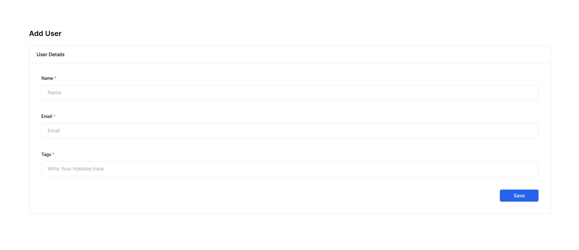
In this initial code, we set up a basic form component within a Next.js application. It uses the useState hook from React to manage state variables such as name, email, and hobbies.
The form includes fields for a user's name, email, and hobbies. The onSubmit function logs the entered values for testing purposes.
Adding Basic Zod Validation
In this section, our focus shifts towards fortifying our form with server-side validation using basic Zod validation.
Now next, let’s import Zod, a schema validation library for TypeScript. It utilizes the z object from Zod to define a schema that validates the form inputs.
const onSubmit = async (e: any) => {
  e.preventDefault();
  setIsLoading(true);

  try {
    // prepare validation rules for each field
    const mySchema = z.object({
      name: z.string().min(3),
      email: z.coerce.string().email().min(5),
      hobbies: z
        .array(z.string().min(2))
        .min(1, { message: "Hobbies is required" }),
    });

    // validate form data
    mySchema.parse({
      name: name,
      email: email,
      hobbies: hobbies,
    });

    setErrors([]);
  } catch (error) {
    console.error(error);
  }
};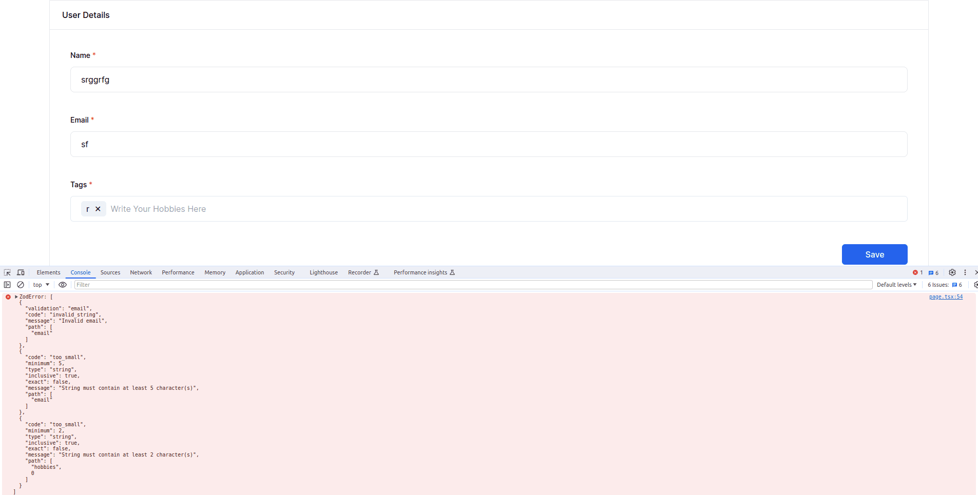
The onSubmit function is modified to use this schema for validation. If the validation succeeds, the errors state is cleared, and if it fails, the errors are logged to the console.
Displaying Validation Errors
Building upon the foundation laid in the above section, this iteration aims to enhance the user interface by providing real-time feedback on validation errors.
Validate and Refine Errors
Now, let’s initialize the errors state using useState to manage and display validation errors.
const [errors, setErrors] = useState<any[]>([]);
const [isLoading, setIsLoading] = useState<boolean>(false);

const onSubmit = async (e: any) => {
  e.preventDefault();
  setIsLoading(true);

  try {
    const mySchema = z.object({
      name: z.string().min(3),
      email: z.coerce.string().email().min(5),
      hobbies: z
        .array(z.string().min(2))
        .min(1, { message: "Hobbies is required" }),
    });

    // store validation response
    const response = mySchema.safeParse({
      name: name,
      email: email,
      hobbies: hobbies,
    });

    // refine errors
    if (!response.success) {
      let errArr: any[] = [];
      const { errors: err } = response.error;
      for (var i = 0; i < err.length; i++) {
        errArr.push({ for: err[i].path[0], message: err[i].message });
      }
      setErrors(errArr);
      throw err;
    }

    setErrors([]);
  } catch (error) {
    console.error(error);
  } finally {
    setIsLoading(false);
  }
};
Parsing the validation errors and transforming them into a more structured format to simplify handling and display.
🔴 Now it’s time to show errors.
Show Errors
So, in this code, we will enhance the user interface by displaying validation errors for each form field.
<form className="flex flex-col gap-10 p-10" method="post" onSubmit="{onSubmit}">
  <div>
    <label
      className="mb-3 block text-sm font-medium text-black dark:text-white"
    >
      Name <span className="text-red-500">*</span>
    </label>
    <input type="text" placeholder="Name" className="w-full rounded-lg border-[1.5px] px-5 py-3 text-black outline-none transition focus:border-blue-500 active:border-primary disabled:cursor-default disabled:bg-whiter dark:border-form-strokedark dark:bg-form-input dark:text-white dark:focus:border-primary"
      onChange={(e) => setName(e.target.value)} autoComplete="off" required />
    <div className="mt-1 text-xs text-red-500">
      {errors.find((error) => error.for === "name")?.message}
    </div>
  </div>
  <div>
    <label
      className="mb-3 block text-sm font-medium text-black dark:text-white"
    >
      Email <span className="text-red-500">*</span>
    </label>
    <input type="text" placeholder="Email" className="w-full rounded-lg border-[1.5px] px-5 py-3 text-black outline-none transition focus:border-blue-500 active:border-primary disabled:cursor-default disabled:bg-whiter dark:border-form-strokedark dark:bg-form-input dark:text-white dark:focus:border-primary"
      onChange={(e) => setEmail(e.target.value)} autoComplete="off" required />
    <div className="mt-1 text-xs text-red-500">
      {errors.find((error) => error.for === "email")?.message}
    </div>
  </div>
  <div>
    <label
      className="mb-3 block text-sm font-medium text-black dark:text-white"
    >
      Tags <span className="text-red-500">*</span>
    </label>
    <TagsInput
      value="{hobbies}"
      onChange="{setHobbies}"
      placeHolder="Write Your Hobbies Here"
    />
    <div className="mt-1 text-xs text-red-500">
      {errors.find((error) => error.for === "hobbies")?.message}
    </div>
  </div>
  <div className="text-end">
    <button
      type="submit"
      className="h-10 w-32 rounded-md bg-blue-600 font-medium text-white disabled:cursor-not-allowed disabled:opacity-30"
      disabled="{isLoading}"
    >
      {isLoading ? "Saving..." : "Save"}
    </button>
  </div>
</form>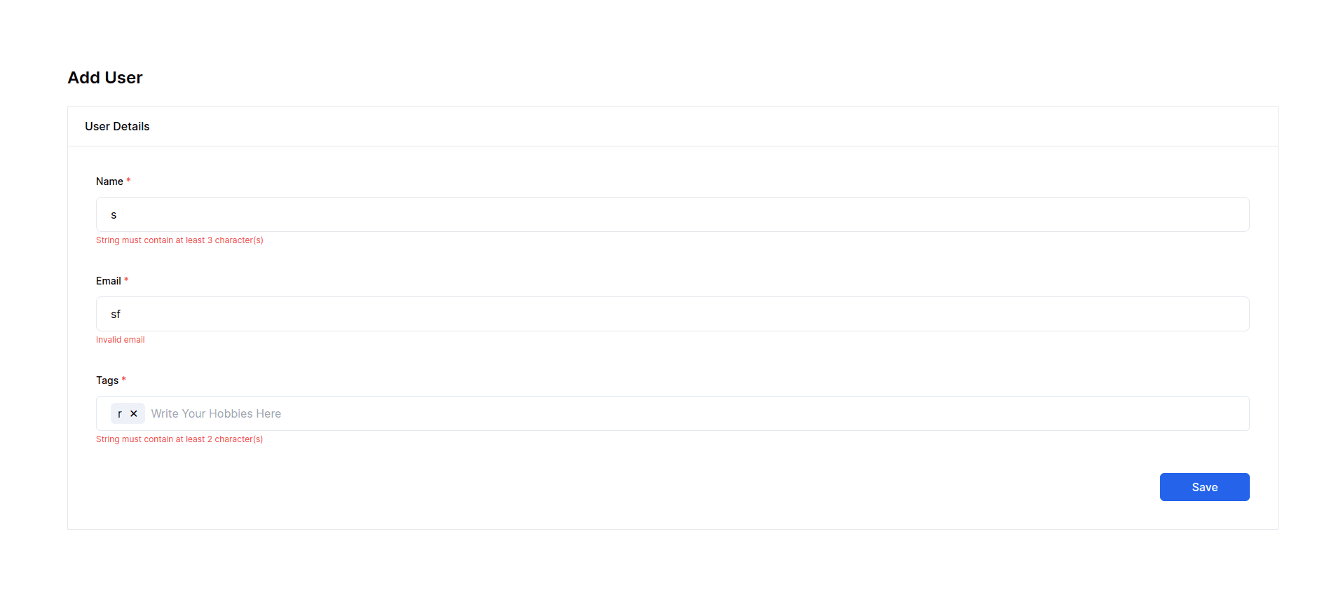
If there are validation errors, they are captured and stored in the errors state. The form fields are now equipped with error messages that dynamically appear below them, providing feedback to the user.
The submit button is also disabled and shows a "Saving..." message when the form is being processed to prevent multiple submissions.
Show Success Popup
In this iteration, our focus shifts towards enhancing the user experience by incorporating a successful popup feature.
"use client";

import { useState } from "react";
import { z } from "zod";
import { TagsInput } from "react-tag-input-component";

export default function Home() {
  // already defined stats

  const [success, setSuccess] = useState<boolean>(false);

  const onSubmit = async (e: any) => {
    e.preventDefault();
    setIsLoading(true);

    try {

      /* current error handling code */

      // set success `true` to show popup
      setSuccess(true);
    } catch (error) {
      console.error(error);
    } finally {
      setIsLoading(false);
    }
  };

  const closeSuccessPopup = () => {
    // set success `false` to hide popup
    setSuccess(false);
  };

  return (
    <main className="flex min-h-screen flex-col p-24">
    {/* Form code */}
    {/* Success Popup */}
    {success && (
      <div className="fixed top-0 left-0 w-full h-full flex items-center justify-center bg-black bg-opacity-50">
        <div className="bg-white p-8 rounded-md text-center">
          <p className="text-green-500 text-lg font-semibold mb-4">
            Data Successfully Saved!
          </p>
          <button
            className="bg-blue-600 text-white px-4 py-2 rounded-md"
            onClick={closeSuccessPopup}>
            Close
          </button>
        </div>
      </div>
    )}
    </main>
  );
}
The onSubmit function has been extended to simulate the data insertion or API call process. Once the submission is successful, the success state is set to true. The form fields and errors are then cleared to prepare for potential new entries.
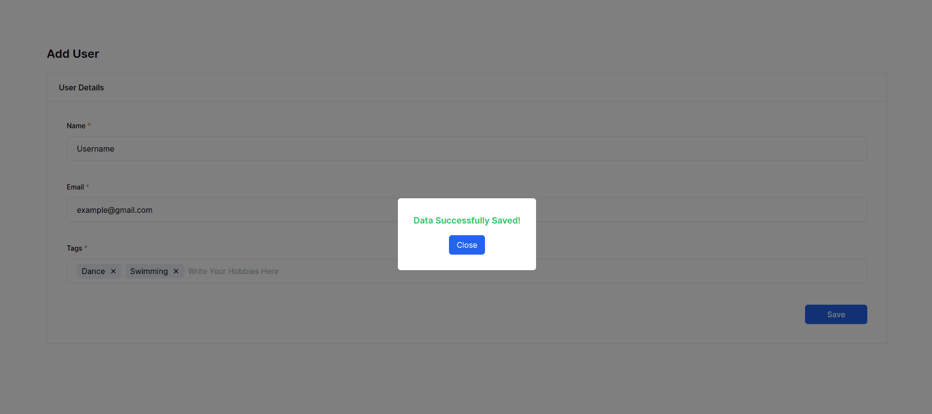
This success popup is implemented as a modal overlay with a semi-transparent background, ensuring that it captures the user’s attention without obstructing the entire view. It contains a success message and a button to close the popup.
The close button triggers the closeSuccessPopup function, updating the success state to false and hiding the success popup.
The complete source code — Next Js: Server Side Validation Using Zod
That’s it for today. Keep Coding! 👋
Conclusion
Implementing server-side form validation adds an extra layer of security to your application. we’ve not only implemented robust server-side validation but also considered the user interface’s responsiveness and feedback mechanisms.
With each iteration, we refined the user interface, providing real-time feedback to users through dynamic error messages. These messages guide users in correcting their inputs and contribute to a more intuitive and responsive form-filling experience.
To further enhance user satisfaction, we introduced a success popup to acknowledge successful form submissions. This visual cue assures users that their data has been successfully saved, contributing to an overall positive user experience.
Remember to customize the schema according to your specific form requirements.
Happy coding! 🤖
Related Articles

