React Component library with Storybook + Anima
Introduction
Components are the building blocks of your website. They should be efficiently reusable to improve development speed and consistency.
To streamline your web design process and create visually appealing user interfaces, it’s essential to have a robust component library in place.
In this blog post, we’ll walk you through the process of building a component library with Anima and Storybook. In just a few steps, without code, you will have a ready-to-use component library for your website.
Sponsored
We are what we repeatedly do. Excellence, then, is not an act, but a habit. Try out Justly and start building your habits today!
Storybook and Anima
Before diving into the details, let’s briefly introduce the two core tools we’ll be using in this tutorial:
- Storybook: Storybook is a tool for developing and documenting UI components. It provides an interactive environment where you can build, view, and test individual components in isolation. Storybook is widely used in the industry to create and maintain component libraries.
- Anima: It is a design-to-code platform that allows designers to convert their design files directly into responsive code. It helps bridge the gap between design and development, making it easier to create web interfaces that match the original design.
Component library in React App
Install and set up the storybook
Navigate to the root directory of your react app and initialize the storybook using the below command,
npx sb initThe above command will do the following,
- Install the latest version of the storybook
- Add storybook scripts in package.json
- Create
storiesdirectory in thesrcfolder with a basic Button component
Note — You can change the location of
storiesand also rename it. Make sure you are updating the path inside.storybook/main.tsfile’s stories field.
Setting up Anima
Prerequisites — Logged in on Anima
For creating a Figma design to React code, we will use Anima with the React plugin in Figma.
Steps to set anima with react in Figma
- Open your design in Figma (Create an account on Figma if you don't have one and start with the basic button design).
- Turn on developer mode from the right corner of the header in Figma, you will see options like inspect and plugins
- Select Anima — Figma to React, HTML (React, HTML in DevMode) plugin and run it
- Login to Anima and you will have a running anima plugin
- Click on your design (i.e. Button) for which you want to create a component. This will create the source code of the selected section
- Click on
download selectionto download the code
Add component in the storybook
Now it is time to create reusable components with storybooks, which you can use in your website or web application.
Steps to include anima component in storybook
- Extract the downloaded anima code.
- Drop all the files and folders from the
stories(created at step 1) of your project - Copy
<anima-code-directory>/src/components/<component-name — i.e. Button>to the stories.
Note — If you are using typescript, covert files to typescript.
Directory structure
- <component-name>.js — This file includes the source code of the component
- <component-name>.stories.js — This file includes an example of a storybook for a given component
- index.js — The main file of the component
- style.css — Styles created with anima. You can change it as per your preferences
Example of Button component from Anima
/*
We're constantly improving the code you see.
Please share your feedback here: https://form.asana.com/?k=uvp-HPgd3_hyoXRBw1IcNg&d=1152665201300829
*/

import PropTypes from "prop-types";
import React from "react";
import "./style.css";

export const Btn = ({ className, divClassName, text = "Content" }) => {
  return (
    <button className={`btn ${className}`}>
      <div className={`content ${divClassName}`}>{text}</div>
    </button>
  );
};

Btn.propTypes = {
  text: PropTypes.string,
};
Customize component
You can customize components like adding click events or custom classes like below in the typescript,
import PropTypes from 'prop-types';
import { useEffect, useReducer } from 'react';
import './style.css';

interface Props {
  text?: string;
  state?: string; //'default' | 'hovered' | 'disabled'
  classes?: string;
  onClick?: any;
}

export const Button = ({
  text = 'Content',
  state = 'default',
  classes = '',
  onClick,
}: Props): JSX.Element => {
  const [stateProp, dispatch] = useReducer(reducer, {
    prevState: state,
    state,
  });

  useEffect(() => {
    dispatch({ type: 'default', newState: state });
  }, [state]);

  const handleClick = (e: any) => {
    if (state === 'disabled') return;
    onClick ? onClick(e) : '';
  };

  return (
    <button
      type="button"
      className={`btn content ${stateProp.state} ${classes}`}
      onMouseLeave={() => {
        dispatch({ type: 'mouse_leave', newState: stateProp.prevState });
      }}
      onMouseEnter={() => {
        dispatch({
          type: 'mouse_enter',
          newState: stateProp.state === 'disabled' ? 'disabled' : 'hovered',
        });
      }}
      onClick={handleClick}
    >
      {text}
    </button>
  );
};

function reducer(state: any, action: any) {
  switch (action.type) {
    case 'mouse_enter':
      return {
        prevState: state.state,
        state: action.newState,
      };
    case 'default':
      return {
        prevState: action.newState,
        state: action.newState,
      };
    case 'mouse_leave':
      return {
        state: state.prevState,
      };
  }

  return state;
}

Button.propTypes = {
  text: PropTypes.string,
  classes: PropTypes.string,
  state: PropTypes.oneOf(['default', 'hovered', 'disabled']),
  priority: PropTypes.oneOf(['primary', 'secondary']),
};
Run storybook
Run below command,
npm run storybookYou will be redirected to http://localhost:6006/ and You will see the components you created.
Create as many components as you need and you will have a library of reusable components.
Here is an example of a Button element we created,
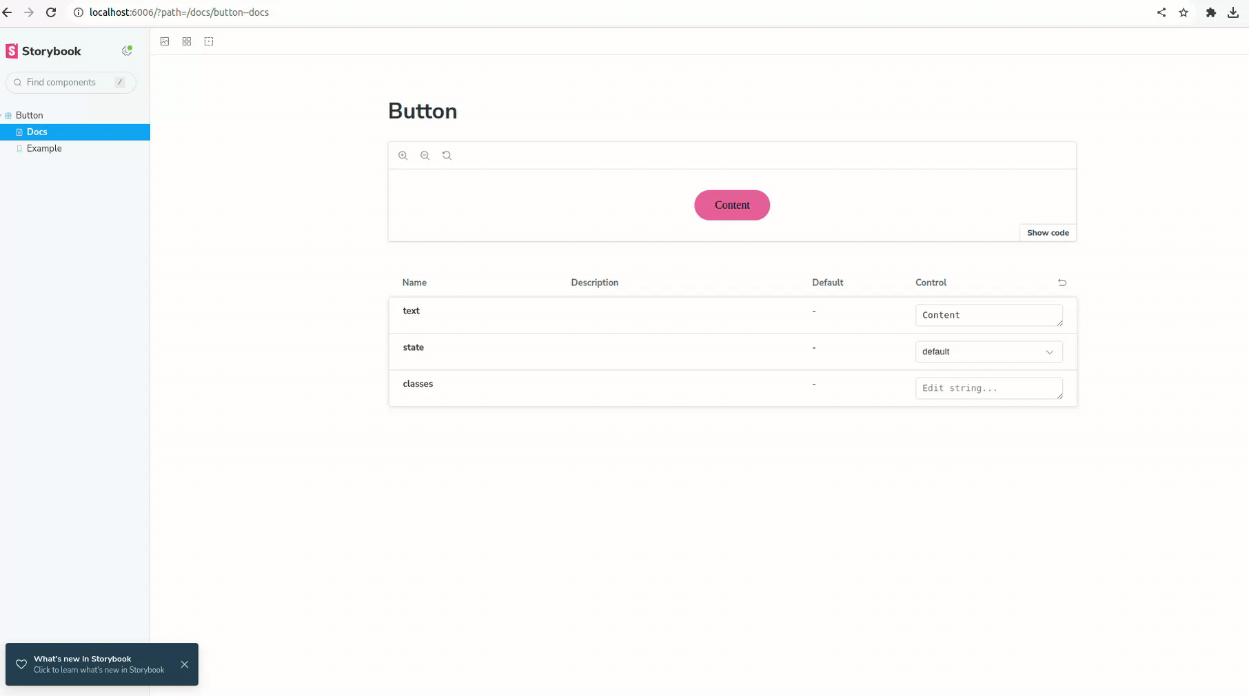
How to use these components?
You can use this component anywhere in the code as below,
import { Button } from "../stories/Button";

// define required properties
<Button state="hovered" text="Hello button"/>
Conclusion
By leveraging the power of design-to-code conversion with Anima and the interactive component development environment provided by Storybook, you can streamline your web development workflow and create beautiful, consistent components. As your library grows, continue to add new components and stories to keep it up-to-date and useful for your team.
We’re Grateful to have you with us on this journey!
Suggestions and feedback are more than welcome!
Please reach us at Canopas Twitter handle @canopassoftware with your content or feedback. Your input enriches our content and fuels our motivation to create more valuable and informative articles for you.
Keep exploring and growing!!
Related Articles

