Jetpack compose: Cool Button Click Effects
Background
Every component of the screen has its way of giving the user feedback when interacting with them. For example, when the user touches the Toggle button, it’ll change its state to respond to the interaction. This interaction gives a feel to the user.
In this blog, we’ll implement a few custom click effects to make your button clicks attractive.
By default, the button displays a ripple effect when it is touched. You can customize ripple color, alpha, etc.. as per your requirement, but that we’re not going to cover in this article. Yes, but we’ll learn a few ways to disable default ripple effects.
What we’re going to implement?
- Pulsate effect
- Press Effect
- Shake Effect
- Animate the shape on click
- 3 Ways to disable the default click effect
Let’s get started…
Sponsored
Pulsate effect
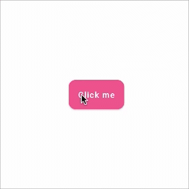
For this effect, we just need to change the scale of a button to give a nice bounce effect. Let’s see how
enum class ButtonState { Pressed, Idle }
fun Modifier.bounceClick() = composed {
    var buttonState by remember { mutableStateOf(ButtonState.Idle) }
    val scale by animateFloatAsState(if (buttonState == ButtonState.Pressed) 0.70f else 1f)

    this
        .graphicsLayer {
            scaleX = scale
            scaleY = scale
        }
        .clickable(
            interactionSource = remember { MutableInteractionSource() },
            indication = null,
            onClick = {  }
        )
        .pointerInput(buttonState) {
            awaitPointerEventScope {
                buttonState = if (buttonState == ButtonState.Pressed) {
                    waitForUpOrCancellation()
                    ButtonState.Idle
                } else {
                    awaitFirstDown(false)
                    ButtonState.Pressed
                }
            }
        }
}
Nothing fancy, just animated the scaling value based on the button state. Let’s apply this Modifier to the button.
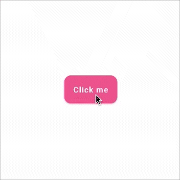
@Composable
fun PulsateEffect() {
    Button(onClick = {
        // clicked
    }, shape = RoundedCornerShape(12.dp),
        contentPadding = PaddingValues(16.dp),
        modifier = Modifier.bounceClick()) {
        Text(text = "Click me")
    }
}
Let me show you this cool effect that we’ve implemented in our live application — Justly.

Cool!!, isn’t it?
Let’s move to the next effect…
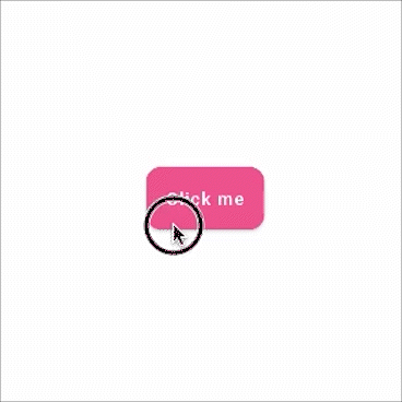
Press Effect
We’ll slightly move the button to give it a pressing effect.
enum class ButtonState { Pressed, Idle }
fun Modifier.pressClickEffect() = composed {
    var buttonState by remember { mutableStateOf(ButtonState.Idle) }
    val ty by animateFloatAsState(if (buttonState == ButtonState.Pressed) 0f else -20f)

    this
        .graphicsLayer {
            translationY = ty
        }
        .clickable(
            interactionSource = remember { MutableInteractionSource() },
            indication = null,
            onClick = {  }
        )
        .pointerInput(buttonState) {
            awaitPointerEventScope {
                buttonState = if (buttonState == ButtonState.Pressed) {
                    waitForUpOrCancellation()
                    ButtonState.Idle
                } else {
                    awaitFirstDown(false)
                    ButtonState.Pressed
                }
            }
        }
}
Nothing new, same as our previous effect, we’ve just animated tranlateY value on button state change.
@Composable
fun PressEffect() {
   Button(onClick = {
        //Clicked
    }, shape = RoundedCornerShape(12.dp), contentPadding = PaddingValues(16.dp),
        modifier = Modifier.pressClickEffect()) {
        Text(text = "Click me")
    }
}
And here’s the output
Shake Effect
The shaking effect is useful to show invalid interactions, for example, invalid data on the registration forms.
For shake, we just need to implement repeatable animation.
fun Modifier.shakeClickEffect() = composed {
    var buttonState by remember { mutableStateOf(ButtonState.Idle) }

val tx by animateFloatAsState(
        targetValue = if (buttonState == ButtonState.Pressed) 0f else -50f,
        animationSpec = repeatable(
            iterations = 2,
            animation = tween(durationMillis = 50, easing = LinearEasing),
            repeatMode = RepeatMode.Reverse
        )
    )
    this
        .graphicsLayer {
            translationX = tx
        }
        .clickable(
            interactionSource = remember { MutableInteractionSource() },
            indication = null,
            onClick = { }
        )
        .pointerInput(buttonState) {
            awaitPointerEventScope {
                buttonState = if (buttonState == ButtonState.Pressed) {
                    waitForUpOrCancellation()
                    ButtonState.Idle
                } else {
                    awaitFirstDown(false)
                    ButtonState.Pressed
                }
            }
        }
}
Here we’ve added repeatable animation to move the button 2 times for the shake effect.
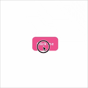
@Composable
fun ShakeEffect(){

    Button(onClick = {
        //Clicked
    }, shape = RoundedCornerShape(12.dp), contentPadding = PaddingValues(16.dp),
        modifier = Modifier.shakeClickEffect()) {
        Text(text = "Click me")
    }
}
And here’s the output — Shaking!!!
Animate the shape on click
For this effect, we’ll animate the view corner radius.
val interactionSource = remember { MutableInteractionSource() }
val isPressed = interactionSource.collectIsPressedAsState()
val cornerRadius by animateDpAsState(targetValue = if (isPressed.value) 10.dp else 50.dp)
Here we’ve used animateDpAsState API to animate radius dp value
Now, apply this radius to composable
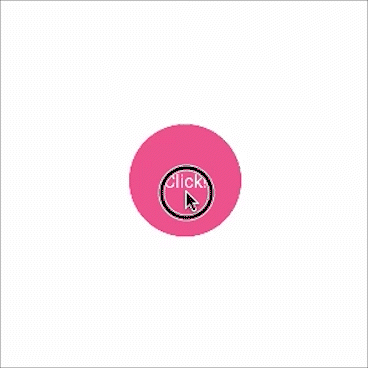
Box(
    modifier = Modifier
        .background(color = pink, RoundedCornerShape(cornerRadius))
        .size(100.dp)
        .clip(RoundedCornerShape(cornerRadius))
        .clickable(
            interactionSource = interactionSource,
            indication = rememberRipple()
        ) {
            //Clicked
        }
        .padding(horizontal = 20.dp),
    contentAlignment = Alignment.Center
) {
    Text(
        text = "Click!",
        color = Color.White
    )
}
Now the last thing, how to remove the default effect?
3 Ways to disable the default click effect
Here’s what the default click looks like,
1. Using Custom InteractionSource
InteractionSource represents a stream of Interactions corresponding to events emitted by a component. These Interactions can be used to change how components appear in different states, such as when a component is pressed or dragged.
class NoRippleInteractionSource : MutableInteractionSource {

    override val interactions: Flow<Interaction> = emptyFlow()

    override suspend fun emit(interaction: Interaction) {}

    override fun tryEmit(interaction: Interaction) = true
}
So here we have a return empty flow, which means the button will not react to the different click states such as button pressed or dragged.
How to use this custom InteractionSource? Button has interactionSource property.
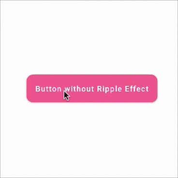
@Composable
fun NoRippleEffect1() {

    Button(
        onClick = {
            //Clicked
        },
        interactionSource = remember { NoRippleInteractionSource() },
        shape = RoundedCornerShape(12.dp),
        contentPadding = PaddingValues(16.dp),
    ) {
        Text(text = "Button without Ripple Effect")
    }
}
Check this output. You’ll have a button without any effect.
2. Removing visual effect by “indication”
Indication represents visual effects that occur when certain interactions happen.
For example: showing a ripple effect when a component is pressed, or a highlight when a component is focused.
The button doesn’t have an indication property so will create a custom button with Box composable.
@Composable
fun NoRippleEffect2() {
    Box(
        modifier = Modifier
            .height(height = 38.dp)
            .background(
                color = pink,
                shape = RoundedCornerShape(percent = 12)
            )
            .clickable(
                interactionSource = remember { MutableInteractionSource() },
                indication = null
            ) {
                //Clicked
            }
            .padding(horizontal = 20.dp),
        contentAlignment = Alignment.Center
    ) {
        Text(
            text = "Click me",
            color = Color.White
        )
    }
}
3. By using a Custom Ripple Theme
private object NoRippleTheme : RippleTheme {
    @Composable
    override fun defaultColor() = // Ripple color

    @Composable
    override fun rippleAlpha(): RippleAlpha = RippleAlpha(0.0f, 0.0f, 0.0f, 0.0f)
}
RippleAlpha defines the alpha of the ripple/state layer for different Interactions. We’ve added 0.0f for all the states, which means there’s no ripple effect. Apply the custom theme to the button using CompositionLocalProvider
@Composable
fun NoRippleEffect3() {
    CompositionLocalProvider(LocalRippleTheme provides NoRippleTheme) {
        Button(
            onClick = {
                //Clicked
            }, shape = RoundedCornerShape(12.dp),
            contentPadding = PaddingValues(16.dp)
        ) {
            Text(text = "Click me")
        }
    }
}
That’s it!!
The source code for this post can be found on GitHub or You can watch the implementation video of all the click effects on Youtube.
Video
Conclusion
So far we’ve learned a few custom button click effects. Buttons are an essential part of any application, it’s worth putting more effort to make your button more attractive and interactive. You can implement many such types of effects by using the Animation API of Jetpack compose.
I hope you found this blog post useful to you.
Thank you!!
Popular Articles

Let's Work Together
Not sure where to start? We also offer code and architecture reviews, strategic planning, and more.