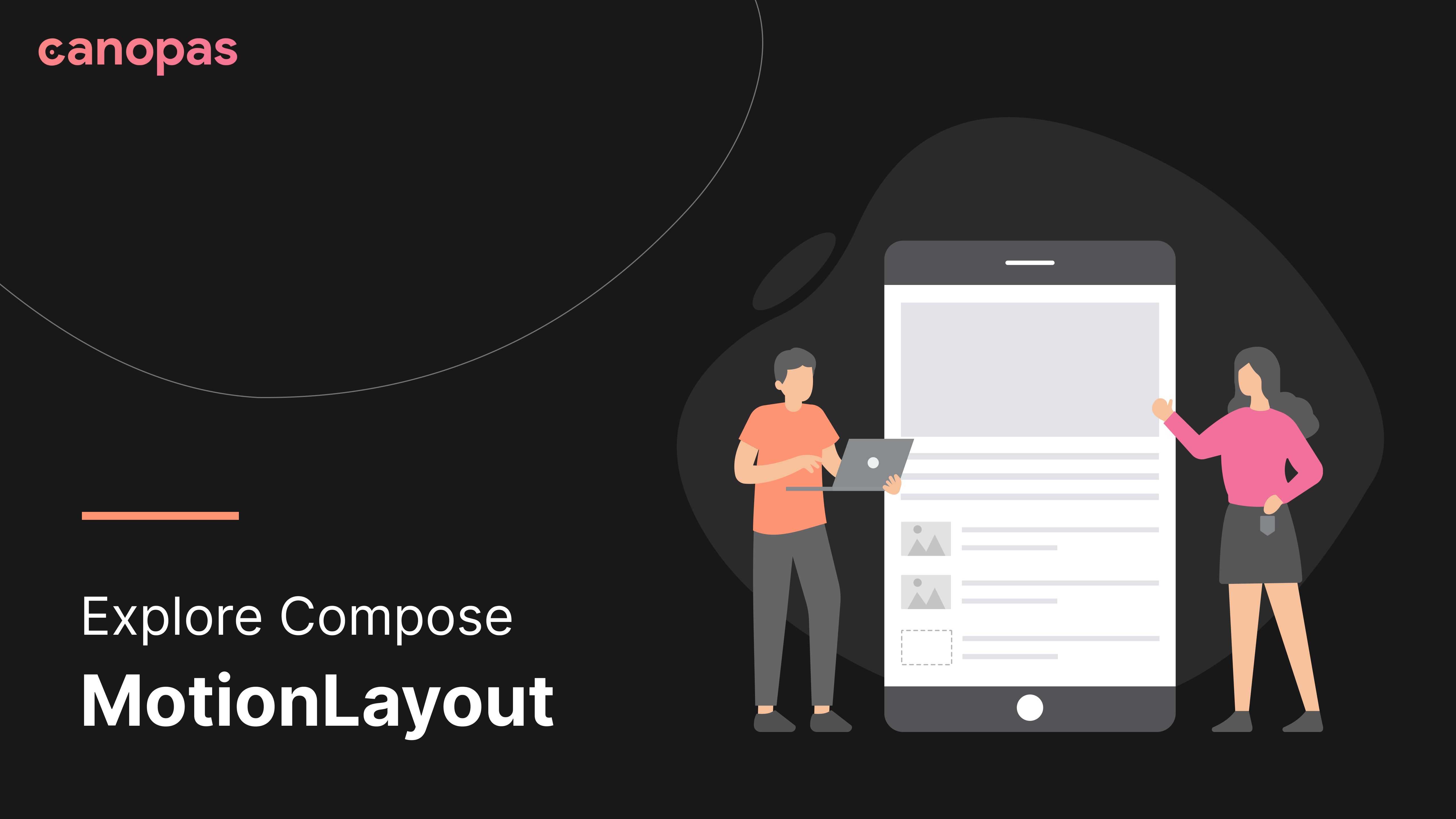
Explore Compose MotionLayout
Background
MotionLayout is a layout type that helps you to manage motion and widget animation in your app. As you’re here you may know a bit about MotionLayout.
MotionLayout is a subclass of ConstraintLayout. It is used to resize, move and animate views with which users interact.
In this article, we’ll explore Compose MotionLayout. We will implement a pretty cool UI with motion animation in Jetpack compose.
Currently MotionalLayout API in experimental state and it is likely to change.
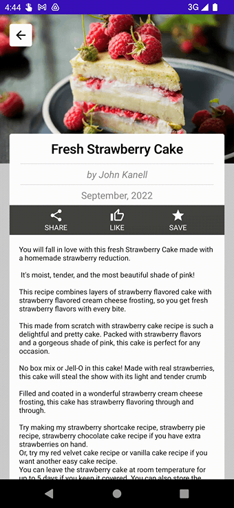
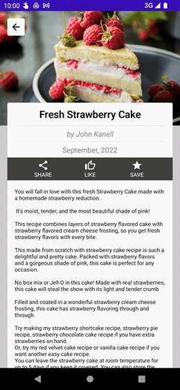
Here is what we’re going to implement in this blog post.
Not interested in implementation? Here’s the source code for you.
We’ll divide implementation into 4 simple steps to make each step easy to understand.
- Basic Setup
- Design UI and Apply constraint set to views
- Add swipe transition
- Add a custom property to change the background color
Sponsored
Let’s get started!
Basic Setup
Create a project with an empty jetpack compose activity.
Add the following dependency
implementation "androidx.constraintlayout:constraintlayout-compose:1.1.0-alpha03"Create Composable
Surface(
    modifier = Modifier.fillMaxSize(),
    color = MaterialTheme.colors.background
) {
    RecipeDetail()
}
MotionLayout for Compose takes on:
- Two ConstraintsSet (start & end), a Transition, and progress
- A MotionScene and motionLayoutState
We’re going to use MotionalLayout with MotionScene
Add MotionLayout in RecipeDetail
val motionState = rememberMotionLayoutState()

MotionLayout(
    motionScene = /* our motion scene json */,
    motionLayoutState = motionState,
    modifier = Modifier
        .fillMaxSize()
        .background(LightGray)
) { ... }
Add @OptIn(ExperimentalMotionApi::class) to RecipeDetail
Before going further let’s have a quick look at some important properties of MotionLayout
- MotionScene — Provides information for MotionLayout to animate between multiple ConstraintSets.
- MotionLayoutState — Read and manipulate the state of a MotionLayout Composable
Currently, MotionScene Only supports a JSON syntax.
See the official GitHub Wiki to learn the syntax.
Design UI and Apply constraint set to views
Create JSON file for motion scene at res/raw/motion_scene.json
{
  ConstraintSets: {
    start: {
      ....
    },
    end: {
      ....
    }
  }
}
Here’s the start contain all the constrain for the initial state of motion, and end include constraints for the final state.
Now add this JSON file content.
val context = LocalContext.current
val motionScene = remember {
    context.resources
        .openRawResource(R.raw.motion_scene)
        .readBytes()
        .decodeToString()
}

MotionLayout(
    motionScene = MotionScene(content = motionScene),
) { ... }
You can directly add motion scene string as content, but as the screen, the content grows it’s become complex, so to make it easy and clean we’ve used JSON.
Add a header image
Image(
    painter = painterResource(id = R.drawable.cake), contentDescription = "",
    contentScale = ContentScale.Crop,
    modifier = Modifier
        .layoutId("headerImage")

)
layoutId — The unique Id string assigned to the Composabletag — A string to represent a group of Composables that may be affected by a ConstraintLayout function.
Let’s add constrain set for a header image
start: {
  headerImage: {
    width: "spread",
    height: 250,
    top: ['parent', 'top', 0],
    start: ['parent', 'start', 0],
    end: ['parent', 'end', 0],
    translationY: 0,
    alpha: 1
  }
},
end: {
  headerImage: {
    width: "spread",
    height: 250,
    top: ['parent', 'top', 0],
    start: ['parent', 'start', 0],
    end: ['parent', 'end', 0],
    translationY: -250,
    alpha: 0.3,
  }
}
This defines the size of our header image, it’s top ,start and end constraints. Motion starts with translationY 0 and alpha 1, and at the end image translate to -250 with 0.3 alpha
Add a white background sheet
Box(
    modifier = Modifier
        .fillMaxHeight()
        .background(White, shape = RoundedCornerShape(topStart = corners, topEnd = corners))
        .layoutId("contentBg")
)
Define motion scene for this View.
start: {
  ...
  contentBg: {
    width: 'spread',
    height: 'spread',
    start: ['parent', 'start',16],
    end: ['parent', 'end',16],
    top: ['parent','top', 200],
    bottom: ['parent','bottom'],
  }
},
end: {
  ...
  contentBg: {
    width: 'spread',
    height: 'spread',
    start: ['parent', 'start'],
    end: ['parent', 'end'],
    top: ['parent','top'],
    bottom: ['parent','bottom'],
  }
Initially, this will set a 16dp margin horizontally and 200dp at the top. And at the end, the View fills the whole screen.
Add Title and subTitle with animated Divider
Text(
    text = "Fresh Strawberry Cake", fontSize = 22.sp,
    textAlign = TextAlign.Center,
    fontWeight = FontWeight.SemiBold, modifier = Modifier
        .layoutId("title")
        .fillMaxWidth()
        .padding(10.dp)
)

Divider(
    Modifier
        .layoutId("titleDivider")
        .fillMaxWidth()
        .padding(horizontal = 34.dp)
)

Text(
    text = "by John Kanell", fontSize = 16.sp,
    textAlign = TextAlign.Center,
    color = Gray, fontStyle = FontStyle.Italic,
    modifier = Modifier
        .layoutId("subTitle")
        .fillMaxWidth()
        .padding(6.dp)
)
Define constrain set
start: {
  title: {
    width: 'spread',
    height: 'wrap',
    start: ['parent', 'start'],
    end: ['parent', 'end'],
    top: ['parent','top',200],
  },
  titleDivider: {
    width: 'spread',
    height: 'wrap',
    start: ['parent', 'start'],
    end: ['parent', 'end'],
    top: ['title','bottom'],
  },
  subTitle: {
    width: 'spread',
    height: 'wrap',
    start: ['parent', 'start'],
    end: ['parent', 'end'],
    top: ['titleDivider','bottom'],
  },
  subTitleDivider: {
    width: 'spread',
    height: 'wrap',
    start: ['parent', 'start'],
    end: ['parent', 'end'],
    top: ['subTitle','bottom'],
  }
},
end: {
  title: {
    width: 'spread',
    height: 'wrap',
    start: ['parent', 'start'],
    end: ['parent', 'end'],
    top: ['parent','top', 6],
  },
  titleDivider: {
    width: 'spread',
    height: 'wrap',
    start: ['parent', 'start',34],
    end: ['parent', 'end', 34],
    top: ['title','bottom'],
  },
  subTitle: {
    width: 'spread',
    height: 'wrap',
    start: ['parent', 'start'],
    end: ['parent', 'end'],
    top: ['titleDivider','bottom'],
  },
  subTitleDivider: {
    visibility: 'gone',
    width: 'spread',
    height: 'wrap',
    start: ['parent', 'start'],
    end: ['parent', 'end'],
    top: ['subTitle','bottom'],
  }
}
Self-explanatory Right!!. For the title, we have set a 200dp initial Top margin and that becomes 6dp at the end, Same for the divider we have set up different margins for both states. Also, we’ve added visibility for subTitleDivider as we don’t need to show it when the sheet expands.
Add remaining UI elements
Text(
    modifier = Modifier
        .layoutId("date")
        .fillMaxWidth()
        .padding(6.dp),
    text = "September, 2022", fontSize = 16.sp,
    textAlign = TextAlign.Center,
    color = Gray
)
Row(
    modifier = Modifier
        .layoutId("actions")
        .background(Color.DarkGray),
    verticalAlignment = Alignment.CenterVertically,
    horizontalArrangement = Arrangement.SpaceEvenly,
) {
    ... // Three Icon buttons
}
Text(
    text = "Some long text...",
    modifier = Modifier.fillMaxHeight()
        .layoutId("text")
        .padding(horizontal = 16.dp),
    fontSize = 12.sp,
)
Define constrain set
start: {
  date: {
    width: 'spread',
    height: 'wrap',
    start: ['parent', 'start'],
    end: ['parent', 'end'],
    top: ['subTitleDivider','bottom'],
  },
  actions: {
    width: 'spread',
    height: 50,
    start: ['parent', 'start',16],
    end: ['parent', 'end',16],
    top: ['date','bottom'],
  },
  text: {
    width: 'spread',
    height: 'spread',
    start: ['parent', 'start',16],
    end: ['parent', 'end',16],
    top: ['actions','bottom', 16],
    bottom: ['parent','bottom']
  }
},
end: {
  date: {
    visibility: 'gone',
    width: 'spread',
    height: 'wrap',
    start: ['parent', 'start'],
    end: ['parent', 'end'],
    top: ['subTitleDivider','bottom'],
  },
  actions: {
    width: 'spread',
    height: 70,
    start: ['parent', 'start'],
    end: ['parent', 'end'],
    top: ['subTitle','bottom'],
  },
  text: {
    width: 'spread',
    height: 'spread',
    start: ['parent', 'start'],
    end: ['parent', 'end'],
    top: ['actions','bottom',16],
    bottom: ['parent','bottom'],
  }
}
Let’s run the app and check our UI
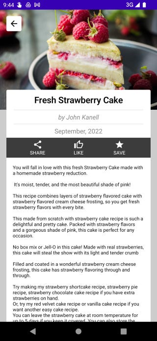
Cool!! Isn’t it?
Now Let’s make your content swipeable.
Add swipe transition
MotionLayout allows us to handle swiping with Transitions , which defines the interpolation parameters between two ConstraintSets. For more detail about Transition check out the official wiki
We’ll define onSwipe property in Transitions . OnSwipe allows controlling gestures with swiping.
The main properties of onSwipe are
anchor- The Composable you wish your finger to trackside- The side of the anchor is Composable your finger will trackdirection- direction of your motion
Let’s define it for our contentBg element
Transitions: {
  default: {
    from: 'start',
    to: 'end',
    onSwipe: {
      anchor: 'contentBg',
      direction: 'up',
      side: 'top'
    },
  }
}
That’s it and we’re done with transition.
Add a custom property to change the background color
Within constraints, we can set the custom property for UI elements.
start: {
   actions: {
     ...
     custom: {
       background: '#444444'
     }
  }
},
end{
   actions: {
      ...
     custom: {
         background: '#9b0024'
      }
   }
}
Now how to access this property?
val properties = motionProperties("actions")Let’s get color from this and set it to the View
Row(
    modifier = Modifier
        .layoutId("actions")
        .background(properties.value.color("background")),
) { ... }
Now run your application to see the output.

To Conclude
Motion Layout is currently an experimental API, so you may feel a bit complicated and not so useful, but it’s a potent tool. It becomes easy to handle complex motions with MotionLayout. Let’s wait for Experimental Tag to be removed from MotionLayout, till keep exploring it 🍻.
The source code for this post can be found on GitHub
Popular articles


Whether you need...
- *High-performing mobile apps
- *Bulletproof cloud solutions
- *Custom solutions for your business.
