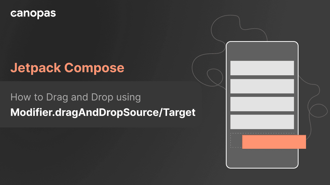
How to Drag and Drop using Modifier.dragAndDropSource/Target - Jetpack Compose
Background
A year ago, I discovered a workaround for enabling the drag-and-drop functionality in any part of the screen using Jetpack Compose. At the time, this feature wasn't natively supported in Jetpack Compose, that's why I had to come up with a way of doing it
My previous blog post on Jetpack Compose drag-and-drop garnered widespread developer attention. You can check it out here.
In January 2024, a significant Jetpack Compose update was introduced dragAndDropSource and dragAndDropTarget modifiers, simplifying drag-and-drop interactions compared to the manual approach I previously demonstrated.
This post revisits the original example, demonstrating how these modifiers enhance functionality with greater ease and efficiency.
What we'll achieve at the end of this blog?
You can find the full source code on GitHub
Sponsored
We are what we repeatedly do. Excellence, then, is not an act, but a habit. Try out Justly and start building your habits today!
Let's Get Started
We'll divide implementation into 4 simple steps to make each step easy to understand.
We're using the same example of the original post. Let's quickly have a look at our UI components.
1. Design Composable to Show Food Items
fun FoodItemCard(foodItem: FoodItem) {
    Card(
        elevation = CardDefaults.elevatedCardElevation(defaultElevation = 10.dp),
        colors = CardDefaults.elevatedCardColors(
            containerColor = Color.White,
        ), shape = RoundedCornerShape(24.dp),
        modifier = Modifier.padding(8.dp)
    ) {
        Row(
            verticalAlignment = Alignment.CenterVertically,
            modifier = Modifier.padding(10.dp)
        ) {
            Image(
                painter = painterResource(id = foodItem.image),
                contentDescription = null,
                contentScale = ContentScale.Crop,
                modifier = Modifier
                    .size(130.dp)
                    .clip(RoundedCornerShape(16.dp))

            )

            Spacer(modifier = Modifier.width(20.dp))
            Column(modifier = Modifier.weight(1f)) {
                Text(
                    text = foodItem.name,
                    fontSize = 22.sp,
                    color = Color.DarkGray
                )
                Spacer(modifier = Modifier.height(6.dp))
                Text(
                    text = "$${foodItem.price}",
                    fontSize = 18.sp,
                    color = Color.Black,
                    fontWeight = FontWeight.ExtraBold
                )
            }
        }
    }
}

LazyColumn(
    modifier = Modifier.fillMaxSize(),
    contentPadding = PaddingValues(horizontal = 10.dp)
) {
    items(items = foodList) { food ->
        FoodItemCard(foodItem = food)
    }
}
Here's our Food item card.

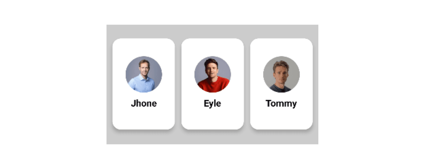
2. Composable to Show Users
Now, Let’s add composable to show Persons, we’ll show the profile image and the person’s name on the card.
@Composable
fun PersonCard(person: Person) {
        Column(
            modifier = Modifier
                .padding(6.dp)
                .shadow(elevation = 4.dp, shape = RoundedCornerShape(16.dp))
                .width(width = 120.dp)
                .fillMaxHeight(0.8f)
                .background(Color.White, RoundedCornerShape(16.dp)),
            verticalArrangement = Arrangement.Center,
            horizontalAlignment = Alignment.CenterHorizontally
        ) {
            Image(
                painter = painterResource(id = person.profile), contentDescription = null,
                modifier = Modifier
                    .size(70.dp)
                    .clip(CircleShape),
                contentScale = ContentScale.Crop
            )
            Spacer(modifier = Modifier.height(10.dp))
            Text(
                text = person.name,
                fontSize = 18.sp,
                color = Color.Black,
                fontWeight = FontWeight.Bold
            )
        }
}

// To show a list of users
LazyRow(
    modifier = Modifier
        .fillMaxHeight(0.3f)
        .fillMaxWidth()
        .background(Color.LightGray, shape = RoundedCornerShape(topEnd = 10.dp, topStart = 10.dp))
        .padding(vertical = 10.dp)
        .align(Alignment.BottomCenter),
    verticalAlignment = Alignment.CenterVertically,
    horizontalArrangement = Arrangement.Center
) {
    items(items = persons) { person ->
        PersonCard(person)
    }
}
And here’s the result:
3. Add Drag Source
Before we jump into implementation let’s have a quick look at the modifier
Modifier.dragAndDropSource
This Modifier in Jetpack Compose enables an element to become a source for drag-and-drop operations when applied to it.
@Composable
fun MyDraggableComponent() {
    Box(
        modifier = Modifier
            .size(100.dp)
            .background(Color.Blue)
            .dragAndDropSource(
                drawDragDecoration = {
                    // Provide visual representation of the dragged item
                }
            ) {
                // Logic to handle drag-and-drop operation
                startTransfer (/* data to transfer */ )
            }
    ) { /* Content of the draggable component*/ }
}Modifier.dragAndDropSourcetakes two parameters:drawDragDecorationandblock.drawDragDecorationis a lambda that provides the visual representation of the item being dragged during the drag-and-drop gesture.blockis a lambda that receives aDragAndDropSourceScopeas a receiver, which allows you to detect the drag gesture and handle the drag-and-drop operation.- Inside the block lambda, you can call
startTransferto initiate the drag-and-drop operation.
Pretty simple, Right?
Now, let's use the above Modifier for the Food image composable in our example.
Image(
    painter = painterResource(id = foodItem.image),
    contentDescription = null,
    contentScale = ContentScale.Crop,
    modifier = Modifier
        .size(130.dp)
        .dragAndDropSource {
            detectTapGestures(
                onLongPress = {
                    startTransfer(
                        // ... data to transfer
                    )
                }
            )
        }.clip(RoundedCornerShape(16.dp))
The startTransfer used to initiate a drag-and-drop session with the specified transferData.
Here, transferData carries the information to be shared in the drag-and-drop process.
For our example, this means dropping data related to a FoodItem onto a person's card.
private const val foodItemTransferAction = "action_foodItem"
private const val foodItemTransferData = "data_foofdItem"
...
startTransfer(
    DragAndDropTransferData(
        clipData = ClipData.newIntent(
            "foodItem",
            Intent(foodItemTransferAction).apply {
                putExtra(
                    foodItemTransferData,
                    Gson().toJson(foodItem)
                )
            },
        )
    )
Now our FoodItem's image becomes draggable.
4. Add Drop Target
It's time to set up the drop target to receive drop source data.
Let's have a quick look at our modifier.
Modifier.dragAndDropTarget
This Modifier in Jetpack Compose allows a composable to receive drag-and-drop events.
@Composable
fun MyDragTarget() {
    Box(
        modifier = Modifier
            .size(100.dp)
            .background(Color.Green)
            .dragAndDropTarget(
                shouldStartDragAndDrop = { startEvent-> return true },
                target =  object : DragAndDropTarget { ... }
            )
    ) { /*  Content of the drag target composable */ }
}
It takes two parameters:
shouldStartDragAndDrop: A lambda function that allows the composable to decide whether it wants to receive drag-and-drop events based on theDragAndDropEventthat started the session.target: TheDragAndDropTargetthat will receive below events for a given drag-and-drop sessiononDrop(event): This function is called when an item is dropped inside theDragAndDropTarget. Returningtrueindicates that theDragAndDropEventwas consumed, whilefalseindicates it was rejected.onStarted(event): This function is called when a drag-and-drop session is started, allowing setting the state for theDragAndDropTargetin preparation for consuming the session.onEntered(event),onMoved(event),onExited(event): These functions are called when an item being dropped enters, moves within, or exits the bounds of theDragAndDropTarget.onChanged(event): This function is called when an event in the current drag-and-drop session changes within theDragAndDropTargetbounds, such as when a modifier key is pressed or released.onEnded(event): This function is called when the drag-and-drop session is completed. AllDragAndDropTargetinstances in the hierarchy that previously received anonStartedevent will receive this event, allowing resetting of the state for theDragAndDropTarget.
When applied to a composable, these modifiers will make it a target for receiving drag-and-drop events.
All drag-and-drop target modifiers in the hierarchy will have an opportunity to participate in a given drag-and-drop session through the shouldStartDragAndDrop lambda.
In our example, PersonCard is the Drop target, so let's add this modifier.
fun PersonCard(person: Person) {
    // State to hold food items associated with the person
    val foodItems = remember { mutableStateMapOf<Int, FoodItem>() }
    Column(
        modifier = Modifier
             ....
            .background(Color.White, RoundedCornerShape(16.dp))
            .dragAndDropTarget(
                shouldStartDragAndDrop = { event ->
                    // Check if the drag-and-drop event contains text intent mime type
                    event.mimeTypes().contains(ClipDescription.MIMETYPE_TEXT_INTENT)
                },
                target = object : DragAndDropTarget {
                    override fun onDrop(event: DragAndDropEvent): Boolean {
                       // Extract food item from the drag-and-drop event and add it to the state
                        val foodItem = event.toAndroidDragEvent().clipData.foodItem() ?: return false
                        foodItems[foodItem.id] = foodItem
                        return true
                    }
                }
            ),
        verticalArrangement = Arrangement.Center,
        horizontalAlignment = Alignment.CenterHorizontally
    ) { // Content of the PersonCard composable }

private fun ClipData.foodItem(): FoodItem? {
    return (0 until itemCount)
        .mapNotNull(::getItemAt).firstNotNullOfOrNull { item ->
            item.intent?.getStringExtra(foodItemTransferData)?.takeIf { it.isNotEmpty() }
        }?.let { Gson().fromJson(it, FoodItem::class.java) }
}
Inside the onDrop function, we're extracting the food item from the drag-and-drop event and adding it to the foodItems state.
Let's see what it looks like,
Now, we want the drop target to change its color when the source is in the bound. It's pretty simple, just have to listen onEntered and onExited events and we're done.
@OptIn(ExperimentalFoundationApi::class)
@Composable
fun PersonCard(person: Person) {
   var bgColor by remember { mutableStateOf(Color.White) }

    Column(
        modifier = Modifier
            ....
            .background(bgColor, RoundedCornerShape(16.dp))
            .dragAndDropTarget(
                shouldStartDragAndDrop = { event -> ... },
                target = object : DragAndDropTarget {
                    override fun onDrop(event: DragAndDropEvent): Boolean {
                        ...
                        bgColor = Color.White
                        return true
                    }

                    override fun onEntered(event: DragAndDropEvent) {
                        super.onEntered(event)
                        bgColor = Color.Red
                    }

                    override fun onExited(event: DragAndDropEvent) {
                        super.onExited(event)
                        bgColor = Color.White
                    }

                }
            ),
) { /* Content of the PersonCard composable */ }You can find the full source code on GitHub.
Conclusion
In conclusion, the introduction of the dragAndDropTarget and dragAndDropSource modifiers in Jetpack Compose simplifies the addition of drag-and-drop features.
This streamlined process is a significant improvement over the previous method, showcasing Jetpack Compose's commitment to enhancing developer experiences. Consider incorporating these modifiers into your projects for a more interactive and enjoyable user experience.
Happy coding! 🚀✨
Useful Articles

Get started today
Let's build the next
big thing!
Let's improve your business's digital strategy and implement robust mobile apps to achieve your business objectives. Schedule Your Free Consultation Now.
Get Free Consultation
Get started today
Let's build the next big thing!
Let's improve your business's digital strategy and implement robust mobile apps to achieve your business objectives. Schedule Your Free Consultation Now.
Get Free Consultation