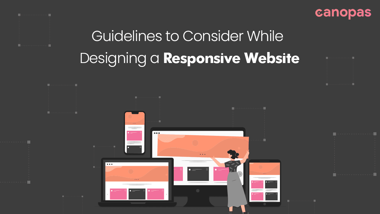
Guidelines for Designing a Responsive Website
Introduction
Won’t it make you thrilled to design a page that fits in all devices?
In today’s digital age, the internet is accessible from a multitude of devices, ranging from smartphones and tablets to desktop computers and even smart TVs.
As a web developer, it’s your responsibility to ensure that the websites you create are not only visually appealing but also functional on all screen sizes. This is where responsive web design comes into play. It is important because it ensures that users have a consistent experience no matter what device they are using.
In this blog, we’ll explore the concept of responsive web design and discuss best practices for building websites that adapt seamlessly to various devices and screen resolutions.
Sponsored
We are what we repeatedly do. Excellence, then, is not an act, but a habit. Try out Justly and start building your habits today!
Understanding Responsive Web Design
Responsive web design is an approach that aims to make web pages render well on different devices and window or screen sizes. The primary goal is to ensure that users have a consistent and user-friendly experience regardless of the device they are using to access a website.
One example of responsive design excellence is Apple’s website. Whether you visit it on a large desktop screen or a small smartphone screen, the layout and content adapt seamlessly to provide an optimal user experience.
Best Practices:
- Mobile-First Approach: Start designing for mobile devices first and then progressively enhance the design for larger screens. Prioritize content and features that are essential for mobile users.
- Content Prioritization: Identify the most critical content for each screen size and make sure it’s prominently displayed. This helps maintain a streamlined user experience on smaller screens.
- Fluid Layouts: Create fluid and flexible layouts that can adapt to different screen sizes without breaking or becoming unreadable.
Mobile-First Approach
One key strategy in responsive web design is the “mobile-first” approach. This philosophy suggests that you should design for mobile devices first and then progressively enhance the design for larger screens.
A classic example of the mobile-first approach is Google Search. The search page is designed with mobile users in mind, emphasizing simplicity and ease of use. It extends well to larger screens without losing functionality.
Best Practices:
- Simplify Navigation: On mobile, focus on simple and intuitive navigation menus, such as hamburger menus. Avoid overwhelming users with too many options.
- Touch-Friendly Elements: Ensure that buttons and interactive elements are large enough and spaced adequately to be easily tapped with a finger. Consider touch gestures and interactions.
- Performance Optimization: Optimize for mobile performance by minimizing HTTP requests, compressing assets, and using lazy loading for images and media.
Loading images as per the container size will minimize the loading time, instead of loading off-size images for smaller containers.
Viewport and Media Queries
Responsive web design relies heavily on CSS media queries and viewport meta tags. Media queries allow you to conditionally apply CSS styles based on characteristics such as screen width, height, or device orientation.
However, If you don’t want to go with media queries(manual approach) you can go with the progressive CSS frameworks like Tailwind CSS or Bootstrap.
The New York Times website is a prime example of a site that uses media queries effectively. As you resize the browser window, you’ll notice changes in the number of columns, font sizes, and image sizes — all thanks to responsive design techniques!
Best Practices:
- Use Relative Units: Use relative units like percentages and ems for responsive design elements. This ensures that content scales proportionally with the screen size.
- Mobile-First Media Queries: Start with mobile-specific styles and use media queries to progressively enhance layouts for larger screens.
Try following standard resolutions for media queries, rather than defining your own. - Test Multiple Resolutions: Test your website on a range of devices and screen resolutions to ensure that media queries trigger the appropriate styles at the right breakpoints.
Flexible Grid Systems
To create responsive layouts, web designers often use flexible grid systems like CSS Grid and Flexbox. These technologies allow for the creation of dynamic, adaptable page structures.
Smashing Magazine’s website is an excellent example. It employs a flexible grid system using CSS Grid and Flexbox to create a responsive layout. The website’s grid adjusts gracefully as you resize the browser, ensuring a clean and user-friendly design.
Best Practices:
- Grid Planning: Plan your grid layout carefully, considering the content’s hierarchy and how it will flow on different screens.
- Flexibility with Flexbox: Learn how to use Flexbox for complex layouts, especially when dealing with content that may vary in size or importance.
However, don’t forget to verify whether your browser(generally older ones) supports Flexbox properties or not. - CSS Grid Fallbacks: Provide fallback styles for browsers that do not support CSS Grid to ensure a consistent experience for all users.
Images and Media for Different Devices
Responsive design isn’t limited to layout and typography. It also extends to images and media. To ensure fast loading times and optimal image quality, responsive websites serve appropriately sized images based on the user’s device.
Airbnb, for instance, excels in this aspect. The platform serves smaller image files for faster loading on mobile devices with smaller screens, while high-quality images are delivered to showcase accommodations effectively on larger screens.
Best Practices:
- Use Responsive Images: Employ responsive image techniques, such as the
srcsetattribute, to deliver appropriately sized images based on the user's device and screen size. - Lazy Loading: Implement lazy loading for images and media to improve page load times. Load media as the user scrolls to conserve bandwidth.
- Optimize Image Formats: Choose the right image format (e.g., WebP for modern browsers) and compress images without sacrificing quality for faster loading.
Responsive Typography
Typography plays a significant role in responsive design. Maintaining legibility and aesthetics across devices is essential.
Web designers use responsive typography techniques to ensure that text remains readable and visually pleasing.
A List Apart is known for its attention to responsive typography. The website adjusts font sizes, line heights, and spacing to ensure readability on all devices. Whether you’re on a phone or a desktop, the text is consistently legible and aesthetically pleasing.
Best Practices:
- Use Relative Units: Set font sizes, line heights, and margins using relative units like percentages and ems to ensure text scales appropriately.
- Testing Across Devices: Test your typography on various devices to ensure that it remains readable and visually appealing. Pay attention to line heights and letter spacing.
- Performance Testing: Monitor page performance and load times to identify and address any bottlenecks or slowdowns.
Testing and Debugging
Testing and debugging are crucial steps in responsive web design. Web developers use browser developer tools (e.g., Chrome DevTools) to test and debug responsive designs.
These tools allow you to simulate different screen sizes, inspect CSS, and identify and fix issues in real time.
Best Practices:
- Device Emulation: Use browser developer tools to emulate different devices and screen sizes for testing.
- Cross-Browser Testing: Ensure compatibility across multiple browsers and browser versions to catch any rendering issues.
Frameworks and Tools
Many web developers rely on responsive web design frameworks and tools to streamline the development process.
Tailwind CSS is a popular utility-first CSS framework packed with classes that can be directly adopted to design your markup.
Bootstrap is a popular choice, providing a responsive grid system, responsive components, and a wide range of pre-designed elements that make it easier for developers to create responsive websites efficiently.
Best Practices:
- Customization: Customize framework components to match your website’s unique design requirements and avoid a generic look.
- Performance Considerations: Optimize the framework’s assets and code to ensure fast loading times and minimal impact on performance.
Performance and Page Speed
Performance is a critical aspect of responsive design. Ensuring that your responsive website loads quickly and efficiently can significantly impact the user experience.
Amazon is a prime example of a responsive website optimized for performance. The site’s fast loading times and efficient use of resources ensure a smooth shopping experience on various devices, even in regions with slower internet connections.
Best Practices:
- Optimize Images: Compress and optimize images to reduce their file size without sacrificing quality.
- Minify CSS and JavaScript: Minify your code to reduce file sizes and improve load times.
- Content Delivery Networks (CDNs): Utilize CDNs to distribute assets and resources globally for faster loading times across different regions.
Additional Tips
- Use a mobile-first approach.
- Use simple, easy-to-read fonts.
- Avoid using too much text on a single page.
- Make sure your website is easy to navigate.
- Provide clear calls to action.
- Stay up-to-date with emerging technologies and trends in responsive design through blogs, forums, and industry news.
By following the above tips, you will have a website ready to provide a delightful experience to its visitors. Also, It will help you reach a wider audience and improve your conversion rates.
Closing Thoughts
Overall, responsive web design is not a luxury — it’s a necessity in our multi-device world.
By understanding the principles and best practices of responsive design, web developers can ensure that their websites deliver a consistent and user-friendly experience, regardless of the device being used.
As technology continues to advance, staying up-to-date with responsive design trends and tools is essential for creating websites that stand the test of time.
So, as you embark on your next web development project, remember that responsiveness is critical. Embrace the mobile-first approach, master the art of flexible grids, optimize images and media, and stay tuned for the exciting future of responsive design with variable fonts. Your users will thank you for it.
Happy designing!
Similar Articles

Whether you need...
- *High-performing mobile apps
- *Bulletproof cloud solutions
- *Custom solutions for your business.
