The Ultimate Guide to Crafting Tailwind CSS Themes
Background
Tailwind CSS has revolutionized web development by offering a utility-first approach to styling, allowing you to build responsive websites with lightning speed.
But… what if you crave more than just base styles? What if you dream of infusing your website with unique personalities, tailored to specific sections, audiences, or marketing campaigns? The answer lies in the magic of crafting CSS themes for your application.
Whether you’re a developer seeking to elevate your projects or eager to explore creative possibilities, this post will guide you in mastering tailwind themes step-by-step easily.
So, Get ready to learn the design flexibility, brand consistency, and an enhanced user experience — all powered by the Tailwind!
Sponsored
Innovation often comes from expanding your skill set. With the help of consistency, you can achieve this. Try out Justly today to build healthy habits and stay consistent.
Benefits of themes
Designing themes can have multiple benefits from branding to improved SEO. Before diving into the programming, Let’s quickly see the benefits of having themes in any website or application.
- Branding and Consistency: Drafting a theme allows you to create a consistent look and feel for your website or application that aligns with your brand identity. This can help to create a more professional and memorable experience for users.
- User Preferences: Offering users the option to choose a theme (e.g., light/dark mode) promotes accessibility and personalizes their experience.
- Accessibility: A well-crafted theme will be accessible to users with disabilities. This means that your website or application will be usable by people who use screen readers, have low vision, or have other disabilities.
- Content Focus: You can choose themes that best showcase the content’s nature. For example, a dark theme might suit a portfolio showcasing dramatic photography, while a light theme would better choice for educational content.
- A/B Testing and Optimization: You can experiment with different themes to see which ones resonate better with your audience and improve conversion rates.
- Search Engine Optimization (SEO): A well-structured and consistent theme can improve your website’s SEO. Search engines like Google can more easily understand the content of your website if it has a clear and consistent theme.
Creating Multiple Themes using Tailwind.css
In this section, we will see a step-by-step guide on how you can easily create themes for your web application using Tailwind CSS.
Prerequisites
To create themes you should have the following things available.
- The
latest version oftailwind.cssis installed for whichever frontend frameworks you are using. tailwind.configfile at the root of the projectstyle.cssfile for tailwind.css with the following content
/* style.css */
@tailwind base;
@tailwind components;
@tailwind utilities;
Before starting, Huge thanks to the dev for the guidance! ✨
Decide colors and size
Choosing the right colors is essential for creating a visually appealing and consistent theme. Consider your brand identity, target audience, and the overall mood you want to create. You can use online tools like Adobe Color or Coolors to help you create a harmonious color palette.
The first and foremost step for working on multiple themes is to decide its base colors and sizes for the whole application.
List out your base theme colors and sizes for backgrounds, borders, and fonts which includes all human interaction events also as hovering, focusing, and clicking.
Here is an example,
  --color-primary: #7684ff;
  --color-secondary: #909090;
  --color-success: #6ccade;
  --color-danger: #fe8a7e;
  --color-info: #ffffff66;
  --color-label: #ffffff0d;

  --font-primary: 3rem;
  --font-label: 2rem;
Feel free to name it as per your preferences. Maybe it can be color-topbar , color-sidebar or font-title.
Follow this for all your themes like light, dark, or other. If you need to decide to theme yourself, you can choose contrast colors from the base theme colors or get help from Adobe Colors or Coolers. Make sure your brand’s identity and user experience remain the same for all your themes.
Create different files for themes
Organize your theme files by creating separate CSS files for each theme. This will help you keep your code clean and maintainable. You need to create different files for all your themes like default.css,dark.css, and light.css.
To make it easier to access, put all your files inside the themes folder. Now add your colors for themes in all the files theme-wise as below,
/* your-theme-name.css */

html[data-theme="your-theme-name"] {
  --color-primary: #0c198d;
  --color-secondary: #909090;
  --color-success: #6ccade;
  --color-danger: #8a170b;
  --color-info: #ffffff;
  --color-label: #ffffff0d;

  --font-primary: 3rem;
  --font-label: 2rem;
}
Import theme files in styles.css
Once you have created your theme files, you need to import them into your main styles.css file. This will allow you to use the styles from your theme files throughout your website or application.
Note: If you don’t want to create files, you can add css variables directly to the style.css inside
html[data-theme=”your-theme-name”]block .
Here is the code,
/* style.css */

@tailwind base;
@tailwind components;
@tailwind utilities;

@layer base {
  html {
    ...
  }

  /* import your all themes below */
  @import "themes/your-theme-1.css";
  @import "themes/your-theme-2.css";
  ...
}
Add classes in a tailwind.config
Tailwind CSS uses utility classes to style your website or application. These classes are applied to your HTML elements to control their appearance. You can use different classes to create different looks for your theme.
In this step, you need to overwrite Tailwind's default theme to create your theme like below,
/** @type {import('tailwindcss').Config} */
module.exports = {
  content: ["./src/**/*.{html,ts}"],
  theme: {
    extend: {
      colors: {
        primary: "var(--color-primary)",
        secondary: "var(--color-secondary)",
        success: "var(--color-success)",
        danger: "var(--color-danger)",
        info: "var(--color-info)",
        label: "var(--color-label)",
      },
      fontSize: {
        lg: "var(--font-primary)",
        md: "var(--font-label)",
      },
    },
  },
};
The above configuration will take colors according to the selected theme using CSS variables functionality.
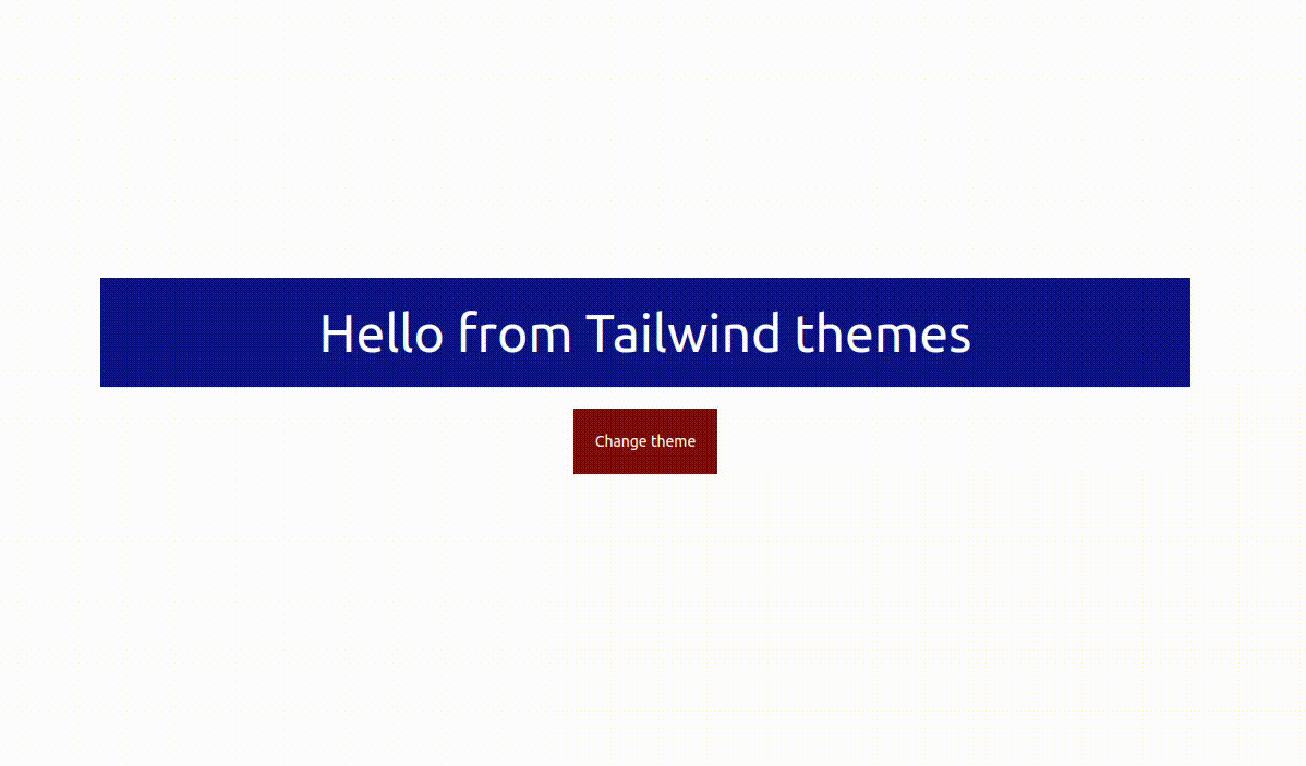
You can use these classes inside your UI like below,
<div class="border-info bg-primary flex items-center justify-center
            text-center text-info w-[1000px] h-[100px]">
    <span class="text-lg">Hello from Tailwind themes</span>
</div>
Change theme
Now it's time to add life to the code!!! Let’s add a button to the UI, which will switch the theme.
<button type="button"
    class="mt-5 bg-danger border-info text-center h-[auto]
           w-[auto] p-5 rounded-5 text-info text-sm"
    onclick="changeTheme()">
        Change theme
</button>
First, we need to add data-theme attribute to the <HTML>,
<script>
  document.querySelector("html").setAttribute("data-theme", "default");
</script>
Then, On clicking the button, we will change the data-theme attribute of the <html> tag, which will change the colors of the theme.
<script>
  document.querySelector("html").setAttribute("data-theme", "default");

  changeTheme = () => {
    var theme =
      document.querySelector("html").getAttribute("data-theme") == "default"
        ? "light"
        : "default";

      document.querySelector("html").setAttribute("data-theme", theme);
  };

</script>
Here is the full code of the HTML,
<!doctype html>
<html>
  <head>
    <meta charset="UTF-8" />
    <meta name="viewport" content="width=device-width, initial-scale=1.0" />
    <link href="./output.css" rel="stylesheet" />
  </head>
  <body>
    <div class="flex flex-col items-center justify-center h-screen">
      <div
        class="flex items-center justify-center border-info
               bg-primary text-center text-info w-2/6 h-24">
        <span class="text-lg">Hello from Tailwind themes</span>
      </div>
      <button
        id="button"
        type="button"
        class="mt-5 bg-danger border-info text-center p-5 rounded-5
               text-info text-sm"
        onclick="changeTheme()">
        Change theme
      </button>
    </div>
  </body>

  <script>
    document.querySelector("html").setAttribute("data-theme", "default");

    changeTheme = () => {
      var theme =
        document.querySelector("html").getAttribute("data-theme") == "default"
          ? "light"
          : "default";

      document.querySelector("html").setAttribute("data-theme", theme);
    };
  </script>
</html>
That’s it. You will have your themes working 🎉.
Conclusion
With a few key steps, you’re now able to create Tailwind CSS themes effortlessly! Remember, your themes should reflect your brand and resonate with your audience.
If you have any questions or suggestions, feel free to add them in the comments section.
Keep crafting and stay innovative!!
Related articles


Get started today
Let's build the next
big thing!
Let's improve your business's digital strategy and implement robust mobile apps to achieve your business objectives. Schedule Your Free Consultation Now.
Get Free Consultation
Get started today
Let's build the next big thing!
Let's improve your business's digital strategy and implement robust mobile apps to achieve your business objectives. Schedule Your Free Consultation Now.
Get Free Consultation