Implement Medium Like Bar Charts using Vue-chartjs
Introduction
It’s always a good practice to get up to date with what’s going on at your organization or your application or even what’s trending among the people.
Analytics plays a key role in hydrating us with the latest or past data. Charts can be handy for analytical purposes.
Medium is serving analytics in a similar manner, using interactive bar charts.
By not taking more of your time, let’s go straight to the point.
In this blog, we will discuss how to implement beautiful interactive bar charts as shown by medium using vue.js. Create a project if you haven’t created one.
Even if you’re new to Vue.js, you can implement charts quickly according to the steps mentioned in this blog.
Sponsored
We are what we repeatedly do. Excellence, then, is not an act, but a habit. Try out Justly and start building your habits today!
Required packages
1. vue(3.2.37) — A popular javascript framework
2. vue-chartjs (4.1.1) — It’s a wrapper around chart.js that makes the implementation easier in Vue.js.
3. chart.js(3.9.1) — It’s a core chart.js library useful for rendering eye-catchy charts
However, both of the above-mentioned packages consist of well-explanatory documentation we can always explore beyond!
Import and register the chart.js components
As an initial step, install the above-listed packages using the following command.
npm i vue-chartjs chart.jsLet’s jump to the implementation part and go stepwise.
- Import chart type from vue-chartjs in App.vue or inside the component you want to integrate the charts so that we won’t need to configure canvas manually.
- Import chart components from chart.js and register them using ChartJS.Register().
- Add the imported chart(Bar chart in our case) in the components section(component registering in Vue.js) and include it inside <template></template> section.
<template>
  <Bar />
</template>

<script >
import { Bar } from "vue-chartjs";
import {
  Chart as ChartJS,
  Title,
  Tooltip,
  Legend,
  BarElement,
  CategoryScale,
  LinearScale,
} from "chart.js";
ChartJS.register(
  Title,
  Tooltip,
  Legend,
  BarElement,
  CategoryScale,
  LinearScale
);
export default {
  components: {
    Bar,
  },
};
</script>
With that, we are done with the basic setup of our Bar chart.
Don’t worry if you find a blank screen, it’s only because we haven’t provided any datasets to the Bar chart yet.
Render a basic chart with data
Add data according to the below snippet and you will see the rendered chart 🎉.
<template>
  <Bar :chart-data="chartData" />
</template>

<script >
const chartData = {
  labels: ["Jan", "Feb", "Mar", "Apr", "May", "Jun", "Jul"],
  datasets: [
    {
      label: "Dataset 1",
      data: [2, 5, 4, 8, 10, 4, 7],
      backgroundColor: "#DB4C77",
    },
  ],
};
import { Bar } from "vue-chartjs";
import {
  Chart as ChartJS,
  Title,
  Tooltip,
  Legend,
  BarElement,
  CategoryScale,
  LinearScale,
} from "chart.js";
ChartJS.register(
  Title,
  Tooltip,
  Legend,
  BarElement,
  CategoryScale,
  LinearScale
);
export default {
  components: {
    Bar,
  },
  data() {
    return {
      chartData: chartData,
    };
  },
};
</script>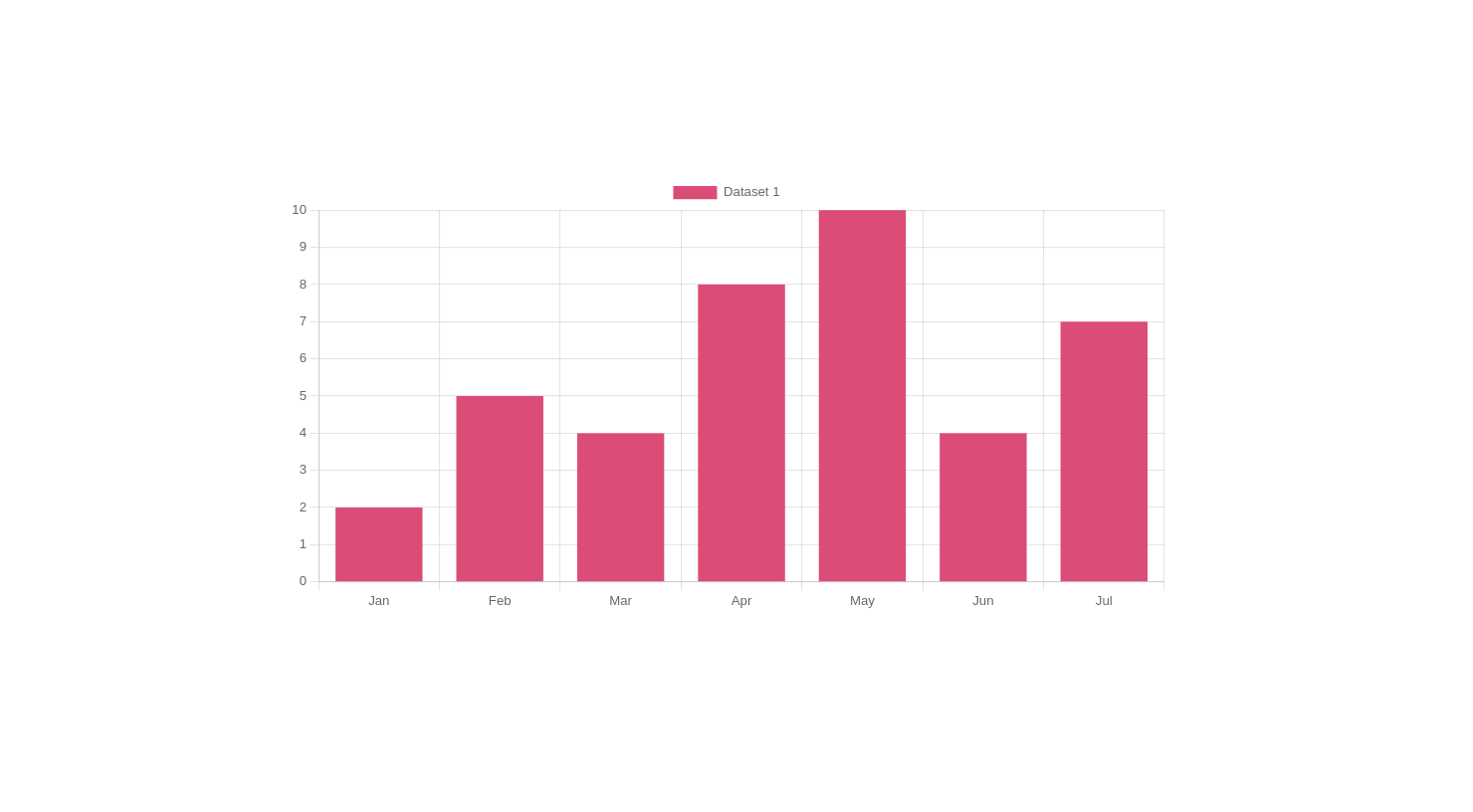
Get familiar with useful chart.js options
Chart.js enables us to customize the chart as per our needs. With that context, we will climb a step towards medium-like chart implementation.
There are so many options available, but we will discuss a few that are required for our requirements.
a. responsive — It resizes a chart according to our container, by default it’s true.
options = {
  responsive: true,
}
b. maintainAspectRatio — It maintains the aspect ratio of the chart canvas while resizing the screen.
options = {
  maintainAspectRatio: false,
}
c. plugins — It consists of multiple options for customization like a tooltip, legend or chart title, etc.
options = {
  plugins: {
    legend:{},
    tooltip:{},
    ...
  }
}
d. scales — It works for both the axis labels, like display or min-max values, etc.
options = {
scales: {
...
}
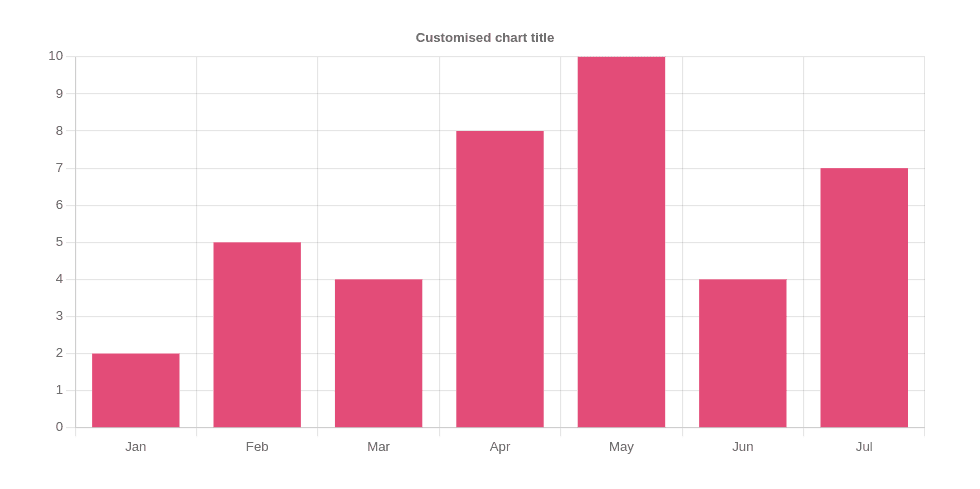
}Customize the chart using options
a. Hide the chart title — using legent: { display: false}

b. Add a custom chart title — using title: { display: true, text: 'Customised chart title'}

<Bar
   :chart-data="chartData"
   :chart-options="{
    responsive: true,
    maintainAspectRatio: false,
    plugins: {
      legend: { display: false },
      title: { display: true, text: 'Customised chart title' },
    },
   }"
/>
The final chart will look like this,

c. Update the chart bar’s color on hover
Basically, what we will do is,
- Add a ref to the chart and update its bar color according to the index detected on the hover event.
- On the mouse leave event of the chart container(<div>), we will update the chart so that all the bars will adopt the original color that we provided.
Update all bar colors to gray on hover:
this.$refs.chart1.chart.data.datasets[0].backgroundColor = "#D3D3D3";
this.$refs.chart1.updateChart();
Then as in the below snippet, loop over the bars and change the specific bar’s color to pink if its index is matching the index passed in on the hover event.
Update Bar color on hover
<template>
  <div style="width: 800px" @mouseleave="getBackOriginalChart">
    <Bar
      ref="chart1"
      :chart-data="chartData"
      :chart-options="{
        responsive: true,
        maintainAspectRatio: false,
        plugins: {
          legend: { display: false },
          title: { display: true, text: 'Customised chart title' },
        },
        onHover: (event, elements) => updateChart(elements[0]),
      }"
    />
  </div>
</template>

<script >
const chartData = {
  labels: ["Jan", "Feb", "Mar", "Apr", "May", "Jun", "Jul"],
  datasets: [
    {
      label: "Dataset 1",
      data: [2, 5, 4, 8, 10, 4, 7],
      backgroundColor: "#DB4C77",
    },
  ],
};
import { Bar } from "vue-chartjs";
import {
  Chart as ChartJS,
  Title,
  Tooltip,
  Legend,
  BarElement,
  CategoryScale,
  LinearScale,
} from "chart.js";
ChartJS.register(
  Title,
  Tooltip,
  Legend,
  BarElement,
  CategoryScale,
  LinearScale
);
export default {
  components: {
    Bar,
  },
  data() {
    return {
      chartData: chartData,
    };
  },
 methods: {
    updateChart(elem) {
      if (elem) {
        this.$refs.chart1.chart.data.datasets[0].backgroundColor = "#D3D3D3";
        this.$refs.chart1.updateChart();
        for (
          let i = 0;
          i < this.$refs.chart1.chart.data.datasets[0].data.length;
          i++
        ) {
          if (i == elem.index) {
            this.$refs.chart1.chart.data.datasets[0].hoverBackgroundColor =
              "#DB4C77";
          }
        }
      }
    },
    getBackOriginalChart() {
      if (this.$refs.chart1.chart.data == null) {
        return;
      }
      this.$refs.chart1.chart.data.datasets[0].backgroundColor = "#DB4C77";
      this.$refs.chart1.updateChart();
    },
  },
};
</script>
getBackOriginalChart() will update the chart to its original state.
With that, you have completed medium-like charts 🎊 😎.
Combine multiple charts into a single Vue component
If you want to combine multiple charts in a single component, you need to provide chart-id attribute to each chart(which should be unique).
<Bar :chart-id="chart" />Customize charts
For more chart customization let’s explore a few options provided by chart.js.
We will again use a chart-options attribute to customize the chart.
a. Update chart tooltip label
To update the chart tooltip label(color or text color), add the following block of code inside the plugins block of options.
tooltip: {
callbacks: {
labelColor: function (context) {
return {
backgroundColor: "green",
};
},
},
labelTextColor: function (context) {
return 'yellow';
},
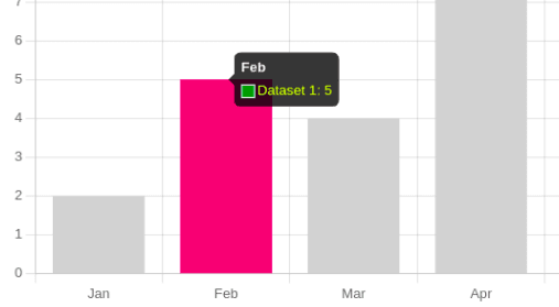
},The tooltip will be shown like,
b. Hide labels from the axis
Hide chart labels from the x or y axis depending upon requirements.
As stated above, we can use options.scale to customize the scaling of an axis.
scales: {
  xAxis: {
    ticks: {
    display: false,
  },
},
},
c. Hide tooltip
To hide the tooltip totally, just add enabled: false inside the tooltip block of options.plugins.

Code snippet for the above-discussed chart options:
<template>
  <div style="width: 800px" @mouseleave="getBackOriginalChart">
    <Bar
      ref="chart1"
      :chart-data="chartData"
      :chart-options="{
        responsive: true,
        maintainAspectRatio: false,
        plugins: {
          legend: { display: false },
          title: { display: true, text: 'Customised chart title' },
          tooltip: {
            callbacks: {
              labelColor: function (context) {
                return {
                  backgroundColor: 'green',
                };
              },
              labelTextColor: function (context) {
                return 'yellow';
              },
            },
            enabled: false,
          },
        },
        scales: {
          xAxis: {
            ticks: {
              display: false,
            },
          },
        },
        onHover: (event, elements) => updateChart(elements[0]),
      }"
    />
  </div>
</template>

<script >
const chartData = {
  labels: ["Jan", "Feb", "Mar", "Apr", "May", "Jun", "Jul"],
  datasets: [
    {
      label: "Dataset 1",
      data: [2, 5, 4, 8, 10, 4, 7],
      backgroundColor: "#DB4C77",
    },
  ],
};
import { Bar } from "vue-chartjs";
import {
  Chart as ChartJS,
  Title,
  Tooltip,
  Legend,
  BarElement,
  CategoryScale,
  LinearScale,
} from "chart.js";
ChartJS.register(
  Title,
  Tooltip,
  Legend,
  BarElement,
  CategoryScale,
  LinearScale
);
export default {
  components: {
    Bar,
  },
  data() {
    return {
      chartData: chartData,
    };
  },
  methods: {
    updateChart(elem) {
      if (elem) {
        this.$refs.chart1.chart.data.datasets[0].backgroundColor = "#D3D3D3";
        this.$refs.chart1.updateChart();
        for (
          let i = 0;
          i < this.$refs.chart1.chart.data.datasets[0].data.length;
          i++
        ) {
          if (i == elem.index) {
            this.$refs.chart1.chart.data.datasets[0].hoverBackgroundColor =
              "#DB4C77";
          }
        }
      }
    },
    getBackOriginalChart() {
      if (this.$refs.chart1.chart.data == null) {
        return;
      }
      this.$refs.chart1.chart.data.datasets[0].backgroundColor = "#DB4C77";
      this.$refs.chart1.updateChart();
    },
  },
};
</script>
However I have mentioned a few, you can explore more about chart-options though.
Closing thoughts
There are more chart props that you can customize according to the requirements.
In this article, I have mentioned the properties which I came around with while implementing one of the feature requirements.
Also, chart.js by default allows the creation of many other types of charts like Line, Pie, Doughnut, Radar, etc. Visit the official site for more options.
As always, feedback and suggestions are more than welcome 🎉.
Keep analyzing & Happy charting !!
Similar Trending Article

Let's Work Together
Not sure where to start? We also offer code and architecture reviews, strategic planning, and more.