How to Implement 2D Scrollable TableView in Flutter
Background
Tables are useful tools for efficient data organization within the application. Flutter’s latest update introduced a TwoDimensionalScrollView widget.
TwoDimensionalScrollView is a widget that combines the TwoDimensionalScrollable and TwoDimensionalViewport to create an interactive scrolling pane of content in both vertical and horizontal dimensions but using it directly is a bit challenging.
Here is a demo code to implement 2D ScrollView in Flutter.
Sponsored
Positive thinking leads to positive outcomes. Try out Justly, build good habits, and start thinking positively today.
Introduction
Flutter’s prebuilt widget has great performance and it renders children lazily only when it is in the view and improves the performance but Flutter has released a new package two_dimensional_scrollables to implement a TableView that scrolls in both the vertical and horizontal axes.
In this tutorial, we’ll explore this package to implement a very simple Tableview and we’ll see how we can customize it.
You can find the full source code here.
Implementation
Add the Dependency
To add the dependency, first open pubspec.yaml file and then add the dependency.
dependencies:
  two_dimensional_scrollables: <latest version>
Adding TableView to a screen
When you are adding a TableView, there are two constructors you can use,
TableView.list: This one is similar to Flutter’s ListView. It adds all the cells at once and works well for shorter lists.
Tableview.builder: It adds children lazily when the view has come into the viewport. Great for larger lists where you don’t want to load everything at once!
Let’s create a simple Tableview to display the following information.
class Employee {
 final String id;
 final String name;
 final String role;
 final String email;
     Employee({
         required this.id,
         required this.name,
         required this.role,
         required this.email});
 static get getEmployees{
    return [
      Employee(id: '1', name: 'John Doe', role: 'Manager', email: 'john@example.com'),
      Employee(id: '2', name: 'Jane Smith', role: 'Developer', email: 'jane@example.com'),
      Employee(id: '3', name: 'Mike Johnson', role: 'Designer', email: 'mike@example.com'),
      Employee(id: '4', name: 'Emily Brown', role: 'HR Specialist',email: 'emily@example.com'),
      Employee(id: '5', name: 'Alex Lee', role: 'Marketing Analyst', email: 'alex@example.com'),
      Employee(id: '6', name: 'John Doe', role: 'Manager', email: 'john@example.com'),
      Employee(id: '7', name: 'Jane Smith', role: 'Developer', email: 'jane@example.com'),
      Employee(id: '8', name: 'Mike Johnson', role: 'Designer', email: 'mike@example.com'),
      Employee(id: '9', name: 'Emily Brown', role: 'HR Specialist',email: 'emily@example.com'),
      Employee(id: '10', name: 'Alex Lee', role: 'Marketing Analyst', email: 'alex@example.com'),
     ];
  }
}
Here is a basic example code of TableView.builder.
class TwoDimensionalScrollableDemo extends StatelessWidget {
   TwoDimensionalScrollableDemo({super.key});

final  List<Employee> employees = Employee.getEmployees;

  @override
  Widget build(BuildContext context) {
    return Scaffold(
      appBar: AppBar(
        title: const Text("Table view Demo"),
      ),
      body: TableView.builder(
          columnCount: 2,
          rowCount: 11,
          columnBuilder: buildTableSpan,
          rowBuilder: buildTableSpan,
          cellBuilder: (BuildContext context, TableVicinity vicinity) {
            return Container(child: Center(child: addText(vicinity)));
          }),
    );
  }

  TableSpan buildTableSpan(int index){
    return TableSpan(extent: FixedTableSpanExtent(50));
  }

  Widget addText(TableVicinity vicinity) {
    if (vicinity.yIndex == 0 && vicinity.xIndex == 0) {
      return const Text("Index");
    } else if (vicinity.yIndex == 0 && vicinity.xIndex == 1) {
      return const Text("name");
    } else if (vicinity.xIndex == 0) {
      return Text(employees[vicinity.yIndex-1].id);
    } else if (vicinity.xIndex == 1) {
      return Text(employees[vicinity.yIndex-1].name);
    }
    return Text("");
  }
}
This is pretty good for just a few lines of code. Let’s break down the required parameters of the TableView.builder.
columnCount: This parameter sets the number of columns in the table.
rowCount: This parameter sets the number of Rows in the table.
columnBuilder: It’s a function that helps define the layout and functionality of each column in the table. It takes an integer as a parameter, and it returns a TableSpan, which structures and configures the columns.
rowbuilder: Similar to columnBuilder, this function defines the layout and behavior for each row in the TableView.
cellBuilder: It handles the layout of each cell within the table. It takes TableVicinity parameter containing the row and column indices for a specific cell. This helps you customize the appearance and behavior of individual cells in your table.
Run the above code and you’ll see the following output.
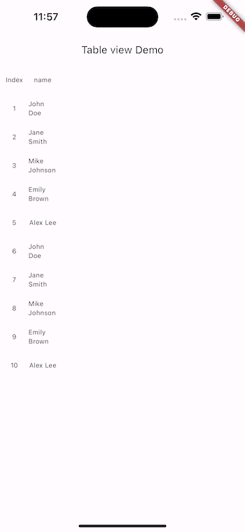
Now, let’s study the features that the TableView.builder offers! So, let’s see how to customize, and control the TableView and add more functionality.
TableSpan
TableSpan represents a row or a column within the TableView.
Add a border
TableSpan buildTableSpan(int index) {
  TableSpanDecoration decoration = const TableSpanDecoration(
      border: TableSpanBorder(
          trailing: BorderSide(color: Colors.black),
          leading: BorderSide(color: Colors.black)));
  return  TableSpan(
      extent: const FixedTableSpanExtent(100),
      foregroundDecoration: decoration);
}
TableSpanDecoration class is used to specify the decoration for a TableSpan. We can add a border to TableSpan through border parameters from TableSpanBorder class which has trailing and leading properties representing the border on the row's right and left sides and the Column's ups and downsides.
Add color
TableSpan buildTableSpan(int index) {
  TableSpanDecoration decoration =  TableSpanDecoration(
      color: index == 0 ? Colors.grey[300] : null,
      border: const TableSpanBorder(
          trailing: BorderSide(color: Colors.black),
          leading: BorderSide(color: Colors.black)));
  return  TableSpan(
      extent: const FixedTableSpanExtent(100),
      backgroundDecoration: decoration);
}
The color property within the TableSpanDecoration is used to set the color for TableSpan.
Run the code and the output will look like this,
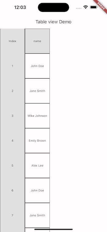
Because,
- In a
TableView, decorations are painted in a specific order. backgroundDecorationof themainAxis(rows or columns that are the primary axis) is painted first.- Then, decorations from other axes are painted.
- Next, the individual cell content within the span is painted.
- Finally, any specified
foregroundDecorationis painted on top of the content.
Here the default axis is Axis.vertical so, columns are painted first and then the rows are painted and the border is overlapped by row decoration so, let's add a border to the foreground Decoration.
TableSpan buildTableSpan(int index) {
  TableSpanDecoration foreGroundDecoration = const TableSpanDecoration(
      border: TableSpanBorder(
          trailing: BorderSide(color: Colors.black),
          leading: BorderSide(color: Colors.black)));
  TableSpanDecoration backGroundDecoration = TableSpanDecoration(
    color: index == 0 ? Colors.grey[300] : null,
  );
  return TableSpan(
      extent: const FixedTableSpanExtent(100),
      backgroundDecoration: backGroundDecoration,
      foregroundDecoration: foreGroundDecoration);
}
Adding a border in the foreground Decoration ensures that it’s rendered on top of the cell content in the TableView.

TableSpan.extent
It represents the height of the row and the width of the column. There are four types of the TableSpanExtent.
1. FixedTableSpanExtent
A Span with a fixed [pixels].
extent: const FixedTableSpanExtent(50)
2. FractionTableSpanExtent
It specifies the span extent as a fraction of the viewport extent. It is the same as Expanded widget which occupies space according to the provided fraction.
extent: const FractionalTableSpanExtent(0.5),
3. RemainingTableSpanExtent
It specifies that the span should occupy the remaining space in the viewport.
TableSpan buildColumnSpan(int index) {
  TableSpanDecoration decoration =  const TableSpanDecoration(
      border: TableSpanBorder(
          trailing: BorderSide(color: Colors.black),
          leading: BorderSide(color: Colors.black)));
  return TableSpan(
      extent: index==0? FixedTableSpanExtent(100):RemainingTableSpanExtent(), backgroundDecoration: decoration);
}
4. CombiningTableSpanExtent
It takes two extents as a parameter and runs the result of these two extents through a combiner function.
TableSpan buildRowSpan(int index) {
    TableSpanExtent extent1 = FixedTableSpanExtent(100);
    TableSpanExtent extent2 = FixedTableSpanExtent(100);
    double combiner(double value1, double value2) {
      return value1 + value2;
    }

    TableSpanDecoration foreGroundDecoration = const TableSpanDecoration(
        border: TableSpanBorder(
            trailing: BorderSide(color: Colors.black),
            leading: BorderSide(color: Colors.black)));
    TableSpanDecoration backGroundDecoration = TableSpanDecoration(
      color: index == 0 ? Colors.grey[300] : null,
    );
    if (index == 1) {
      return TableSpan(
          extent: CombiningTableSpanExtent(extent1, extent2, combiner),
          backgroundDecoration: backGroundDecoration,
          foregroundDecoration: foreGroundDecoration);
    }
    return TableSpan(
        extent: const FixedTableSpanExtent(100),
        backgroundDecoration: backGroundDecoration,
        foregroundDecoration: foreGroundDecoration);
  }
void Function(PointerEnterEvent)? onEnter
It Triggers when a mouse pointer, with or without a button pressed, has entered the row or column described by this span.
void Function(PointerEnterEvent)? onEntervoid Function(PointerExitEvent)? onExit
It triggers when a mouse pointer, with or without a button pressed, has exited the row or column described by this span.
void Function(PointerExitEvent)? onExitrecognizerFactories
recognizerFactories: <Type, GestureRecognizerFactory>{
  TapGestureRecognizer:
  GestureRecognizerFactoryWithHandlers<TapGestureRecognizer>(
        () => TapGestureRecognizer(),
        (TapGestureRecognizer t) {
          t.onTapDown=(TapDownDetails tapdownDetails){
            print(tapdownDetails.localPosition);
          };
          t.onTapUp=(TapUpDetails tapupDetails){
            print(tapupDetails.localPosition);
          };
        }
  ),
},
recognizerFactories is a map where the keys are types of gestures and the values are instances of GestureRecognizerFactory.
The GestureRecognizerFactoryWithHandlers takes two arguments.
A function that returns an instance of TapGestureRecognizer when called and a callback function that initializes the TapGestureRecognizer and sets the event handler to handle specific event details.
Add a Padding
The padding property is used to add padding for each row and column.
padding: TableSpanPadding(leading: 10),Add more columns & rows to the UI
Let’s show more data from the Employee class like email and role in the TableView.
 Widget addText(TableVicinity vicinity) {
    if (vicinity.yIndex == 0 && vicinity.xIndex == 0) {
      return const Text("Index");
    } else if (vicinity.yIndex == 0 && vicinity.xIndex == 1) {
      return const Text("name");
    } else if (vicinity.yIndex == 0 && vicinity.xIndex == 2) {
      return const Text("Email");
    } else if (vicinity.yIndex == 0 && vicinity.xIndex == 3) {
      return const Text("Role");
    } else if (vicinity.xIndex == 0) {
      return Text(employees[vicinity.yIndex - 1].id);
    } else if (vicinity.xIndex == 1) {
      return Text(employees[vicinity.yIndex - 1].name);
    } else if (vicinity.xIndex == 2) {
      return Text(employees[vicinity.yIndex - 1].email);
    } else if (vicinity.xIndex == 3) {
      return Text(employees[vicinity.yIndex - 1].role);
    }
    return Text("");
  }
...

      body: TableView.builder(
          mainAxis: Axis.horizontal,
          columnCount: 4,
          rowCount: 21,
          columnBuilder: buildColumnSpan,
          rowBuilder: buildTableSpan,
          cellBuilder: (BuildContext context, TableVicinity vicinity) {
            return Center(child: addText(vicinity));
          }),
...

TableSpan buildColumnSpan(int index) {
  TableSpanDecoration decoration = const TableSpanDecoration(
      border: TableSpanBorder(
          trailing: BorderSide(color: Colors.black),
          leading: BorderSide(color: Colors.black)));
  if (index == 2) {
    return TableSpan(
      extent: const RemainingTableSpanExtent(),
      backgroundDecoration: decoration,
    );
  } else if (index == 3) {
    return TableSpan(
      extent: const FractionalTableSpanExtent(0.5),
      backgroundDecoration: decoration,
    );
  }
  return TableSpan(
      extent: FixedTableSpanExtent(100), backgroundDecoration: decoration);
}
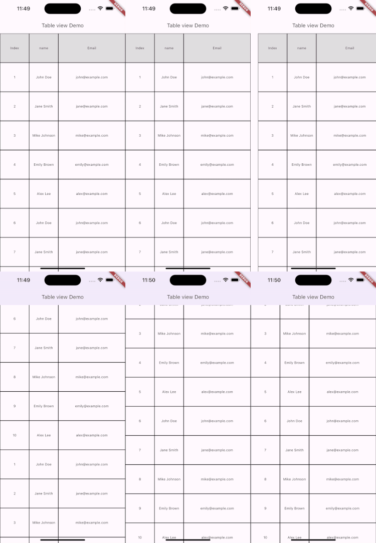
and the output is,
Pinning the rows and columns
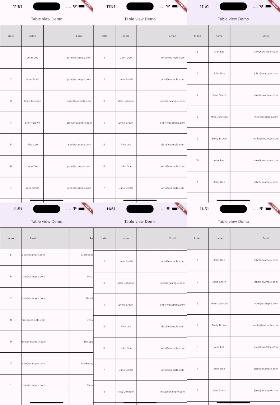
To pin a specific number of rows and columns persistently appearing at the edges of the TableView viewport.
TableView.builder(
...
    pinnedRowCount: 1,
    pinnedColumnCount: 1,
   ),
ScrollableDetail
The ScrollableDetail allows specific configurations for the vertical and horizontal scroll behavior of the widget.
verticalDetails: ScrollableDetails.vertical(
  reverse: true,
  controller: verticalController,
  physics: const AlwaysScrollableScrollPhysics(),
  decorationClipBehavior: Clip.hardEdge
),
The verticalDetails within the ScrollableDetails allows specific configuration for the vertical scroll behavior of a widget. It encapsulates various properties.
Here’s a breakdown of the properties:
reverse: When set totrue, the content within the widget scrolls in the opposite direction.controller: TheScrollControllerassigned to manage and control the scrolling behavior. It allows you to scroll to specific positions or listen to the scroll offset changes.physics: Determines the behavior of the scrolling physics.decorationClipBehavior: Specifies the clipping behavior for the scrollable area's decorations
cacheExtent
cacheExtent: 200,Similar to ListView, cacheExtent is the size of the area drawn before being in the visible part of the screen.
DiagonalDragBehavior
This enum allows developers to specify how diagonal scrolling should be handled using kTouchSlop.
Conclusion
In this tutorial, we learned how to implement tableView in Flutter using the two_dimensional_scrollable in Flutter and there is much more we can do with this and add more functionality using it. This was a small introduction to the TableView in Flutter from my side.
I hope this article has given you enough information to add TableView to your Flutter projects. If you have any questions or feedback, feel free to leave them in the comments section.
You can find the full source code here.
Happy coding! 👋
Useful Articles


Let's Work Together
Not sure where to start? We also offer code and architecture reviews, strategic planning, and more.
