Exploring Flutter’s new Sliver API: A Comprehensive Guide
Background
Up until now, there is no way to group slivers together and render them as single sliver in customScrollview. What if we needed to apply different padding to individual groups of slivers? or what if you wanted to create a vertically scrollable list of slivers side by side, much like using a raw widget?
Well, the release of Flutter 3.13, introduces two different widgets, SliverMainAxisGroup and SliverCrossSxisGroup to group slivers in the main-axis and cross-axis respectively. There are new features and improvements when it comes to scrolling with this new API and the best part? you can easily create one of my favorite— sticky headers.
In this article, I’ll give you a basic guide on these new slivers and then play with slivers to create a demo UI.
What we’re going to implement?
Sponsored
We are what we repeatedly do. Excellence, then, is not an act, but a habit. Try out Justly and start building your habits today!
What is a sliver?
A sliver is a portion of a scrollable area that you can define to behave in a special way. You can use slivers to achieve custom scrolling effects, such as elastic scrolling.
To put it simply, slivers are like a more detailed way to control how things scroll.
You can think of slivers as a lower-level interface, providing finer-grained control on implementing scrollable areas. Because slivers can lazily build each item just as it scrolls into view, slivers are particularly useful for efficiently scrolling through large numbers of children.
All of the scrollable views you use, like ListView and GridView, are actually implemented using Slivers.
Let’s look at the types of the SliversGroup there are:
- SliverCrossAxisGroup
- SliverMainAxisGroup
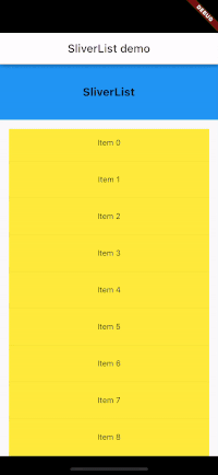
SliverMainAxisGroup
A sliver that places multiple sliver children in a linear array along the main axis, one after another. To use SliverMainAxisGroup, simply pass in the slivers. For example,
The general format for the code is
CustomScrollView(
          slivers: [
            SliverMainAxisGroup(slivers: [
              SliverPersistentHeader(
                delegate: HeaderDelegate(title: 'SliverList'),
                pinned: true,
              ),
              SliverPadding(
                padding: EdgeInsets.all(16),
                sliver: decoratedSliverList(),
              ),
            ]),
            SliverMainAxisGroup(slivers: [
              SliverPersistentHeader(
                delegate: HeaderDelegate(title: 'SliverGrid'),
                pinned: true,
              ),
              sliverGrid(10)
            ]),
          ],
        ),


 Widget decoratedSliverList() {
    return DecoratedSliver(
      position: DecorationPosition.background,
      decoration: BoxDecoration(
        color: Colors.yellow,
      ),
      sliver: SliverList.separated(
        itemBuilder: (_, int index) =>
            Container(height: 50, child: Center(child: Text('Item $index'))),
        separatorBuilder: (_, __) => Divider(),
        itemCount: 15,
      ),
    );
  }
}
No need to explain, right?? here we added SliverMainAxisGroup to group sliver elements sequentially along the main Axis. Each SliverMainAxisGroup contains SliverPersistentHeader with a delegate that creates a sticky header. The pinned: true property set headers to be fixed at the top during scrolling.
Flutter introduces DecoratedSliver, which is similar to DecoratedBox for sliver to paint a decoration either before or after its child paints.
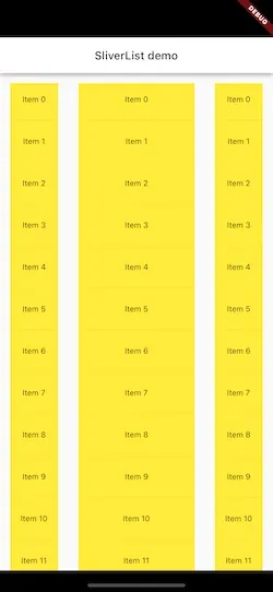
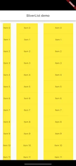
SliverCrossAxisGroup
It’s a widget that arranges a list of slivers in a linear array along the cross-axis.

The picture looks quite simple and its implementation is as easy as it looks…😊
 SliverCrossAxisGroup(slivers: [
              SliverPadding(
                  padding: const EdgeInsets.all(16),
                  sliver: decoratedSliverList()),
              SliverPadding(
                  padding: const EdgeInsets.all(16),
                  sliver: decoratedSliverList()),
              SliverPadding(
                  padding: const EdgeInsets.all(16),
                  sliver: decoratedSliverList()),
            ]),
Well, this widget organizes these slivers in a linear array along the cross-axis, similar to how row handle their children. The widget will take in a list of slivers, and by default, each widget will be assigned equal cross-axis constraints.
But what if we want to divide up the cross-axis constraint in a different way like row and column divides up space? That’s where Flutter introduces two more widgets SliverCrossAxisExpanded and SliverConstrainedCrossAxis.
SliverCrossAxisExpanded
The SliverCrossAxisExpanded widget is similar to Expanded widget for row and column to fill available along the cross-axis. The flex property decides how much space should be taken.
      SliverCrossAxisGroup(slivers: [
              SliverPadding(
                  padding: const EdgeInsets.all(16),
                  sliver: decoratedSliverList()),
              SliverCrossAxisExpanded(
                flex: 2,
                sliver: SliverPadding(
                    padding: const EdgeInsets.all(16),
                    sliver: decoratedSliverList()),
              ),
              SliverPadding(
                  padding: const EdgeInsets.all(16),
                  sliver: decoratedSliverList()),
            ]),
The output is,
SliverConstrainedCrossAxis
The SliverConstrainedCrossAxis is similar to the ConstrainedBox widget that allows you to constrain the cross-axis of a sliver.
The SliverConstrainedCrossAxis takes a mxExtent parameter and used as the cross-axis extent of the SliverConstraints passed to the sliver child. The maxExtent should be a non-negative value.
 SliverCrossAxisGroup(slivers: [
              SliverPadding(
                  padding: const EdgeInsets.all(16),
                  sliver: decoratedSliverList()),
              SliverCrossAxisExpanded(
                flex: 2,
                sliver: SliverPadding(
                    padding: const EdgeInsets.all(16),
                    sliver: decoratedSliverList()),
              ),
              SliverConstrainedCrossAxis(
                maxExtent: 200,
                sliver: SliverPadding(
                    padding: const EdgeInsets.all(16),
                    sliver: decoratedSliverList()),
              ),
            ]),
Implement Demo UI
All right, It’s time to have some fun with slivers!! 🍻
We are going to implement this UI inspired by JetSnack.
So, let’s first observe the behavior. Well, it has two pinned Appbars that collapse one after the other, followed by scrolling through the recipe screen.
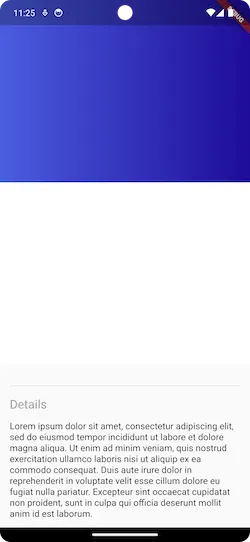
Create a Basic UI
It’s a basic UI for the screen.
class ChocolatePage extends StatefulWidget {
  const ChocolatePage({super.key});

  @override
  State<ChocolatePage> createState() => _ChocolatePageState();
}

class _ChocolatePageState extends State<ChocolatePage> {
  final maxHeight = 600;
  final minHeight = 250;

  @override
  Widget build(BuildContext context) {
    return Scaffold(
      body: CustomScrollView(
        slivers: [
          SliverPersistentHeader(
            pinned: true,
            floating: true,
            delegate: SliverAppbarDelegate(
                maxHeight: maxHeight / 2,
                minHeight: minHeight / 2,
                child: Container(
                  decoration: const BoxDecoration(
                      gradient: LinearGradient(
                          colors: [
                            Color(0xff4b5de0),
                            Color(0xff1e0c98),
                          ]
                      )
                  ),
                )
            ),
          ),
        SliverPersistentHeader(
                pinned: true,
                delegate: SliverAppbarDelegate(
                    maxHeight: maxHeight / 2,
                    minHeight: minHeight / 2,
                    child: Container(
                      color: Colors.white,
                      child: const Padding(
                        padding: EdgeInsets.only(left: 16.0,bottom: 16),
                        child: Column(
                          crossAxisAlignment: CrossAxisAlignment.start,
                          children: [
                            Spacer(),
                            Text('Chips',style: TextStyle(fontSize: 40,fontWeight: FontWeight.w700),),
                            SizedBox(height: 20,),
                            Text('\$12.99 ',style: TextStyle(color:Color(0xff1e0c98),fontWeight: FontWeight.w600,fontSize: 30),)
                          ],
                        ),
                      ),
                    )
                ),
              ),
          recipeDetail()
        ],
      ),
    );
  }
}

class SliverAppbarDelegate extends SliverPersistentHeaderDelegate {
  final double maxHeight;
  final double minHeight;
  final Widget child;

  SliverAppbarDelegate(
      {Key? key, required this.maxHeight, required this.minHeight, required this.child});


  @override
  Widget build(BuildContext context, double shrinkOffset,
      bool overlapsContent) => SizedBox.expand(child: child,);

  @override
  double get maxExtent => maxHeight;

  @override
  double get minExtent => minHeight;

  @override
  bool shouldRebuild(SliverAppbarDelegate oldDelegate) {
    return maxHeight != oldDelegate.maxHeight ||
        minHeight != oldDelegate.minHeight ||
        child != oldDelegate.child;
  }

}
It is self-explanatory, right? We have CustomScrollView with two SliverpersistentHeader, each with the pinned and floating parameter set to true, to create a pinned app bar while scrolling, and below the app bar, there is a recipe detail screen that contains detailed content of the screen.
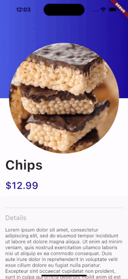
Let’s see what it looks like,
Add CircleAvatar
Okay, now let’s add CircleAvatar.
final double initialRadius=170;

@override
Widget build(BuildContext context) {
  return Scaffold(
    body: Stack(
      children: [
        CustomScrollView(
          ...
        ),
        Positioned(
          top: (maxHeight/2)-initialRadius,
            left: MediaQuery.of(context).size.width/2-initialRadius,
            child: CircleAvatar(
              backgroundImage: AssetImage('assets/chocolate.jpeg'),
              radius: initialRadius,
            ))
      ],
    ),
  );
}
No need for any explanation. CircleAvatar is positioned at the center between both appbars and the radius is set to 170.
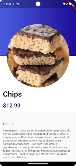
Okay, great 👍.
Move CircleAvatar
Now let’s move the CircleAvater with scrolling.
class _ChocolatePageState extends State<ChocolatePage> {
  late final ScrollController scrollController;
  double scrollPercentage=0.0;


  final double maxHeight = 600;
  final double minHeight = 250;
  final double initialRadius=170;

  @override
  void initState() {
    super.initState();
    scrollController= ScrollController();
    scrollController.addListener(onScroll);
  }

  void onScroll() {
    double offset= scrollController.offset;
    double  maxOffset = 350;
    setState(() {
      scrollPercentage=(offset/maxOffset).clamp(0.0, 1.0);
    });
  }

  @override
  Widget build(BuildContext context) {
    return Scaffold(
      body: Stack(
        children: [
          CustomScrollView(
            ...
          ),
          Positioned(
            top: ((maxHeight/2)-initialRadius)*(1-scrollPercentage),
              right: (MediaQuery.of(context).size.width/2-initialRadius)*(1-scrollPercentage),
              child: CircleAvatar(
                backgroundImage: AssetImage('assets/chocolate.jpeg'),
                radius: initialRadius,
              ))
        ],
      ),
    );
  }
Here, added ScrollController to monitor the scroll position. Calculates the scrollPercentage as the ratio of the current scrolloffset to the maxOffset that is the difference between maxHeight and minHeight of the app bar, clamped between 0.0 to 1.0. This scrollPercentage represents how far the user has scrolled in relation to the maximum scroll distance and updates the position of the CircleAvatar.
Resize CircleAvatar
Almost done, It’s time to resize CircleAvatar
final double initialRadius=130;
final double finalRadius= 60;

 Transform.scale(
      scale: (initialRadius-(initialRadius-finalRadius)*scrollPercentage)/100,
      child: CircleAvatar(
           backgroundImage: AssetImage('assets/chocolate.jpeg'),
           radius: initialRadius,
        ),
     )
Pretty easy 😊, isn’t it?? Here, we have wrapped the CircleAvatar with Transform.scale to resize it based on the scrollPercentage. Simply, as the user scrolls, the radius decreases from initialRadius to finalRadius.
Now, run the app
It's done!! Hold on, we have one issue here. The recipe detail area begins to move slightly before the second app bar starts to collapse.
With SliverMainAxisGroup, it takes it as a part of the same sliver group, causing them to scroll and stay positioned behind the first SliverPersistentHeader. So, let's group second appbar and recepiDetail with SliverMainAxisGroup and set a static height for the app bar while collapsing.
CustomScrollView(
  slivers: [
    SliverPersistentHeader(
             minHeight: 100
    ),
    SliverMainAxisGroup(
      slivers: [
       SliverPersistentHeader(
              minHeight: 250,
     ),
       recipeDetail()
    ],
   ),
  ],
)
Cool 👌…We are done!!!
Conclusion
In this article, we have explored the new Sliver API in Flutter 3.13 and implemented a demo UI to play with Sliver. This was a small introduction to new Slivers on UserInteraction from my side, and you can modify this code according to your requirements.
Thank you !!!
The source code is available here.
