Exploring Cupertino and Material Updates in Flutter 3.27.0
Background
Flutter 3.27.0 arrived with a bang, bringing a wave of improvements to both performance and developer experience. This release shows how Flutter is always getting better and helping developers make great apps.
In this article, we’ll explore the key updates of the Cupertino and Material widgets in Flutter 3.27.0
Ready? Let’s dive in!
SliverFloatingHeader
Just like Google Photos, The SliverFloatingHeader is a widget designed to create headers that appear when the user scrolls forward and gracefully disappear when scrolling in the opposite direction.
CustomScrollView(
  slivers: [
    SliverFloatingHeader(
        child: Container(
      padding: const EdgeInsets.all(10),
      decoration: BoxDecoration(
        borderRadius: BorderRadius.circular(10),
        color: Colors.orange,
      ),
      child: const Text(
        "Sliver Floating Header like Google photos",
        style: TextStyle(
          fontSize: 20,
          fontWeight: FontWeight.bold,
          color: Colors.black,
        ),
      ),
    )),
    SliverList(
      delegate: SliverChildBuilderDelegate(
        (context, index) {
          return ListTile(
            title: Text("Item $index"),
            tileColor: index.isEven? Colors.grey.shade300 : Colors.grey.shade100,
          );
        },
        childCount: 100,
      ),
    ),
  ],
);
Tubular Figures
Have you ever faced UI misalignment when displaying monospaced text like DateTime, such as 01:00 PM or 02:30 PM? I encountered this issue while building the Canbook app, where I needed to display time slots. Initially, I tried calculating the width based on the thickest character (0) to fix the alignment.
How can we improve the UI for rendering monospaced text like DateTime and time, and maintain alignment and consistency for dynamic text updates?
In the old UI implementation, digits had variable widths due to the default font settings. This resulted in inconsistent alignment.
SingleChildScrollView(
  child: Wrap(
    alignment: WrapAlignment.start,
    crossAxisAlignment: WrapCrossAlignment.center,
    spacing: 8,
    runSpacing: 8,
    children: List.generate(30, (index) {
      final time = DateTime.now().add(Duration(minutes: (index) * 15));
      return Container(
        padding: const EdgeInsets.all(8),
        decoration: BoxDecoration(
          border: Border.all(
            color: Colors.white,
          ),
          borderRadius: BorderRadius.circular(8),
        ),
        child: Text(
          DateFormat('hh:mm a').format(time),
          style: const TextStyle(
              fontFeatures: [FontFeature.tabularFigures()],
              color: Colors.white),
        ),
      );
    }),
  ),
);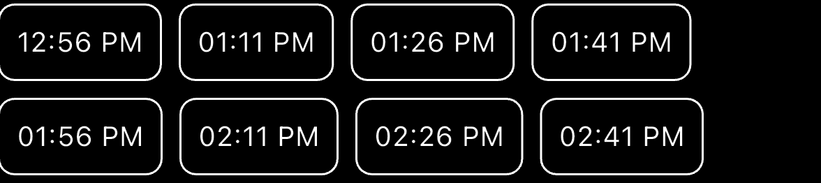
FontFeature.tabularFigures() feature ensures that each character occupies the same width.
This feature enables the use of tabular figures for fonts with both proportional (varying width) and tabular figures. Tabular figures are monospaced, meaning all characters have the same width, making them ideal for aligning text in tables, lists, or dynamic UI elements like time slots or numeric data.
Text(
  DateFormat('hh:mm a').format(time),
  style: const TextStyle(
      fontFeatures: [FontFeature.tabularFigures()],
      color: Colors.white),
),
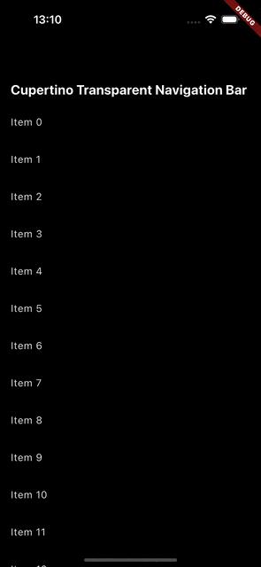
CupertinoSliverNavigationBar
With the latest update, both CupertinoNavigationBar and CupertinoSliverNavigationBar now feature transparent backgrounds until content scrolls underneath them.
This enables,
- The navigation bar to match the background color in its expanded state.
- A customizable color in its collapsed state.
- Smooth transitions between these colors as the user scrolls.
CustomScrollView(
  slivers: [
    const CupertinoSliverNavigationBar(
     largeTitle : Text(
        'Cupertino Transparent Navigation Bar',
        style: TextStyle(color: Colors.white, fontSize: 20),
      ),
      backgroundColor: Colors.transparent,
    ),
    SliverList(
      delegate: SliverChildBuilderDelegate(
        (context, index) {
          return ListTile(
            title: Text("Item $index"),
          );
        },
        childCount: 100,
      ),
    ),
  ],
);
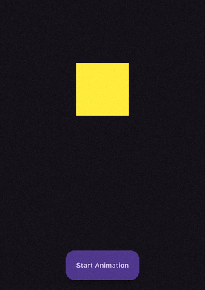
Repeat Animation
Flutter’s repeat method allows animations to run infinitely. But what if you want the animation to run for a specific number of times?
Now, with the addition of the count parameter, the repeat method can restart the animation and perform a set number of iterations before stopping.
If no value is provided for count, the animation will repeat indefinitely.
@override
void initState() {
  super.initState();
  controller = AnimationController(
    duration: const Duration(seconds: 2),
    vsync: this,
  );
  animation = Tween<double>(begin: 100, end: 300).animate(controller)
    ..addListener(() {
      setState(() {});
    });
}

@override
Widget build(BuildContext context) {
  return Scaffold(
    body: Center(
      child: Container(
          width: animation.value,
          height: animation.value,
          color: Colors.yellow),
    ),
    floatingActionButtonLocation: FloatingActionButtonLocation.centerFloat,
    floatingActionButton: FloatingActionButton.extended(
      onPressed: () {
        controller.repeat(count: 2);
      },
      label: Text("Start Animation"),
    ),
  );
}
Row and Column Spacing
With the release of Flutter 3.27.0, Row and Column widgets now support the spacing parameter, eliminating the need for manual SizedBox or Padding to add spacing between child widgets.
Now, with Flutter 3.27, you can simplify the layout by directly using the spacing property.
Using SizedBox for spacing between children,
@override
Widget build(BuildContext context) {
  return Column(
    children: [
      _item(),
      const SizedBox(height: 16),
      _item(),
      const SizedBox(height: 16),
      _item(),
      const SizedBox(height: 16),
      _item(),
      const SizedBox(height: 16),
      _item(),
    ],
  );
}
With Updates,
@override
Widget build(BuildContext context) {
return Column(
spacing: 16,
children: [
_item(),
_item(),
_item(),
_item(),
],
);
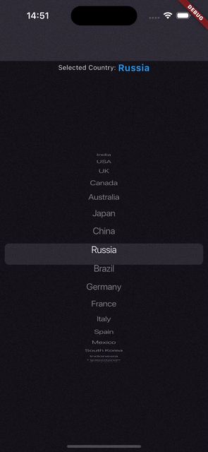
}Tap to scroll to the item in CupertinoPicker
CupertinoPicker now supports tapping on an item to automatically scroll to it, to navigate directly to the selected item.
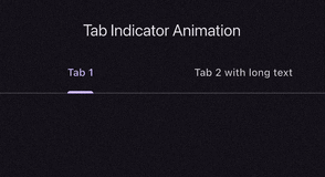
Customize tab indicator animation
Similar to Android’s tab indicator behavior, you can set the mode by which the selection indicator should animate when moving between destinations, Linear or Elastic.
TabBar.indicatorAnimation property, which allows you to customize the animation behavior of the tab indicator when switching between tabs.
TabIndicatorAnimation.linear: A smooth, linear animation (default whenindicatorAnimationis null andindicatorSizeisTabBarIndicatorSize.tab).TabIndicatorAnimation.elastic: A bouncing, elastic animation (whenindicatorSizeisTabBarIndicatorSize.label)
DefaultTabController(
  length: 2,
  child: Scaffold(
    appBar: AppBar(
      title: const Text('Tab Indicator Animation'),
      bottom: const TabBar(
        indicatorAnimation: TabIndicatorAnimation.elastic,
        tabs: <Widget>[
          Tab(text: 'Tab 1'),
          Tab(text: 'Tab 2 with long text'),
        ],
      ),
    ),
    body: TabBarView(),
  ),
); |  |
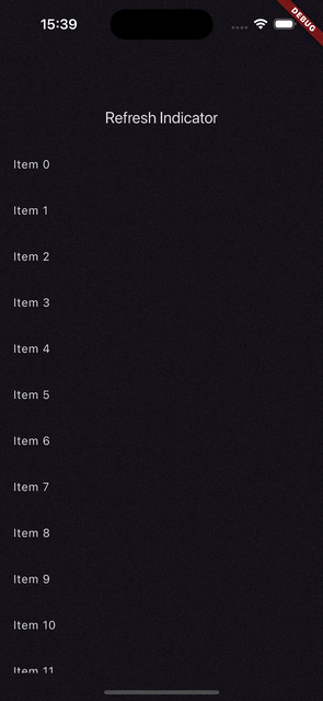
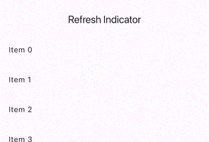
Refresh indicator
Refresh Indicator with No Spinner
RefreshIndicator.noSpinner widget to create a refresh indicator without the default spinner. This allows you to handle the refresh action with custom UI elements while still using the drag-to-refresh functionality.
Stack(
  children: [
    RefreshIndicator.noSpinner(
      onRefresh: () async {
        isRefreshing = true;
        setState(() {});
        await Future.delayed(const Duration(seconds: 2));
        isRefreshing = false;
        setState(() {});
      },
      child: ListView()
    ),
    if (isRefreshing)
      Align(
        child: CircularProgressIndicator(
          color: Colors.orange,
        ),
      ),
  ],
),
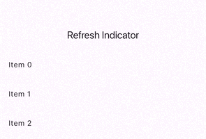
Elevation
The elevation property determines the shadow depth of the RefreshIndicator. The default value is 2.0.
RefreshIndicator(
        elevation: 10,
        backgroundColor: Colors.orange,
        onRefresh: () async {
          await Future.delayed(const Duration(seconds: 2));
        }, // Callback function for refresh action
        child: ListView()
), |  |
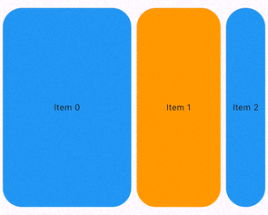
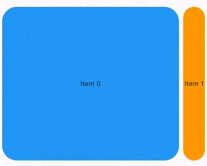
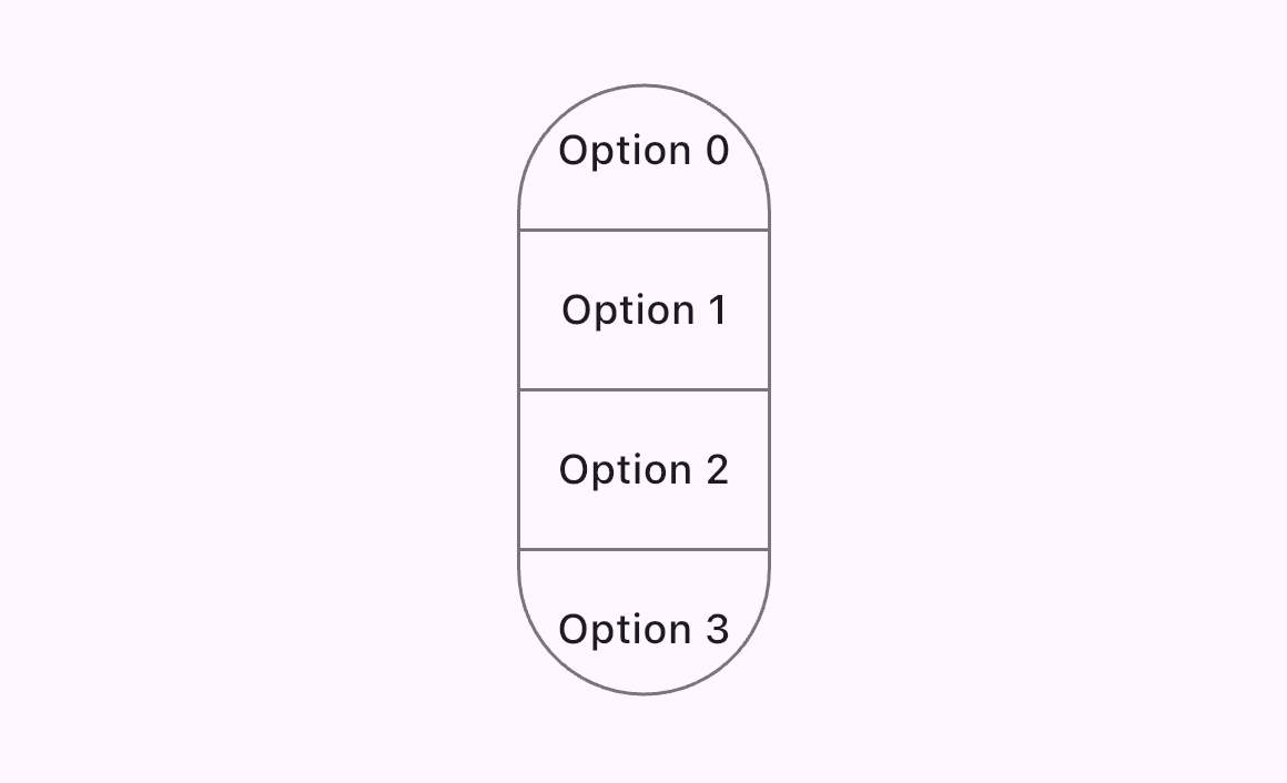
CarouselView Updates
CarouselView with weighting constructor
One of the most useful features is CarouselView.weighted. It allows you to assign relative weights to each carousel item by passing an array of integers called flexWeights (e.g., [3, 2, 1]). These integers represent the relative size of each item in the carousel.
The CarouselView then calculates the total weight of all items, and divides the available carousel width according to the ratio of these weights.
 |
 |
 |
Add enableSplash Parameter
The enableSplash parameter in CarouselView allows you to enable or disable the ink splash effect when an item is tapped. When set to true, tapping an item will create the splash effect as defined by the ThemeData.splashFactory.

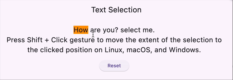
enableSplashText Selection improvements
Flutter has introduced a new improvement to text selection with the SelectionArea widget. It now supports the Shift + Click gesture to move the extent of the selection to the clicked position on Linux, macOS, and Windows. This enhances the interactivity of text selection in Flutter apps across these platforms.
Additionally, the clearSelection method to remove the ongoing text selection.
GlobalKey<SelectionAreaState> _selectionAreaKey = GlobalKey();

class TextSelectionWidget extends StatelessWidget {
  const TextSelectionWidget({super.key});

  @override
  Widget build(BuildContext context) {
    return Scaffold(
      appBar: AppBar(title: Text("Text Selection")),
      body: Padding(
        padding: const EdgeInsets.all(16.0),
        child: Column(
          children: [
            SelectionArea(
                key: _selectionAreaKey,
                child: const Text(
                  "How are you? select me.\n"
                  "Press Shift + Click gesture to move the extent of the selection to \nthe clicked position on Linux, macOS, and Windows.",
                  selectionColor: Colors.orange,
                  textAlign: TextAlign.center,
                  style: TextStyle(
                    fontSize: 20,
                  ),
                )),
            const SizedBox(
              height: 16,
            ),
            ElevatedButton(
                onPressed: () {
                  _selectionAreaKey.currentState?.selectableRegion
                      .clearSelection();
                },
                child: const Text("Reset"))
          ],
        ),
      ),
    );
  }
}
Deep links flag change
The default value for Flutter’s deep linking option has changed from false to true, meaning deep linking is now enabled by default. This simplifies the process for many developers, but if you're using a third-party plugin for deep links, such as:
- Firebase Dynamic Links
- uni_links
- app_links
You must manually disable Flutter’s deep linking to avoid conflicts with these plugins.
For Android
Add the following metadata to your AndroidManifest.xml file to explicitly disable Flutter's default deep linking,
<manifest>
   <application
       <activity>
<meta-data android:name="flutter_deeplinking_enabled" android:value="false" />
       </activity>
   </application>
</manifest>
For iOS
Modify your Info.plist file to disable Flutter's deep linking with the following key,
<key>FlutterDeepLinkingEnabled</key>
<false/>
Edge-to-Edge on Android 15+
I’m a huge fan of native apps where the content extends behind system bars (like the status bar and navigation bar), creating a more immersive and modern experience. This is exactly what you see in many native Android apps, where the UI fills the entire screen, even behind the system bars.
Starting with Android 15 (API level 31) and above, Flutter apps now default to this edge-to-edge mode, allowing them to run in full-screen, extending content behind the system bars.
We can set it like this,
void main() {
  SystemChrome.setEnabledSystemUIMode(
    SystemUiMode.edgeToEdge,
    overlays: [SystemUiOverlay.top], // Show the top system bar (status bar)
  );
  runApp(MyApp());
}
If you don’t want to add edge-to-edge mode, then add the following attribute in your_app/android/app/src/main/res/values/styles.xml.
<?xml version="1.0" encoding="utf-8"?>
<resources>
 …
 <style name="NormalTheme" parent="@android:style/Theme.Light.NoTitleBar">
 …
 <! - Add the following line: →
 <item name="android:windowOptOutEdgeToEdgeEnforcement">true</item>
 </style>
</resources>
CupertinoWidget Updates
CupertinoCheckbox
- A new
fillColorproperty has been added to theCupertinoCheckbox. - Improve
CupertinoCheckboxfidelity. - Add
semanticLabeltoCupertinoCheckbox. - Add
mouseCursorproperty toCupertinoCheckbox. - Deprecate
inactiveColorfromCupertinoCheckbox.
CupertinoRadio
- Improve
CupertinoRadiofidelity.
CupertinoSwitch
- Rename
CupertinoSwitchactiveColorandtrackColortoactiveTrackColorandinactiveTrackColor. - Roll
Switch.adaptivechanges intoCupertinoSwitch.
CupertinoSlidingSegmentedControl
- Add a new property
setEnabledso that segments can be disabled now. - Change default thumb radius, separator height, thumb scale alignment, etc.
CupertinoAlertDialog
- Supports the tap-slide gesture.
CupertinoButton
CupertinoButtonnow has asizeproperty (typeenum CupertinoButtonSize.CupertinoButtonnow has a.tintedconstructor that renders a translucent background.CupertinoButtonnow uses theactionTextStyleTextStyle from the given theme.
CupertinoActionSheet
- Add behavior of native action sheets that produce haptic feedback when the user slides into a button.
Other changes
CupertinoContextMenunow support scrolling if its actions overflow the screen.CupertinoDatePickerno longer clipping long contents in its columns.- Make
CupertinoButtoninteractive by keyboard shortcuts.
Material Widget Updates
SegmentedButtondirectionality can be vertical or horizontal instead of just horizontal position by addingdirectionargument.
- Add
borderRadiusproperty toPopupMenuButton. - Add ability to provide
selectableDayPredicateforshowDateRangePicker.
Color API Deprecation
The API for the Color class in dart:ui is changing to support wide gamut color spaces.
- Deprecate
Color.opacity
// Before: Access the alpha channel as a (converted) floating-point value.
final x = color.opacity;

// After: Access the alpha channel directly.
final x = color.a;- Deprecate
Color.withOpacitytoColor.withValues
// Before: Create a new color with the specified opacity.
final x = color.withOpacity(0.0);

// After: Create a new color with the specified alpha channel value,
// accounting for the current or specified color space.
final x = color.withValues(alpha: 0.0);
Digit separators in Dart 3.6
When working with large numbers, it can be difficult to read and understand their values at a glance.
Dart 3.6 (Flutter 3.27) introduces a helpful feature that adds support for digit separators using the underscore (_) character. You can’t use (_) as prefix or suffix.
const int largeNumber = 10_00_000_000;- Add
TimeOfDaycomparison methods. You can compare theTimeOfDaysame likeDateTime. - Support custom transition duration for
DialogRoute,CupertinoDialogRouteand show dialog methods.
Conclusion
This release is packed with improvements that refine both the visual fidelity and developer tools, ensuring a more smooth Flutter experience across all platforms. 🚀.
Are you ready to dive into the new version? We’d love to hear your thoughts! Which feature excites you the most? Or is there a specific part you’d like more details on? Let us know! 😄
Featured Articles

