
Animations in SwiftUI with Examples - Part 4
Background
Hello readers, Welcome back to our exploration of iOS animations!
In the first three parts of our animation series, we dived into the magic of motion design. If you haven’t read them already, please read the first three parts.
Sponsored
We are what we repeatedly do. Excellence, then, is not an act, but a habit. Try out Justly and start building your habits today!
Introduction
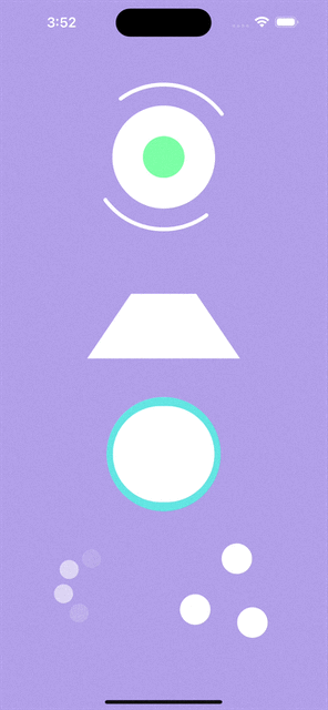
Now, let’s continue the journey with a few new awesome animations:
- FlippingSquare: Rotating square in both vertical and horizontal directions
- ArcRotation: Smooth continuous rotation of arcs around the circle
- TwinCircleScale: Dual circles interaction in a circle
- CircleBlinkDots: Three gracefully blinking dots in a rhythm
- TriangleRotatingDots: Three dots engaged in a triangle rotation
The final implementation will look like this:
Not interested in the implementation? Then just check out the full source code of these animations on GitHub. Feel free to fork or directly use the required animations in your applications.
Alright!!! Let’s dive into the implementation one by one.
1. FlippingSquare
This delightful animation brings a colorful square to the screen, flipping gracefully in vertical and horizontal directions.
Let’s dive into the code to understand the magic behind this animation:
struct FlippingSquare: View {

    // States to control the animation
    @State private var isAnimatingVertically = false
    @State private var isAnimatingHorizontally = false

    @State var color: Color

    let height: CGFloat = 120

    init(color: Color) {
       self.color = color
    }

    var body: some View {
       VStack {
          Rectangle()
             .fill(color)
             .frame(width: height, height: height)
             .rotation3DEffect(.degrees(isAnimatingVertically ? 180 : 0), axis: (x: 1, y: 0, z: 0))
             .animation(Animation.linear(duration: 1).delay(1).repeatForever(autoreverses: false), value: UUID())
             .rotation3DEffect(.degrees(isAnimatingHorizontally ? 180 : 0), axis: (x: 0, y: 1, z: 0))
             .animation(Animation.linear(duration: 1).delay(1).repeatForever(autoreverses: false), value: UUID())
       }
       .onAppear {
          isAnimatingVertically = true

          // Adding a delay to ensure the completion of the first rotation
          DispatchQueue.main.asyncAfter(deadline: .now() + 1) {
              isAnimatingHorizontally = true
          }
       }
    }
}isAnimatingVerticallyandisAnimatingHorizontallystates control the flipping animation in vertical and horizontal directions, respectively.- The
Rectangleis filled with the specified color and framed to create the square. rotation3DEffectis applied to achieve the flipping effect.animationis configured for a smooth visual experience after performing the rotation.- The
onAppearblock is crucial for orchestrating the sequential animation.
Note: The initial vertical flip starts immediately upon appearance. Adding a delay before triggering the horizontal flip ensures that the first rotation completes, creating a seamless and visually pleasing experience.
Feel free to experiment with different durations and delays to observe the impact on the animation sequence!
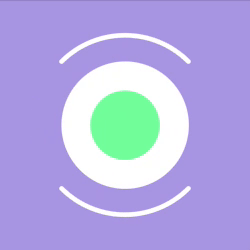
2. ArcRotationAnimation
In this animation, two arcs gracefully rotate within a captivating circular dance.
Let’s delve into the enchanting code:
struct ArcRotationAnimation: View {

    // State to control the animation
    @State private var isAnimating: Bool = false

    // Angles and height variables for dynamic adjustments
    @State private var arcAngle1: Double = 0
    @State private var arcAngle2: Double = 180
    @State private var circleHeight: CGFloat = 135

    @State var color: Color

    init(color: Color) {
        self.color = color
    }

    var body: some View {
        VStack {
            ZStack {

                // Large circle in the background
                Circle()
                    .fill(color)
                    .frame(height: circleHeight)

                // Dynamic circle that changes height based on animation state
                Circle()
                    .fill(Color.green).brightness(0.3)
                    .frame(height: isAnimating ? circleHeight / 2.5 : circleHeight / 1.8)
                    .animation(.easeInOut(duration: 1).repeatForever(autoreverses: true), value: UUID())

                // Group containing two rotating arcs
                Group {
                    ArcShape(startAngle: .degrees(arcAngle1), endAngle: .degrees(arcAngle1 + 90))
                        .stroke(color, style: StrokeStyle(lineWidth: 5, lineCap: .round))

                    ArcShape(startAngle: .degrees(arcAngle2), endAngle: .degrees(arcAngle2 + 90))
                        .stroke(color, style: StrokeStyle(lineWidth: 5, lineCap: .round))
                }
                .frame(width: 190, height: 190)
                .rotationEffect(.degrees(isAnimating ? 360 : 0))
                .animation(.linear(duration: 2).repeatForever(autoreverses: false), value: UUID())
            }
            .onAppear {
                isAnimating = true
            }
        }
    }
}

// Custom shape for drawing arcs
struct ArcShape: Shape {

    var startAngle: Angle
    var endAngle: Angle

    func path(in rect: CGRect) -> Path {
        var path = Path()
        path.addArc(center: CGPoint(x: rect.midX, y: rect.midY), radius: rect.width / 2,
                    startAngle: startAngle, endAngle: endAngle, clockwise: false)
        return path
    }
}
The animation consists of two circles, each with its unique characteristics. The dynamic circle changes its height based on the animation state, creating a pulsating effect along with the continuous arc rotation.
- The
isAnimatingstate orchestrates the circular dance, revealing the dynamic interaction between the arcs and circles. - The
ArcShapestruct is a custom shape used to draw the rotating arcs. - The angles
arcAngle1andarcAngle2define the starting and ending points of each arc. - The
strokemodifier styles the arc with the specified color, line width, and line cap. - The arcs are part of a
Groupand are rotated using therotationEffect. The entire composition is encased in aZStackfor layering. - The
.rotationEffectmodifier rotates the entire group based on the animation stateisAnimating. - When
isAnimatingis true, the group undergoes a full 360-degree rotation, creating a continuous circular motion.
This combination of arcs, rotation, and animation results in the broader ArcRotationAnimation.
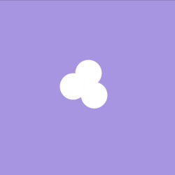
3. TwinCircleScale
Experience the twin circles gracefully scaling and overlapping in this delightful SwiftUI animation.
struct TwinCircleScale: View {

    // State to control the animation
    @State private var isAnimating = false

    // Constant defining the height of the larger circle
    private let circleHeight: CGFloat = 150

    var body: some View {
        ZStack {
            // Larger Circle with Mint Fill
            Circle()
                .fill(Color.mint)
                .frame(width: circleHeight, height: circleHeight)

            // Smaller White Circle Scaling Effect with Horizontal Offset
            Circle()
                .fill(Color.white)
                .frame(height: isAnimating ? circleHeight / 8 : circleHeight)
                .offset(x: isAnimating ? 20 : 0) // Adjust the offset for the desired overlap

            // Another Smaller White Circle with Scaling Effect and Horizontal Offset
            Circle()
                .fill(Color.white)
                .frame(height: isAnimating ? circleHeight / 8 : circleHeight)
                .offset(x: isAnimating ? -20 : 0) // Adjust the offset for the desired overlap
        }
        .clipShape(Circle())
        .animation(.easeInOut(duration: 1.3).delay(0.1).repeatForever(autoreverses: true), value: UUID())
        .onAppear {
            isAnimating = true
        }
    }
}- The first
circleis larger and filled with a soothing mint color, creating the primary visual element of the animation. - Two smaller white circles are positioned on either side of the larger circle, creating a symmetrical composition.
- The
offsetmodifier introduces a horizontal shift to the smaller circles when the animation is active, creating a dynamic overlap effect. - The
clipShapemodifier confines the entire composition within a circular boundary, maintaining a cohesive and polished appearance. - When the
.animationkicks in, the smaller circles playfully shift horizontally with a duration of 1.3 seconds by adding a lively overlap effect. - A slight
delayof 0.1 seconds enhances the visual rhythm and the animationrepeatsindefinitely withautoreversalfor a continuous and enchanting experience.

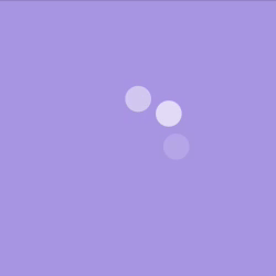
4. ThreeCircleBlinkDots
A playful animation that features three circles gracefully blinking in a rhythm. Each circle takes its turn to shine, creating a captivating sequence.
Now, let’s dive into the code:
struct ThreeCircleBlinkDots: View {

    // State variable to track the current active dot
    @State var current = 0

    @State var color: Color

    // Constants to configure the animation
    private let totalDots = 7
    private let height: CGFloat = 100
    private let timer = Timer.publish(every: 0.35, on: .main, in: .common).autoconnect()

    // Initializer to set the dot color
    init(color: Color) {
        self.color = color
    }

    var body: some View {
        ZStack {
            // Loop through the total number of dots
            ForEach(0..<totalDots, id: \.self) { index in
                // Circle for each dot
                Circle()
                    .fill(color)
                    .frame(height: height / 4)
                    .frame(height: height, alignment: .top)
                    .rotationEffect(Angle(degrees: 360 / Double(totalDots) * Double(index)))
                    // Adjust opacity based on the current dot
                    .opacity(current == index ? 1.0 : current == index + 1 ? 0.5 :
                             current == (totalDots - 1) && index == (totalDots - 1) ? 0.5 : 0)
            }
        }
        // Timer to control the animation
        .onReceive(timer, perform: { _ in
            // Animate the dots with ease-in-out effect
            withAnimation(Animation.easeInOut(duration: 1).repeatCount(1, autoreverses: true)) {
                // Update the current active dot
                current = current == (totalDots - 1) ? 0 : current + 1
            }
        })
    }
}
The animation features a series of dots, each contributing to the dynamic sequence. Each dot is strategically positioned based on its rotation angle, contributing to a harmonious arrangement.
rotationEffectrotates each dot based on its index.- The
opacityadjusts dynamically, with the current active dot shining brightly, and the adjacent dots exhibiting a subtle fade. onReceive(timer)listens to the timer's ticks, which trigger at a regular interval of 0.35 seconds to shift all dots gracefully.withAnimationapplies a gentle ease-in-out animation to move dots with a 1-second duration and autoreverse to add a smooth transition.
The timer ensures a rhythmic and continuous display of the blinking dots.
5. ThreeTriangleRotatingDots
This animation forms an elegant triangular arrangement with a graceful transition.
Now, let’s dive into the code:
struct ThreeTriangleRotatingDots: View {

    // State variable to control the animation
    @State var isAnimating: Bool = false

    @State var color: Color

    // Constants to configure the dots
    private let height: CGFloat = 40

    // Initializer to set the dot color
    init(color: Color) {
        self.color = color
    }

    var body: some View {
        ZStack {
            // Circles forming a triangular pattern
            Circle()
                .fill(color)
                .offset(x: 0, y: isAnimating ? -height : 0)

            Circle()
                .fill(color)
                .offset(x: isAnimating ? -height : 0, y: isAnimating ? height : 0)

            Circle()
                .fill(color)
                .offset(x: isAnimating ? height : 0, y: isAnimating ? height : 0)
        }
        .frame(height: height)
        // Animation for the triangular movement
        .animation(Animation.easeInOut(duration: 1).repeatForever(autoreverses: true), value: UUID())
        // Rotation animation for an overall spinning effect
        .rotationEffect(Angle(degrees: isAnimating ? 360 : 0))
        .animation(Animation.easeInOut(duration: 1).repeatForever(autoreverses: false), value: UUID())
        .onAppear {
            isAnimating = true
        }
    }
}
In this dynamic animation, three circles gracefully rotate by creating a harmonious triangular arrangement.
- Each circle takes center stage with its unique
offsetchoreography. - The first circle gracefully shifts vertically, while the second and third circles perform a horizontal and vertical dance, creating a harmonious triangular arrangement.
- The
animationmodifier to elegantly shift and reverse the circles smoothly. - The
rotationEffectadds a spin effect to the entire composition, creating an overall dynamic and delightful display. And then again perform animation to move dots triangularly.
That’s a wrap for today!
Hope you’ve gained some valuable insights. This article is crafted to lead you on the path toward delving even deeper into SwiftUI animations.
Conclusion
We’ve explored a variety of engaging animations, including the FlippingSquare’s graceful twirl, the ArcRotation’s elegant spin, the TwinCircleScale’s playful bounce, the ThreeCircleBlinkDots’ rhythmic blinking, and the ThreeTriangleRotatingDots’ dynamic triangular rotation.
These animations not only enhance the visual appeal of your app but also contribute to a more enjoyable user experience. As we wrap up this animation adventure, we encourage you to experiment with these animations and add some sparkle to your app.
Keep coding, keep animating, and let your creativity shine!
Related Articles

Get started today
Let's build the next
big thing!
Let's improve your business's digital strategy and implement robust mobile apps to achieve your business objectives. Schedule Your Free Consultation Now.
Get Free Consultation
Get started today
Let's build the next big thing!
Let's improve your business's digital strategy and implement robust mobile apps to achieve your business objectives. Schedule Your Free Consultation Now.
Get Free Consultation